
Role
Lead UX/UI Product Designer — owned HUD navigation, IA, interaction patterns, accessibility considerations, and design system direction.
Warner Bros. Discovery
Product Strategy · UX Architecture · HUD System Design · Cross-Functional Leadership

Lead UX/UI Product Designer — owned HUD navigation, IA, interaction patterns, accessibility considerations, and design system direction.
Strategy game HUD across mobile, tablet, and desktop screens, covering onboarding, map navigation, management states, and decision-support surfaces.
Simplify dense gameplay systems without reducing strategic depth or player control, especially as players transition from onboarding into the live map.
Created scalable HUD patterns, clearer hierarchy, reusable grayscale components, and accessible interaction zones that could grow with the product.
Overview
This case study focuses on how I restructured a complex game HUD into a clearer, more scalable navigation system while preserving the strategic depth that makes the gameplay compelling.
Designed onboarding, navigation and core interaction model for a large-scale mobile, tablet and desktop screens. Delivered user flows, IA frameworks, wireframes, prototypes, and UX patterns to support fast, strategic player decision-making.
Designed high-density gameplay interfaces for AAA strategy games, focusing on decision-support systems that help players navigate complex mechanics without losing clarity or immersion. Building high-density interfaces and decision-support tools within the Game of Thrones / House of the Dragon strategy ecosystem.
Research Foundation
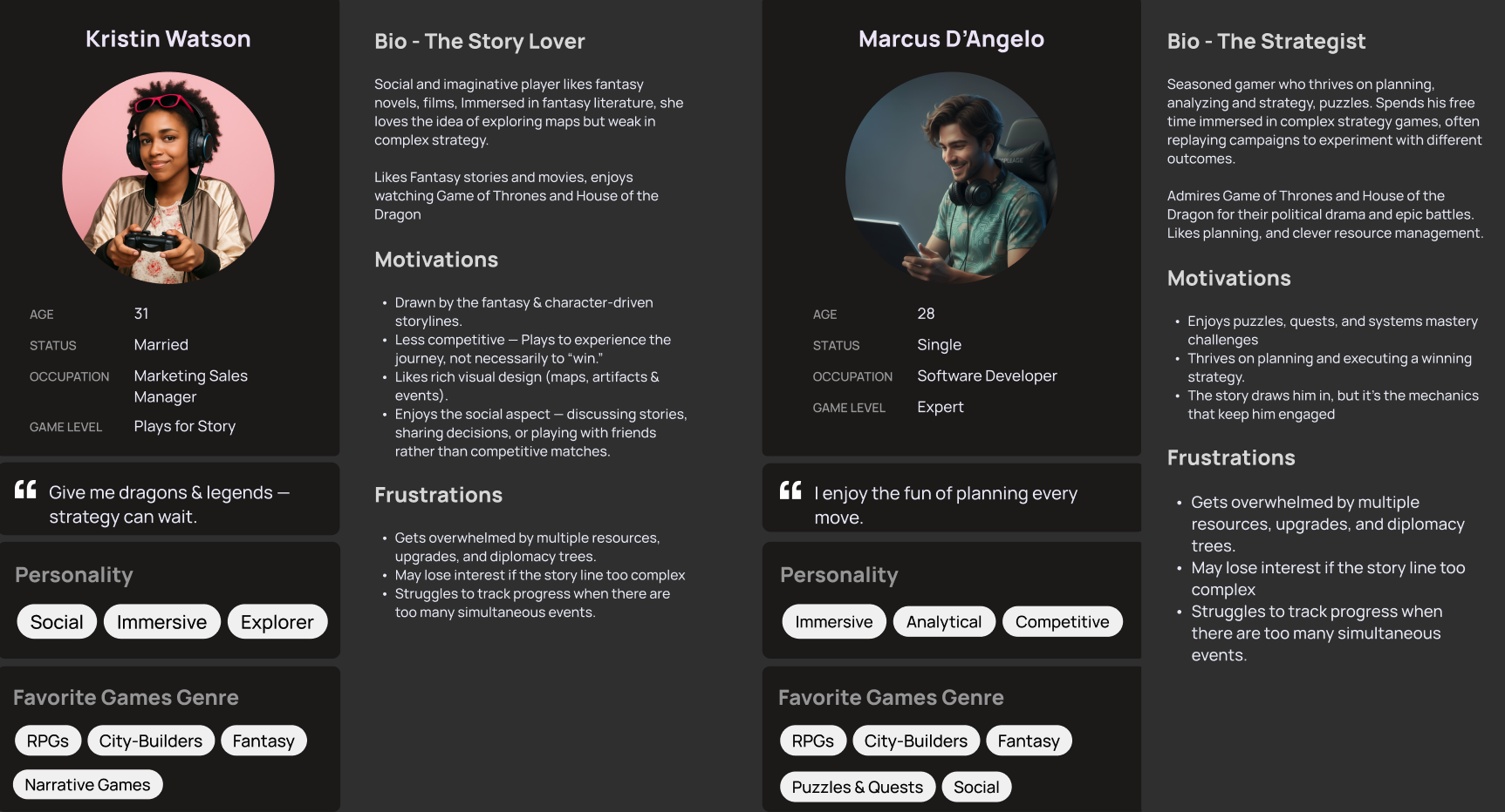
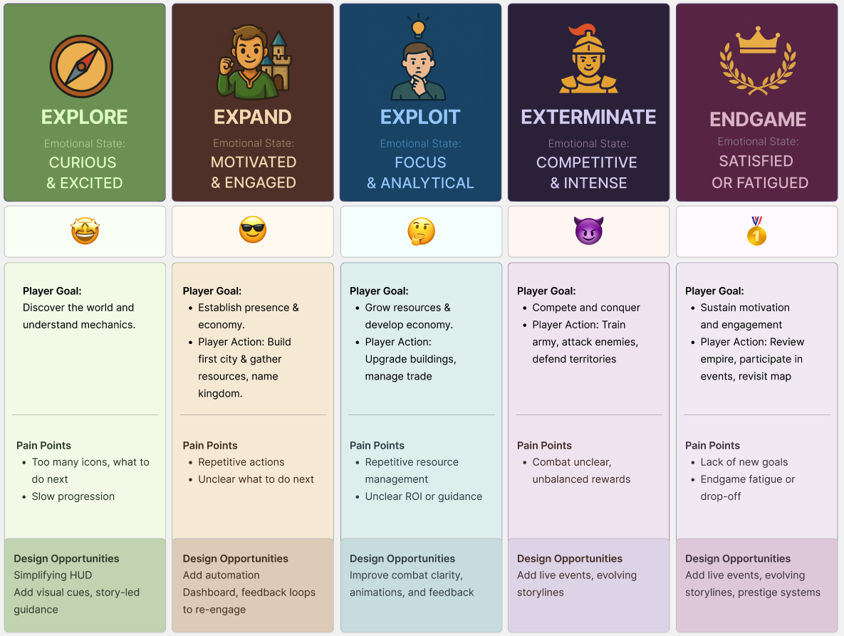
I used research artifacts and visual exploration to connect gameplay complexity with a more legible interface structure.
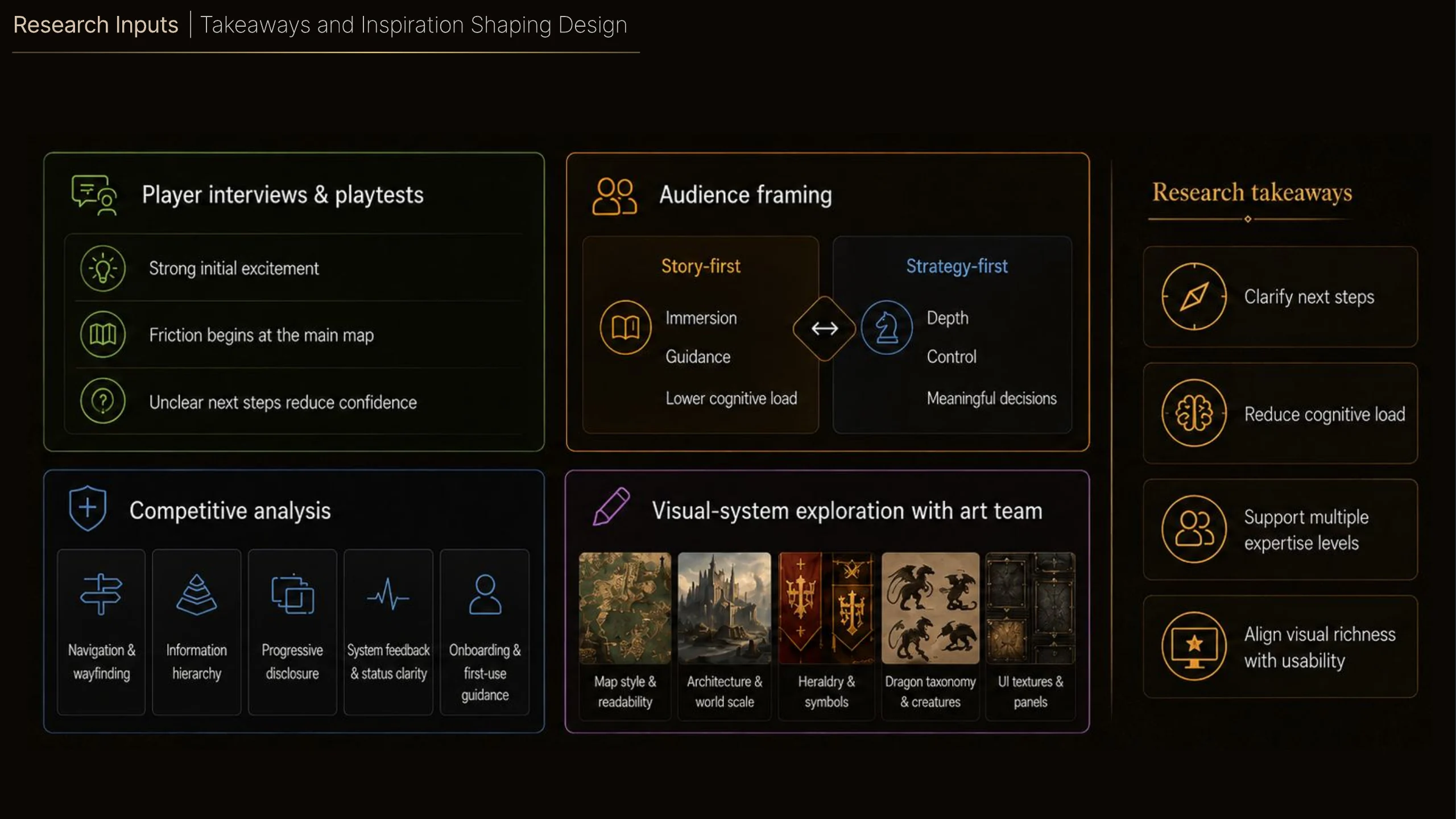
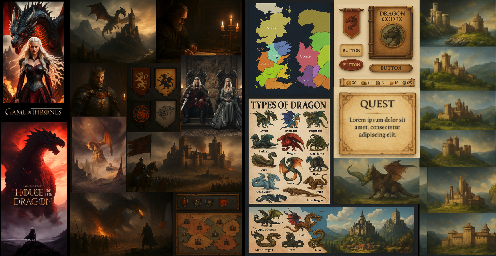
Analyzed player behavior, gameplay flows, and interaction patterns to identify friction in decision-making. Partnered with Game Design, UI Art, and Production to validate concepts, refine usability, and align the HUD with gameplay depth and player expectations.
Player Journey & Pain Points
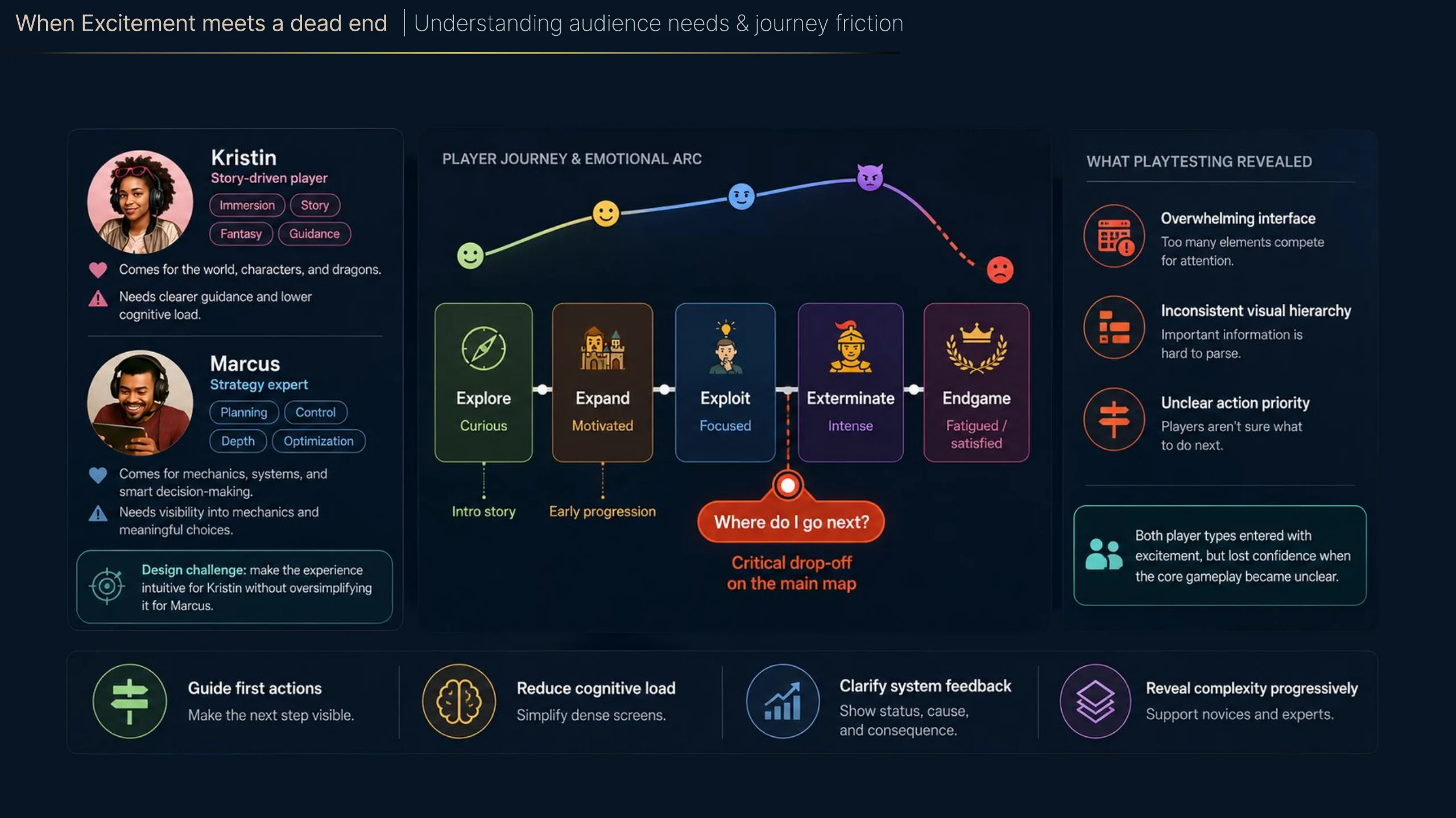
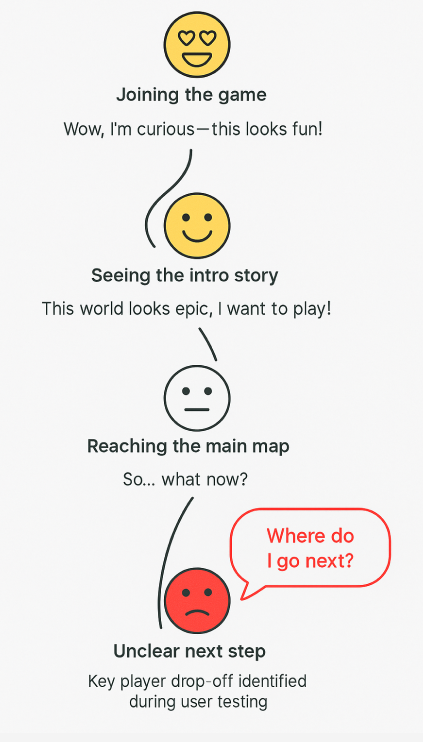
The journey map exposed a clear drop-off moment: high anticipation turned into uncertainty once the system stopped guiding the player.
Mapping the player journey revealed a critical drop-off point: players reached the main map but lacked clear direction on what to do next. A key friction point emerged during onboarding: players entered the main map without clear next steps, leading to confusion and early disengagement.
Core UX Challenges
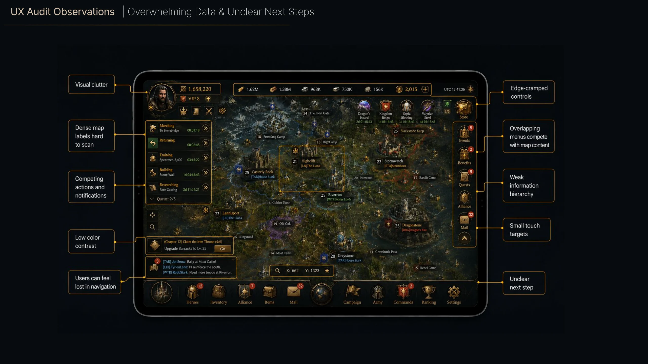
The redesign work centered on information hierarchy, consistency, and accessible decision-making under pressure.
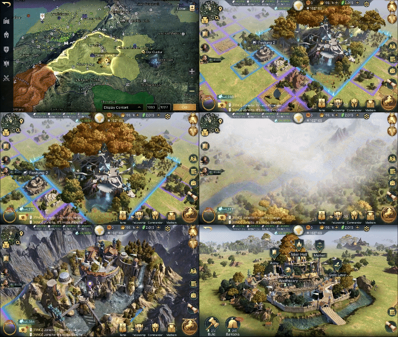
Key Product Decisions
The product strategy was not about removing complexity. It was about placing actions, signals, and feedback in more intuitive locations so the interface could support faster decisions.
Playtesting revealed that players struggled to locate critical information quickly, often navigating through multiple layers to complete basic actions. This directly impacted decision speed and created friction during core gameplay loops.
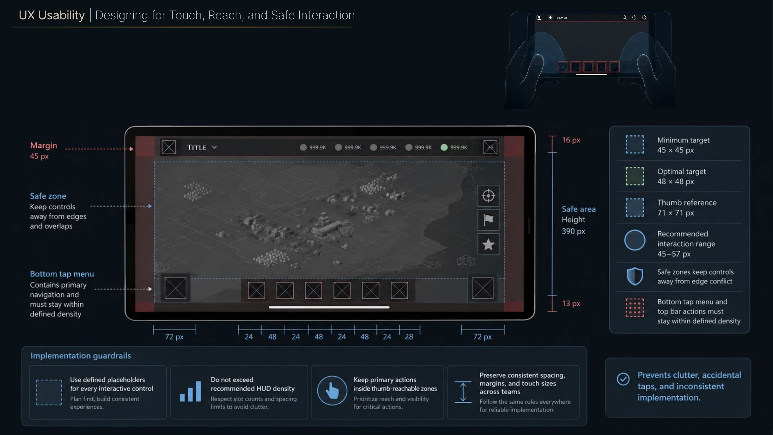
Defined scalable layout rules for touch zones, spacing, and margins to support ergonomic reach, visual consistency, and accessibility across devices.
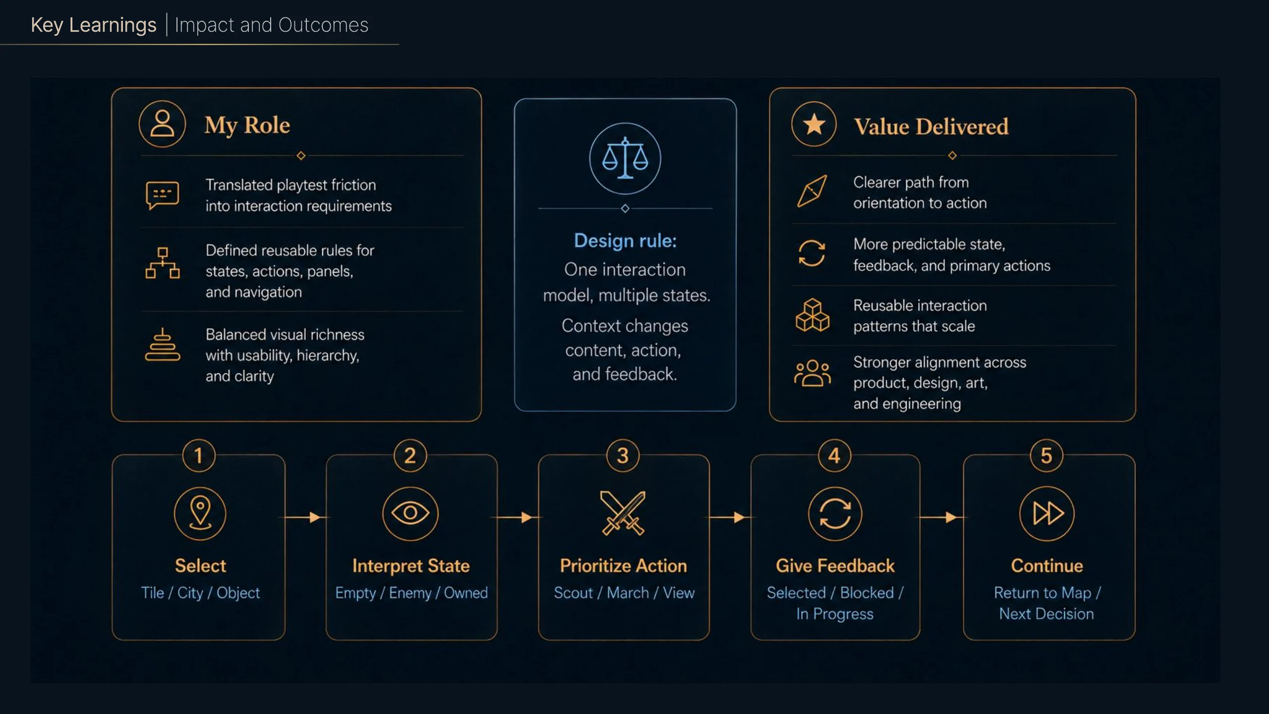
As the experience evolved, I translated research findings into reusable panel rules, placement logic, and hierarchy principles that could support map views, missions, management flows, and future gameplay systems.
HUD Navigation & Information Architecture
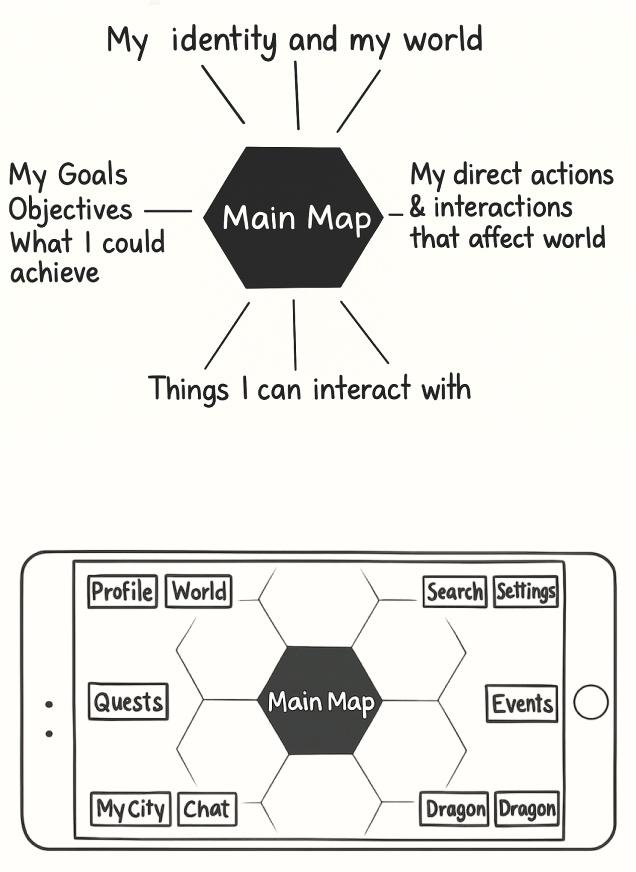
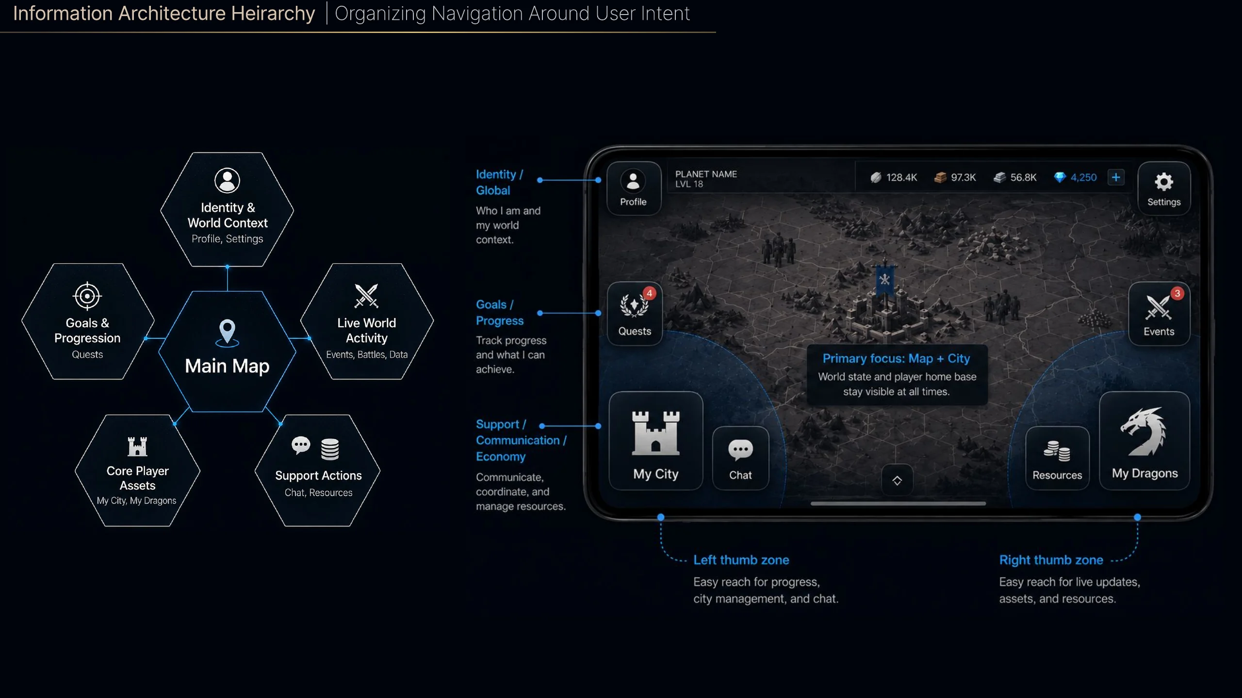
I reframed the interface as a layered system so players could understand what mattered, where to act, and how different surfaces related to one another.
To reduce cognitive load, I restructured the HUD into a clear system of zones, mapping gameplay actions, goals, and world interactions into predictable locations.
Tile Map Optimization
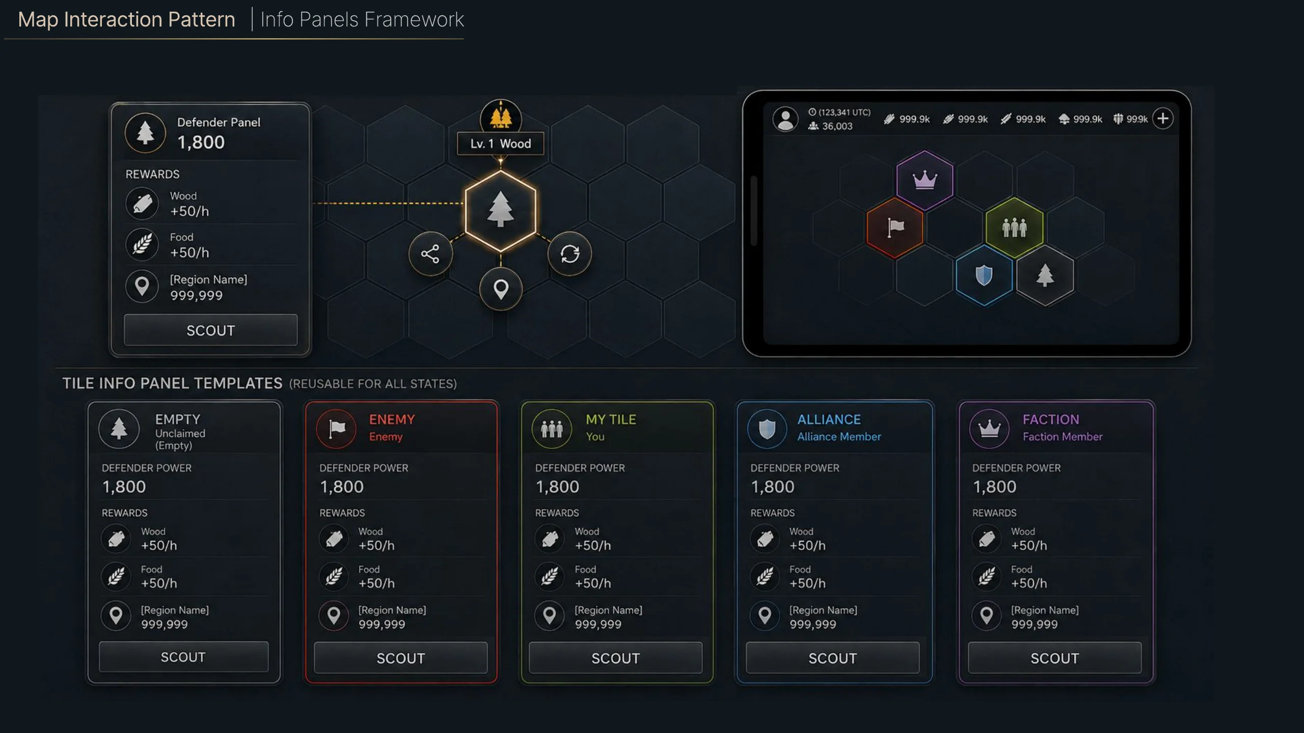
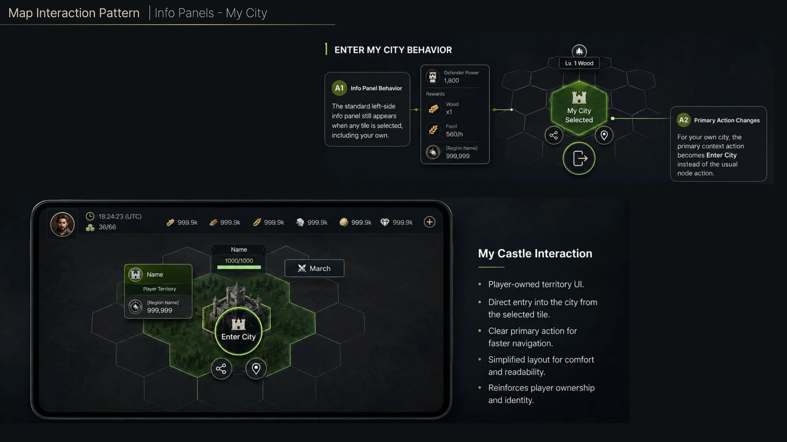
The tile map became a repeatable system rather than a series of bespoke screens.
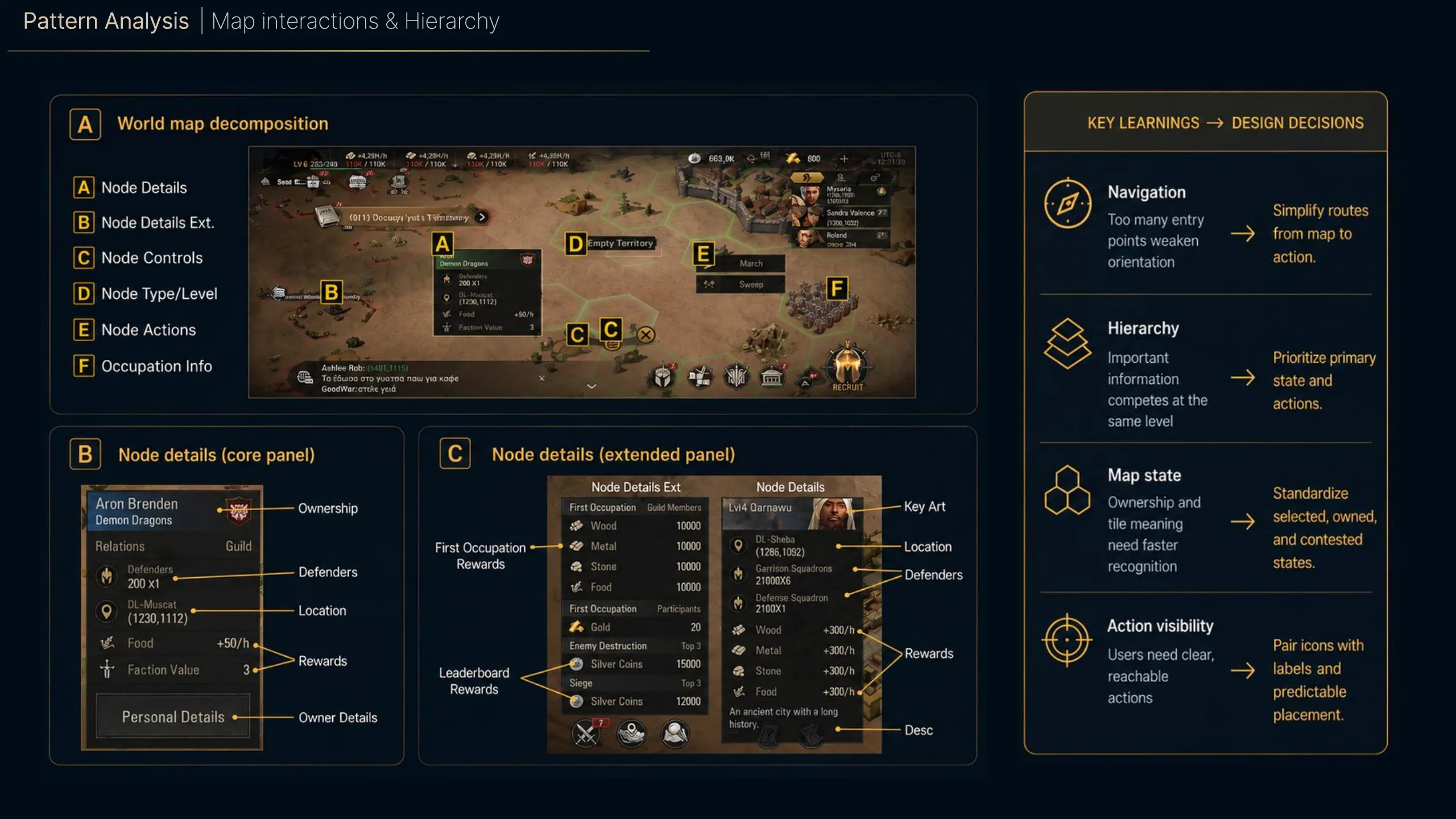
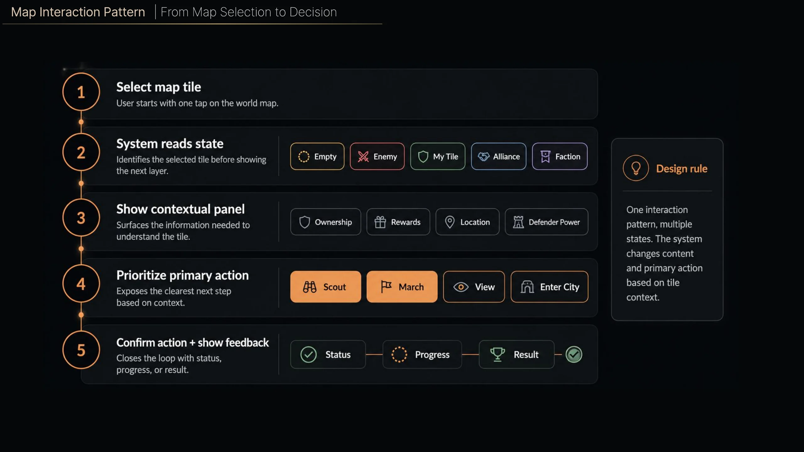
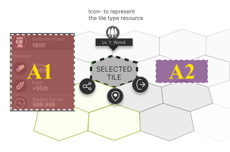
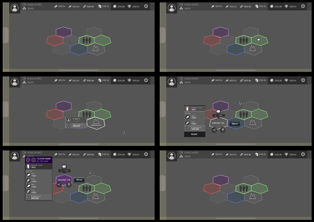
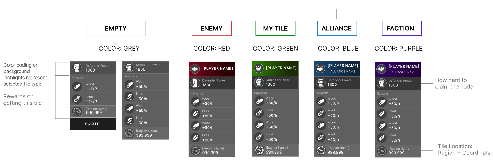
I audited all map info panels and standardized layout rules to ensure every panel communicated hierarchy, ownership, and action state in a predictable way.
Design System Evolution
The design system evolved in parallel with the product so structure, clarity, and implementation speed could reinforce each other.
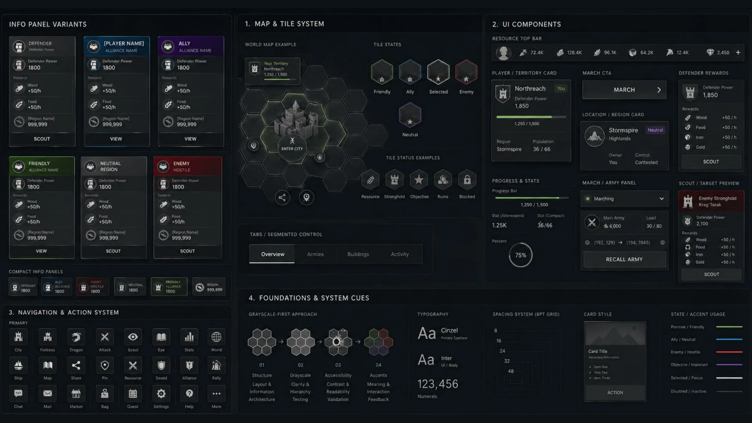
Built the system in grayscale to prioritize structure, readability, and interaction logic first. This enabled faster iteration, reusable components, and consistent implementation across teams as the product evolved.
A living system that evolved with the product, balancing speed, clarity, and collaboration.
Building on the analysis, I created a flexible design system using grayscale foundations to improve clarity, accessibility, and instant recognition. To support color-blind accessibility, every state also includes unique icons and border shapes. The system scales across both map and detail views to maintain orientation and reduce decision time.
Accessibility and Visual Clarity
Accessibility work was embedded into layout, labeling, and visual language, not treated as a late-stage check.
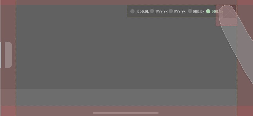
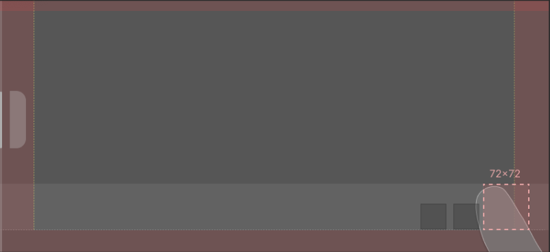
Created a scalable template that defined safe touch zones, margins, and spacing rules for both thumb reach and visibility.
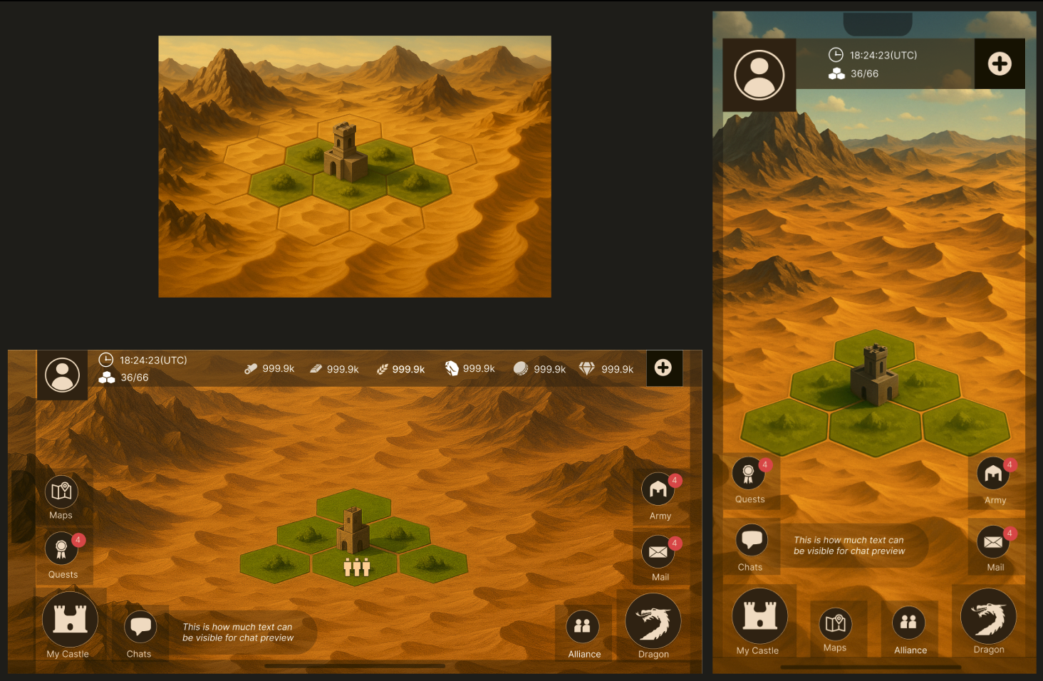
As the design system started to take shape and the engineering team began developing the core game architecture, I moved into exploring textures, visual balance, and environmental context. I tested how textures, icons, labels, and transparency interact together without cluttering the screen.
Labels improve clarity, reduce errors, and help users understand actions without guessing. I evaluated where labels were missing or unclear and how that affected player comprehension, then created a more consistent labeling system for core actions, icons, and navigation elements to improve learnability and reduce mis-taps.
Business Outcomes & Product Performance
The work addressed usability issues that impact player retention, engagement, and decision-making efficiency while making the system easier to scale and implement.
My Contribution
My role extended beyond screens. I aligned teams, clarified the problem space, and kept decisions tied to player needs, product goals, and technical constraints.
I collaborate closely with engineers to validate interactions early and partner with artists to shape a cohesive visual narrative. My approach focused on translating complex gameplay systems into clear, structured experiences.
Reflection
This work deepened my understanding of designing for complex products that need to serve both new and experienced users without losing depth.
I learned how to shape systems that flex for both beginners and experts while preserving clarity in high-density environments.
OTHER PROJECTS
 Interaction Design
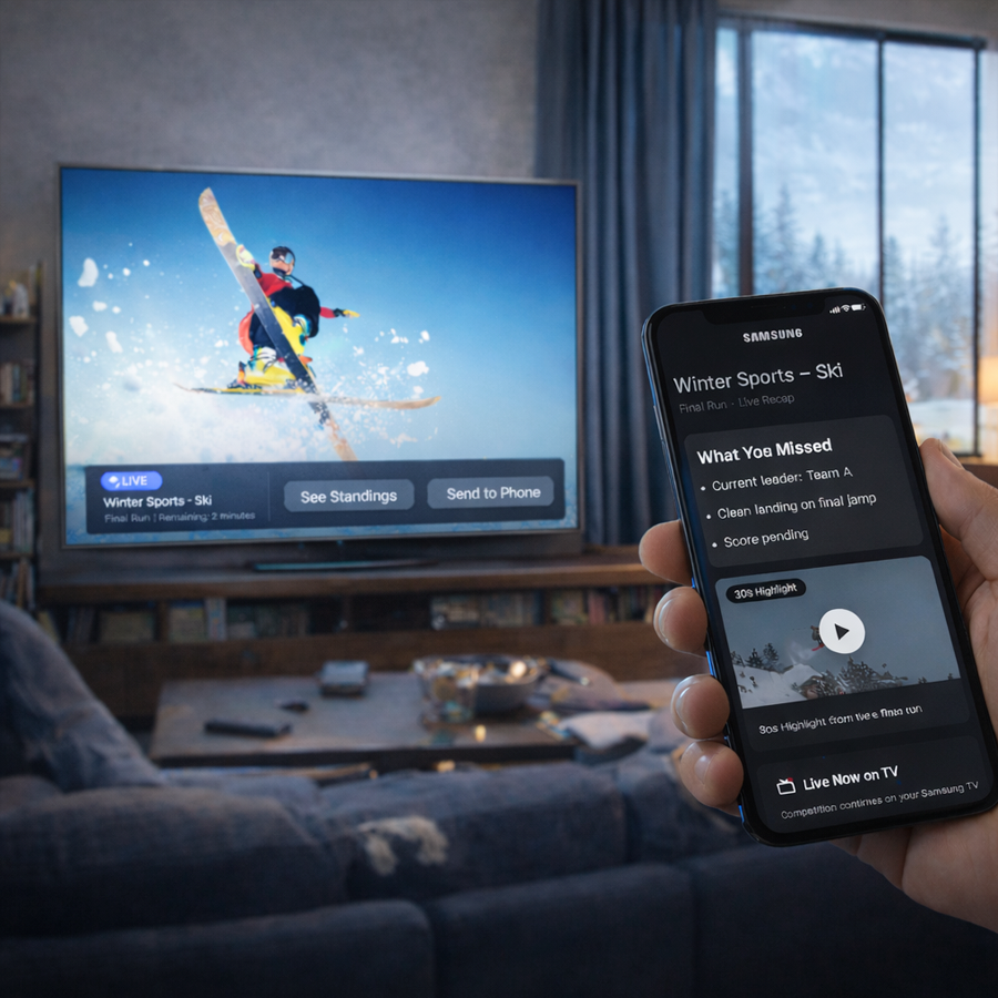
Smart TV UX
Visual-first interaction concepts for cross-device TV experiences and re-engagement flows.
Interaction Design
Smart TV UX
Visual-first interaction concepts for cross-device TV experiences and re-engagement flows.
 Accessibility
Dark Theme
BlackBerry dark and light theme guidelines shaped around contrast, readability, and inclusive UX.
Accessibility
Dark Theme
BlackBerry dark and light theme guidelines shaped around contrast, readability, and inclusive UX.
 Branding
BlackBerry Brand
Packaging and brand marketing guidelines across product, print, and visual identity touchpoints.
Branding
BlackBerry Brand
Packaging and brand marketing guidelines across product, print, and visual identity touchpoints.
 Design Systems
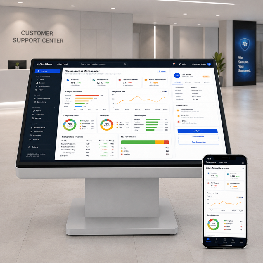
Design System
Enterprise web UI guidelines for dashboards, components, empty states, and accessibility rules.
Design Systems
Design System
Enterprise web UI guidelines for dashboards, components, empty states, and accessibility rules.
 Illustration
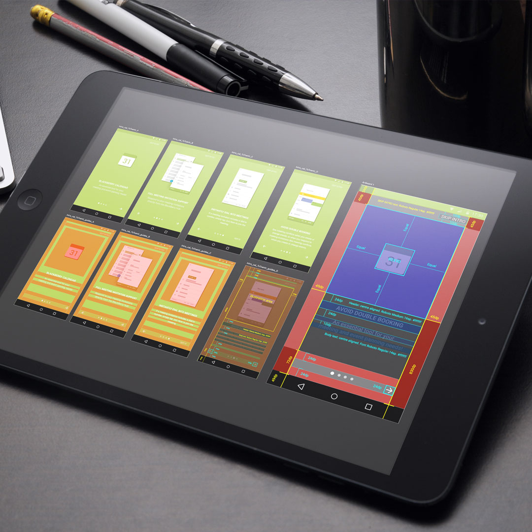
Empty Data
Onboarding and empty-state illustrations that guide users through first-use product moments.
Illustration
Empty Data
Onboarding and empty-state illustrations that guide users through first-use product moments.
 Branding
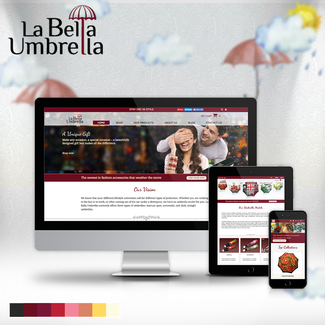
Labella Umbrella
A responsive online store direction combining brand storytelling, layouts, and product imagery.
Branding
Labella Umbrella
A responsive online store direction combining brand storytelling, layouts, and product imagery.
 UX Research
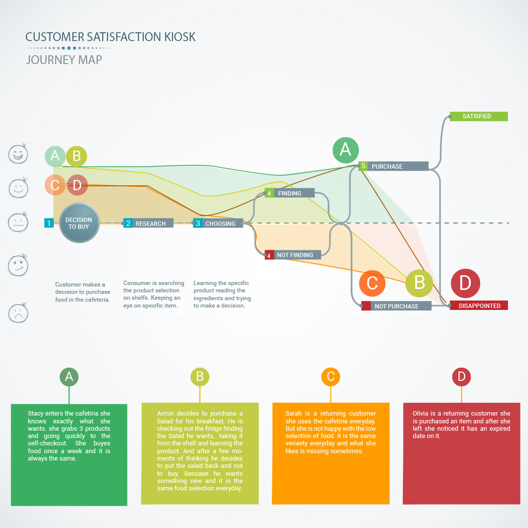
Customer Kiosk
A service kiosk and app concept for measuring customer satisfaction and operational feedback.
UX Research
Customer Kiosk
A service kiosk and app concept for measuring customer satisfaction and operational feedback.
 Interaction Design
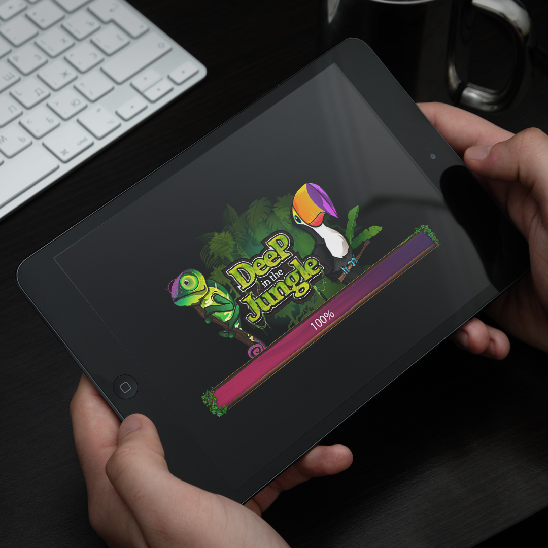
Wizits Game
A mobile game interface with character art, themed screens, animation, and playful UX systems.
Interaction Design
Wizits Game
A mobile game interface with character art, themed screens, animation, and playful UX systems.
 Interaction Design
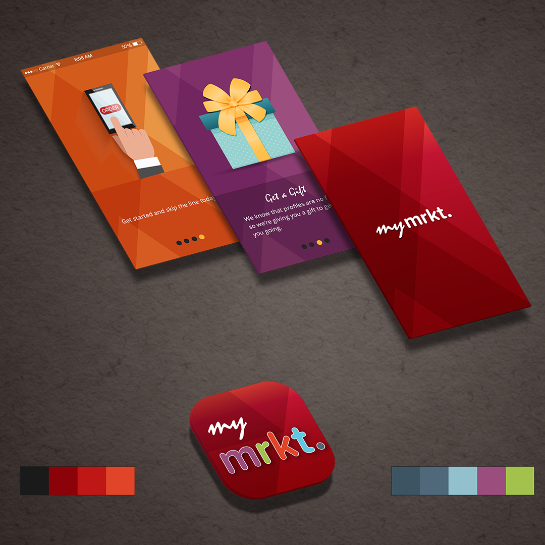
TJX Market
A multi-brand retail app concept exploring navigation, product discovery, and mobile shopping.
Interaction Design
TJX Market
A multi-brand retail app concept exploring navigation, product discovery, and mobile shopping.
 Branding
SharpLight
Beauty spa campaign materials spanning print design, promotional layouts, and branded visuals.
Branding
SharpLight
Beauty spa campaign materials spanning print design, promotional layouts, and branded visuals.
 Branding
Bwin Promo
A festive gaming promotion with campaign concepts, interface graphics, and seasonal art direction.
Branding
Bwin Promo
A festive gaming promotion with campaign concepts, interface graphics, and seasonal art direction.
 Data Visualization
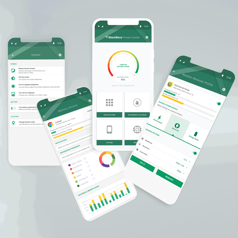
Power Center
Battery app interaction design with information architecture, visual states, and usage insights.
Data Visualization
Power Center
Battery app interaction design with information architecture, visual states, and usage insights.
 Illustration
Interior Art
Interior and architectural illustrations using 3D composition, rooms, textures, and visual mood.
Illustration
Interior Art
Interior and architectural illustrations using 3D composition, rooms, textures, and visual mood.
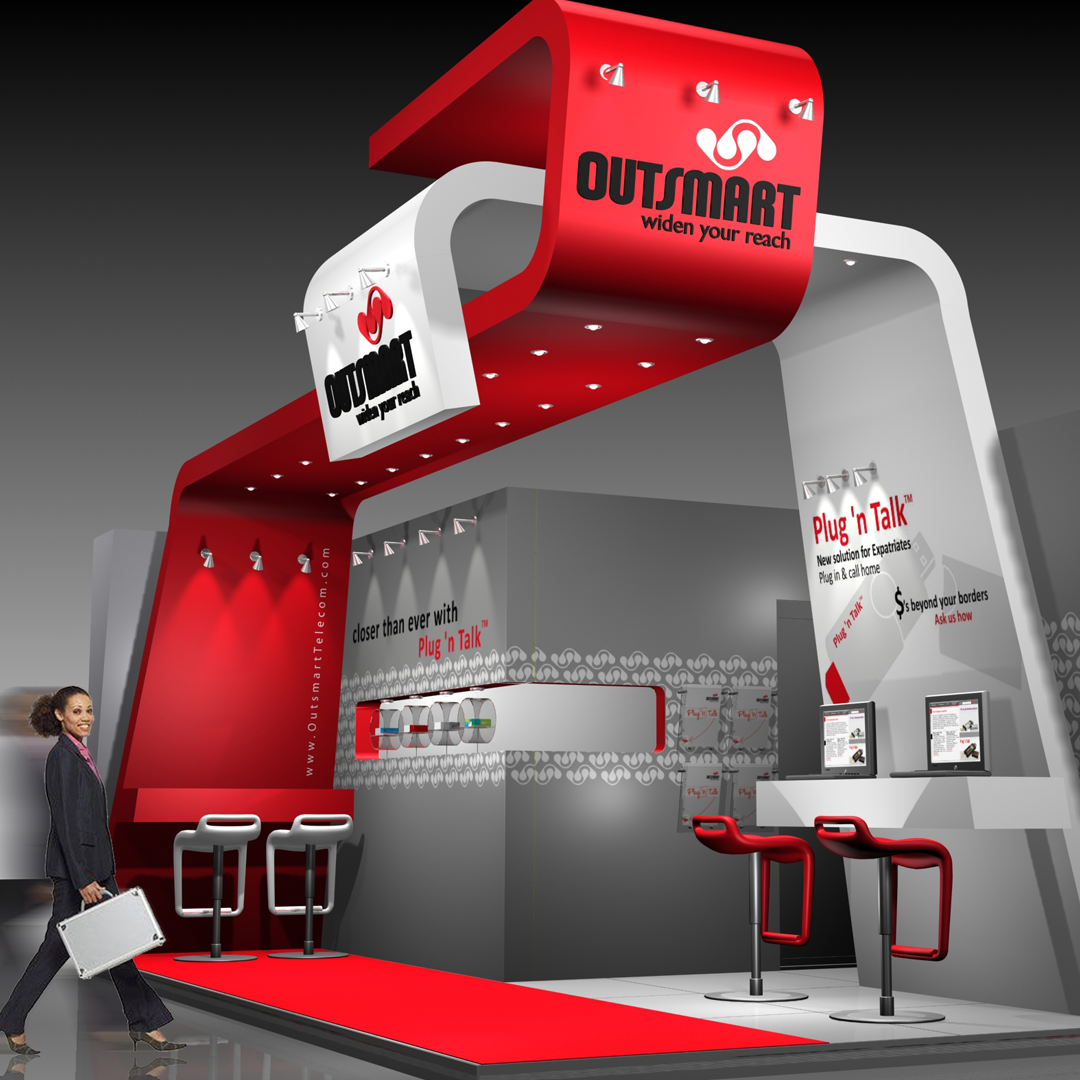 Physical + Digital Experience
3D Exhibition
Exhibition work connecting brand identity, spatial planning, interactive kiosks, product displays, and service conversations.
Physical + Digital Experience
3D Exhibition
Exhibition work connecting brand identity, spatial planning, interactive kiosks, product displays, and service conversations.