Menu
Web UI Design System

Home / Portfolio

mockup

Design System and UI Guidelines for BlackBerry Security Web Portal.


My Role

Web UI Design for a BlackBerry Security Portal

Tools:

  • Adobe XD / Figma
  • Adobe Illustrator
  • Adobe photoshop

Industry

Cyber Security Portal, primarily serving Government and Enterprise clients.


Challenges

I navigated numerous usability challenges in an environment where security is paramount and great focus and attention to detail are required. With a strong emphasis on simplifying complexity and designing a more intuitive navigation & user-friendly experience.

  • Declutter the interface and information density without losing essential features.
  • Create a visual hierarchy, better focus, and easy navigation that simplifies the dozens of menu items but keeps functionality and performance.
  • Consistency in Branding & company’s values.
  • Clear Error and Communication Messages.

Approach

While I was the lead UX UI Designer on the portal - I worked closely with a Developer and Product owner to optimize the creation of the Design System for best performance. My approach involved creating info architecture, wireframe and iconography.

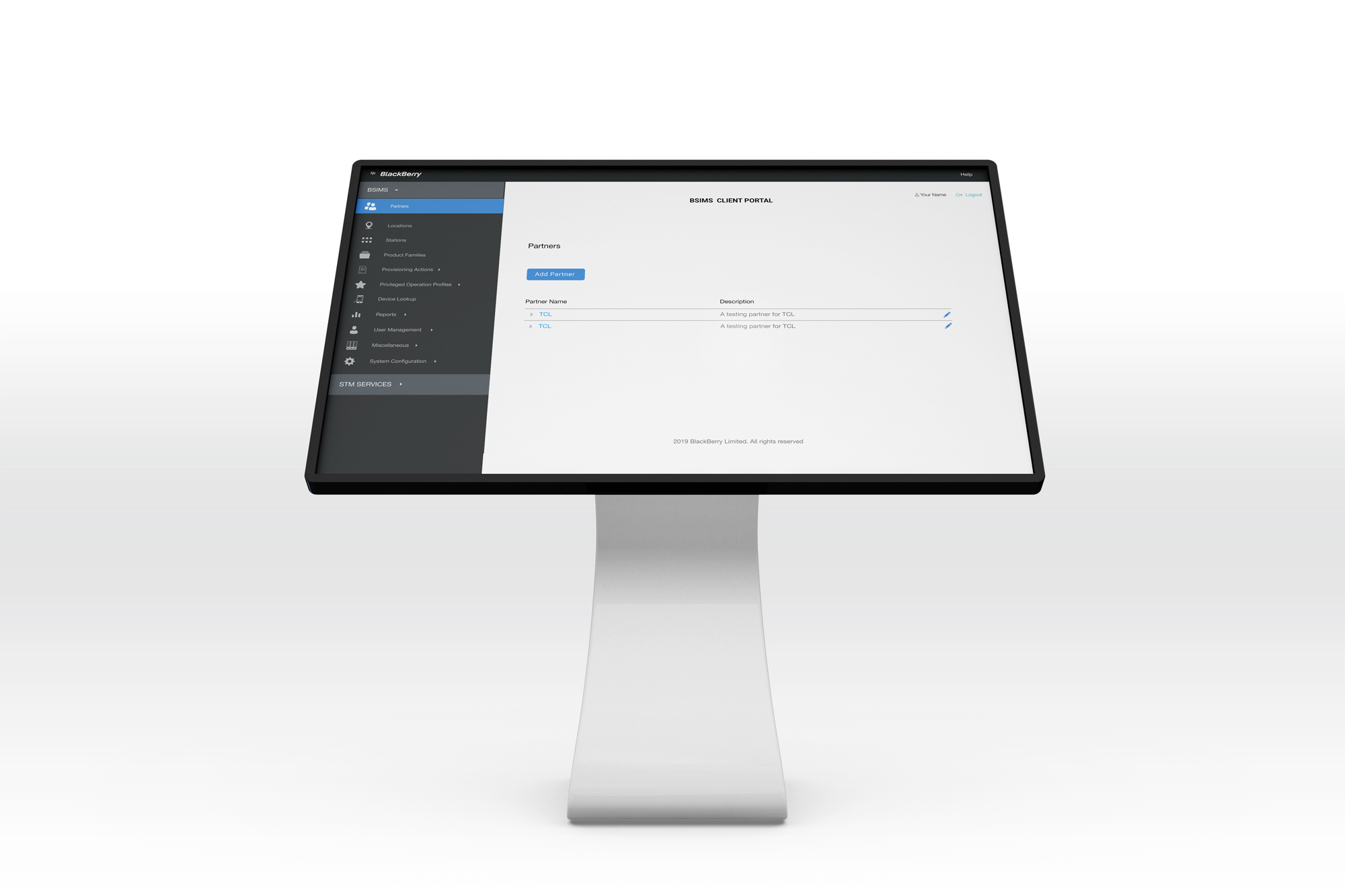
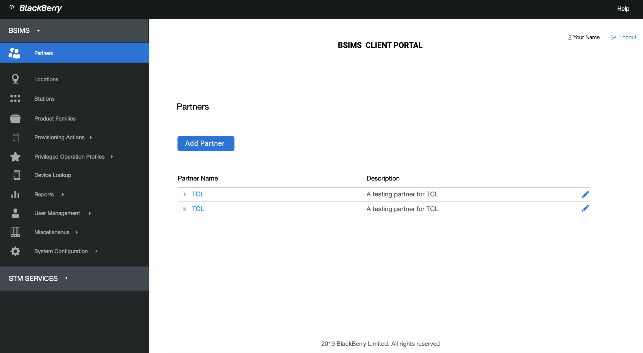
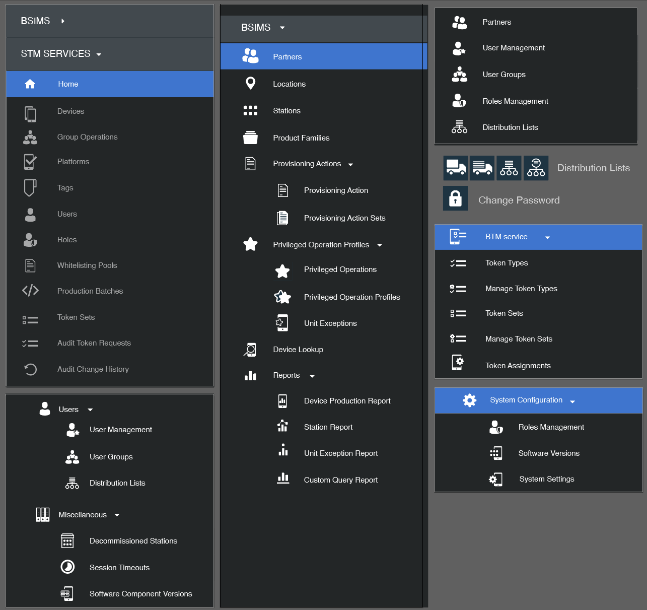
  • Implementing a minimalist design, balancing the use of colors with personalized iconiconography for each menu item so it is easily identifiable. Establishing a clear visual hierarchy to guide users naturally towards the most important elements and actions, while ensuring that all necessary information and functions are accessible.
  • Effective Navigation - ensuring the left-hand navigation panel allows users to see the full content and actions and organizing the menu items in a way that is intuitive and user-friendly.
  • Integrating BlackBerry’s brand values and color palette to resonate with the brand’s identity and ethos.


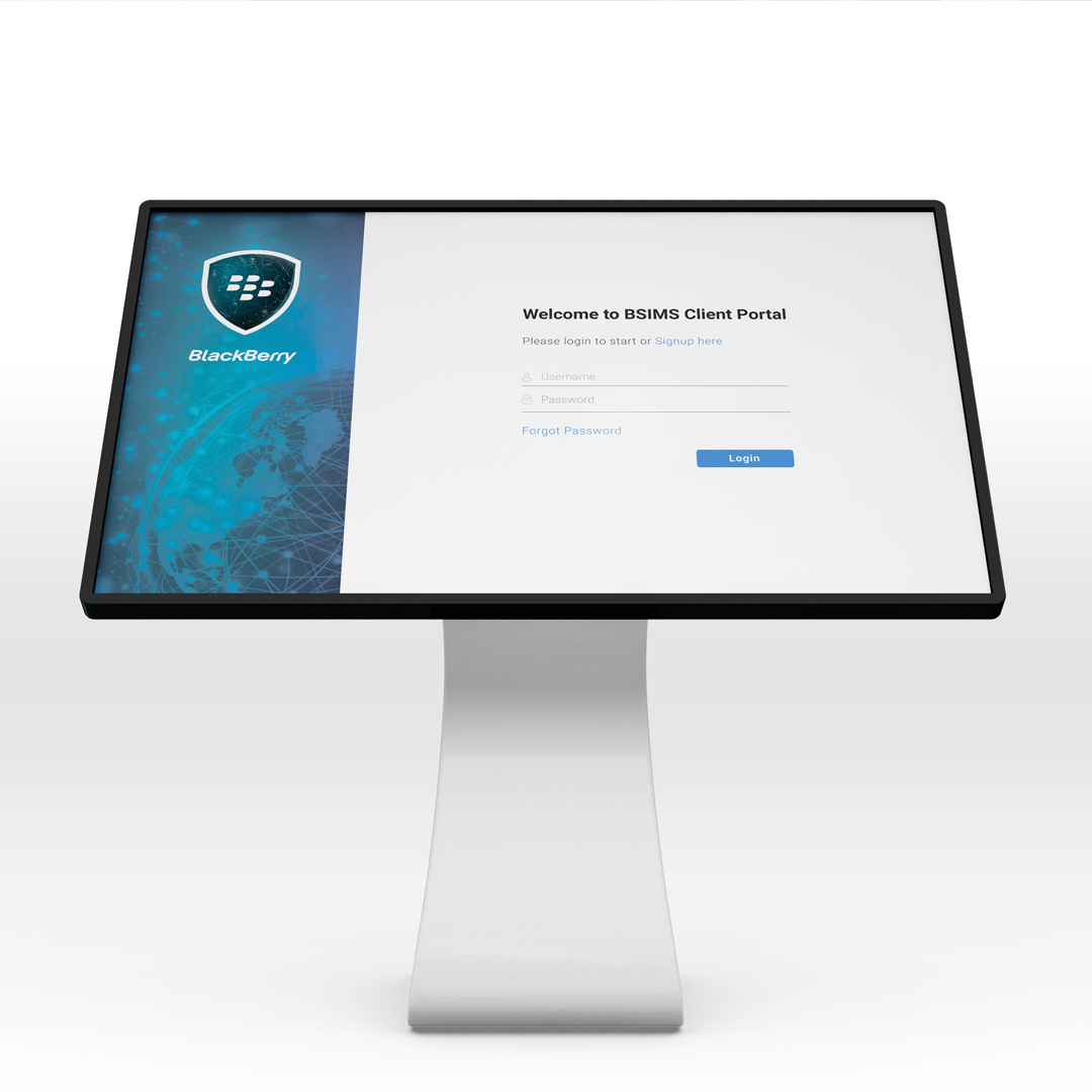
Login


Icons

mockup

mockup

mockup


Icons


View more


Other Pages

Styled Link About Me Styled Link Portfolio Styled Link Testimonials