3D/2D Interior Designer & Illustrator
Marks Media Studio
Interior Architecture & Exhibition Design
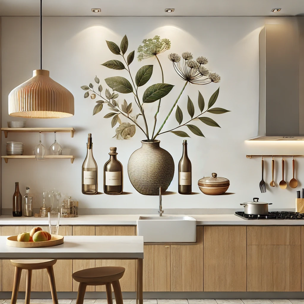
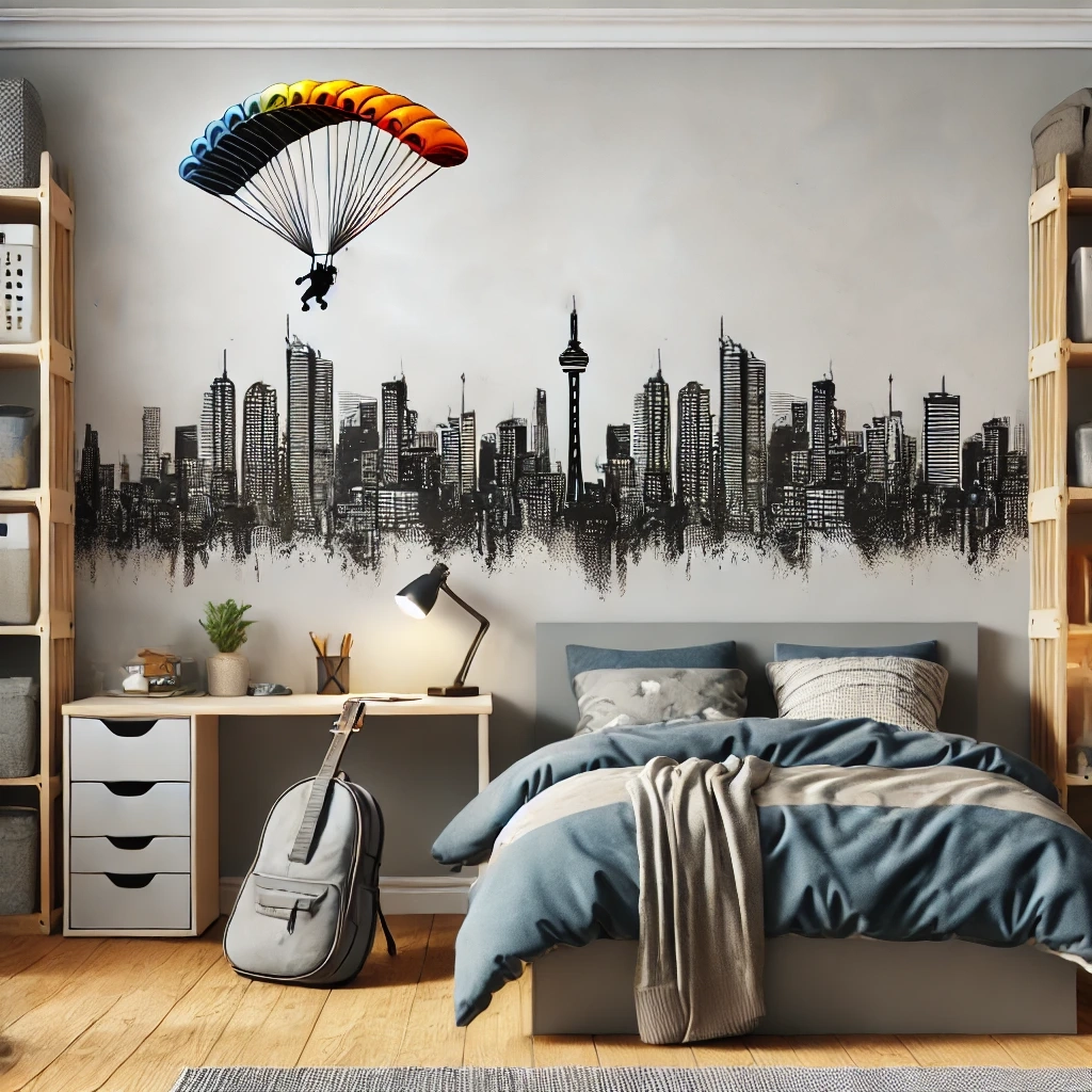
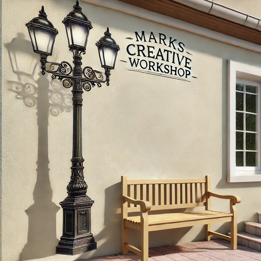
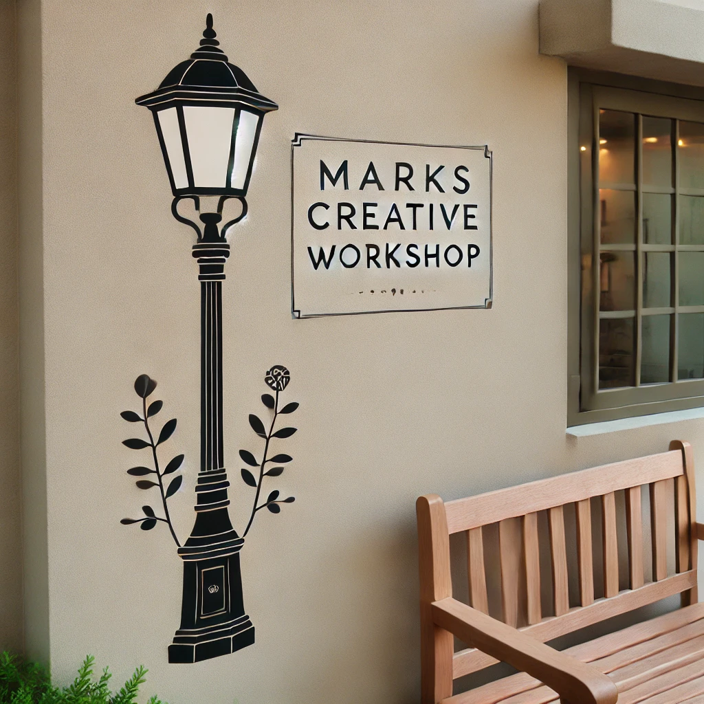

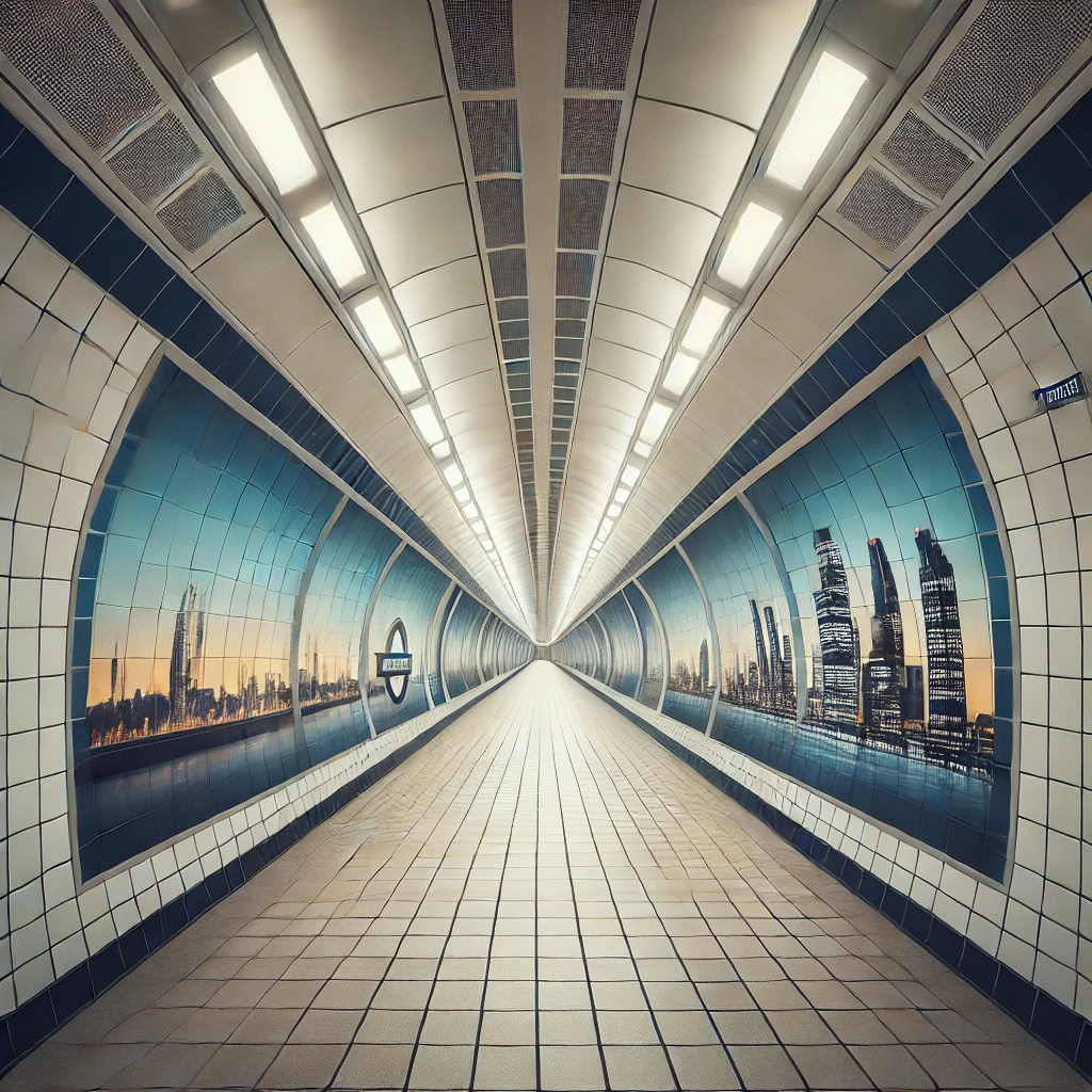
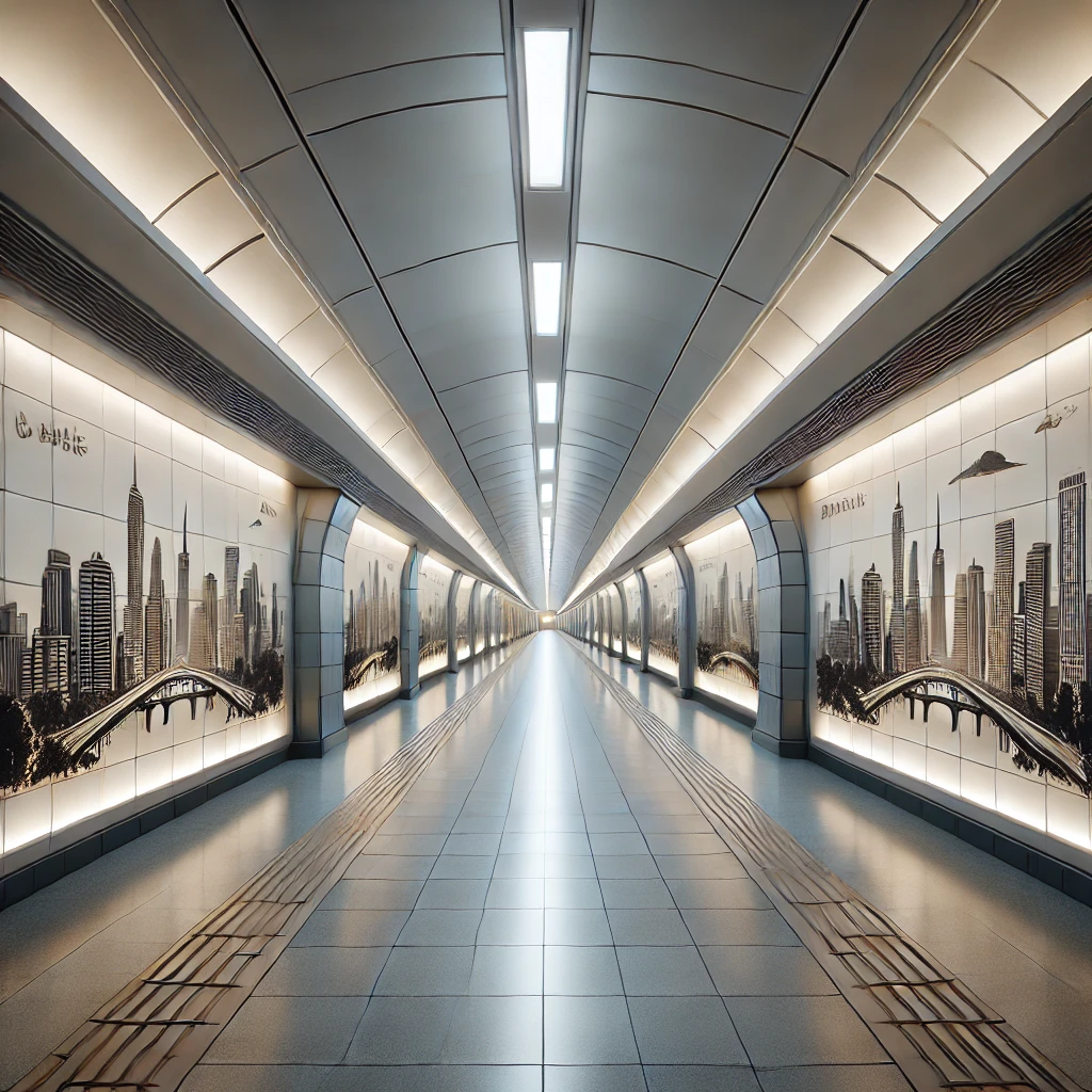
Personalization While working on each order with clients, I designed and Illustrated each decal from scratch with each owner’s personal taste, personality and theme. I needed to consider diverse cultural preferences, aesthetic appeal, visual balance, and technical constraints.
Simplicity and Elegance The decals use minimalist shapes and a limited color palette. I focused on creating a clean and uncluttered visual effect that complements a wide range of styles, from modern to traditional. Space enhancement, visual balance & harmonious arrangement of the elements.
Space Limitations and Layout Constraints The design needs to fit various sizes and layouts, from compact urban spaces to open-plan spaces. Avoiding overwhelming smaller areas while still making a significant impact in larger spaces.
Avoiding Visual Clutter The decal needs to enhance its appearance without adding visual noise. This requires a careful balance between a design that is detailed enough to be interesting but simple enough to avoid cluttering the space.
Color Coordination The decal’s colors need to harmonize with existing ones to ensure a cohesive look. Misjudging the color palette could result in a decal that feels out of place or overly dominant.
Personalization —With corporate orders, the design must also appeal to a wide audience. Consider localization, different cultures, and varying associations with particular objects and colors. The design needs to be sensitive to personalization but, in some cases, also appeal to a wide audience.