
Workflow clarity
Research, journeys, information architecture, and task flows for complex operational work.
BlackBerry Enterprise UX
Workflow Clarity · Cross-Platform Systems · Secure Enterprise Products · Accessibility
My Role
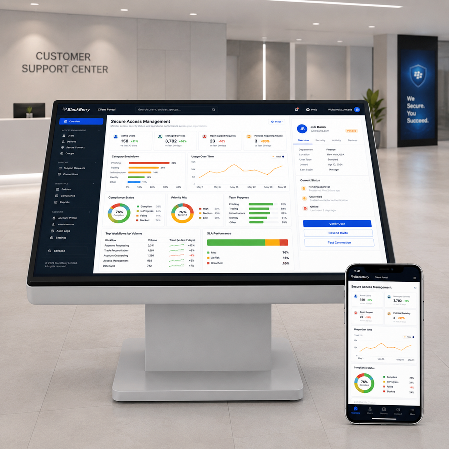
My focus was helping enterprise users understand what requires attention, what state the system is in, and what action to take next.
Research, journeys, information architecture, and task flows for complex operational work.
Security, status, permissions, recovery, and data-heavy product experiences.
Desktop, web, and mobile patterns that behave consistently across products.
Reusable components, contrast, light and dark themes, and state clarity beyond color alone.
Product Domain Ecosystem
BlackBerry's ecosystem serves high-stakes enterprise and government users across security, productivity, emergency communication, and device management.
My focus was helping enterprise users understand what requires attention and what action to take next, while also unifying multiple brands into one BlackBerry ecosystem.
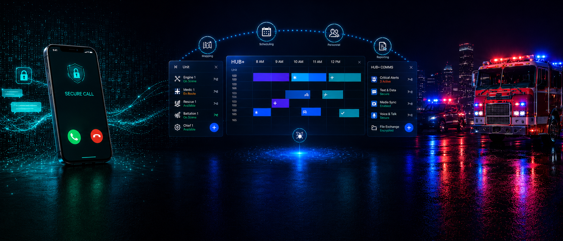
Trusted communication, identity, permissions, and sensitive system states.
Scheduling, reporting, device status, alerts, and high-density workflow decisions.
Fast decisions under pressure, where unclear status or extra steps create risk.
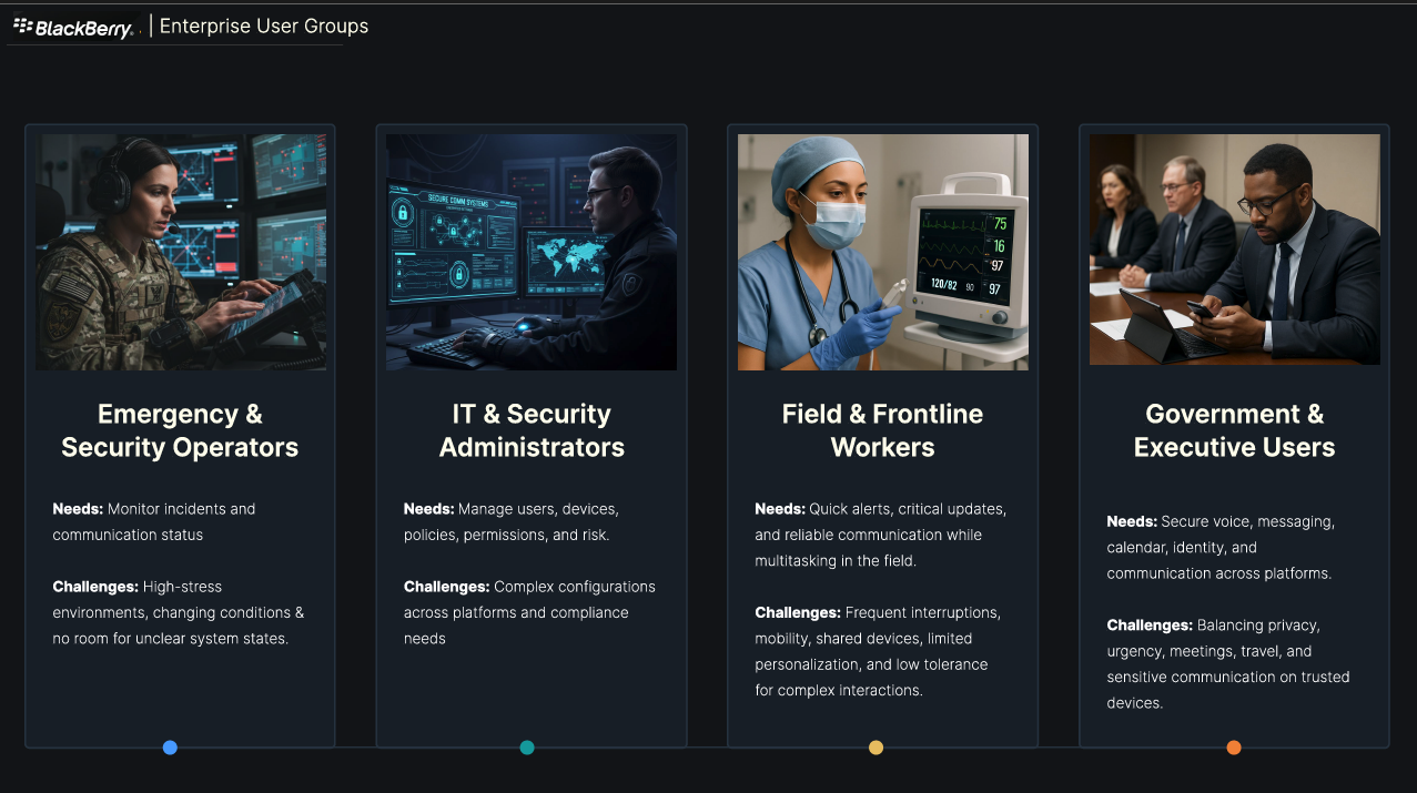
Enterprise User Groups
A big part of the users are government and emergency services, who need constant access to secure communication while balancing privacy, urgency, meetings, travel, and sensitive communication on trusted devices.
The shared challenge was that these users often operated under pressure, with limited tolerance for unclear system states, security ambiguity, or unnecessary steps. The design work had to reduce cognitive load and feel clear, trusted, reliable, and easy to continue across platforms.
Once I understood the ecosystem and the user groups, the next step was identifying where the experience was breaking down across platforms and workflows.
UX Audit
I tested products and reviewed interaction behavior, labels, system states, and flows.
The audit showed that priority was hard to scan, status and alerts were mixed together, lists were too long, and labels did not always explain what needed attention. The data was there, but it was confusing and too hard to understand what mattered first and what action was expected.
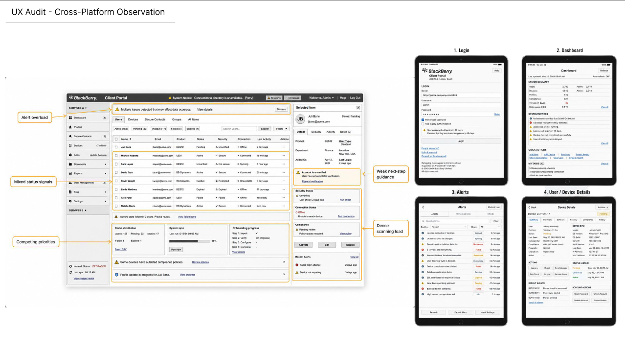
Enterprise UX Problem
Users needed to make fast, high-confidence decisions across secure communication tools, but the ecosystem repeated the same kinds of problems in different places.
Too much information appeared with weak prioritization, making it hard to see what mattered first.
Active, pending, failed, offline, restricted, verified, and unverified states were not always clear.
Products and devices communicated status, actions, and recovery differently.
Users could see data, but not always what state the system was in or what action to take next.
Cross-platform UX Audit Findings
Looking from an enterprise UX problem, users needed to make fast, high-confidence decisions across secure communication tools, but the ecosystem showed recurring issues across platforms.
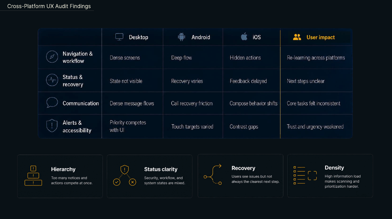
Make complex security and communication states understandable at a glance so users could quickly understand communication states such as secure, active, failed, pending, restricted, or offline, and know what action to take next.
Users were moving across complex products, platforms, and system states without enough clarity. Across platforms, the audit showed four recurring problems: hierarchy, status clarity, recovery, and density. The workflow was too dense, inconsistent, and unclear when users needed to understand priority, status, and recovery.
Research Insights
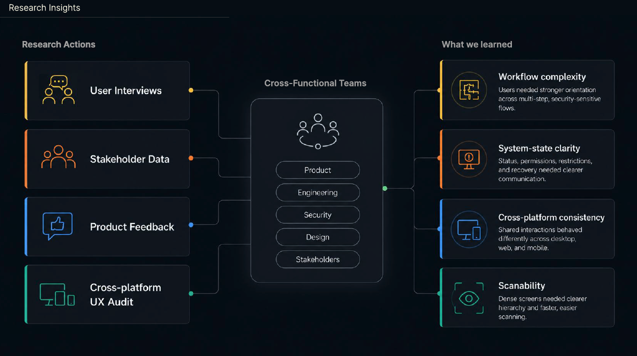
I was involved in several layers of research and discovery. The design direction came from multiple inputs: company user interviews, stakeholder input, product feedback, and cross-platform UX audit work.
We worked together to translate those findings into four needs: workflow complexity, clearer system-state communication, cross-platform consistency, and better scanability.
Design Principles
The principles were written as implementation guidance: reduce cognitive load, make system state visible, show security status clearly, guide users through problems, keep patterns consistent, and support accessibility across themes.
Prioritize what requires attention first and reduce visual noise.
Make active, pending, failed, offline, and restricted states easy to understand.
Use trusted signals for identity, communication, and security feedback.
Write clear errors and next steps for empty, loading, offline, and failure states.
Reuse components and align interaction behavior across mobile and desktop.
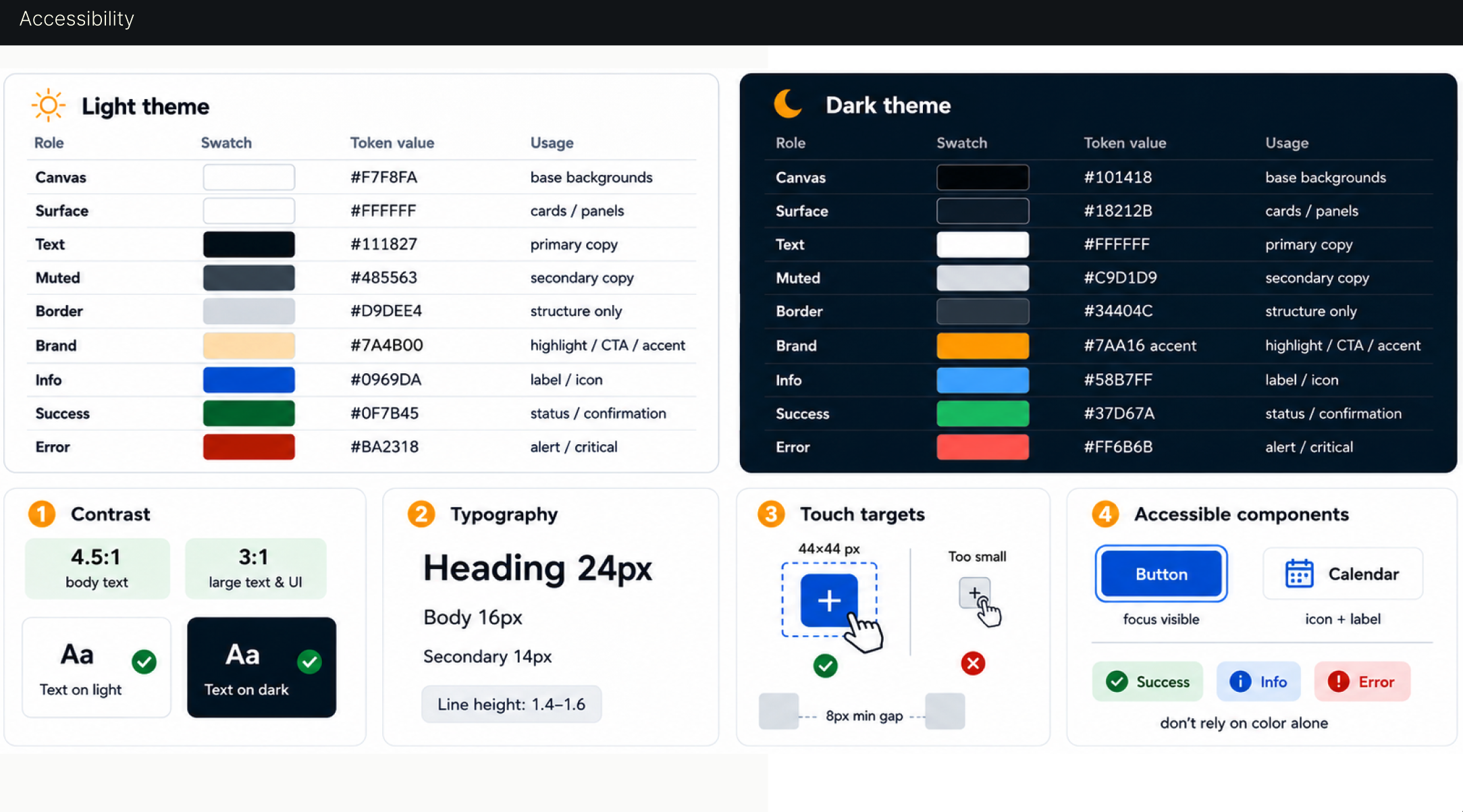
Support contrast, readability, scalable text, touch targets, and dark/light themes.
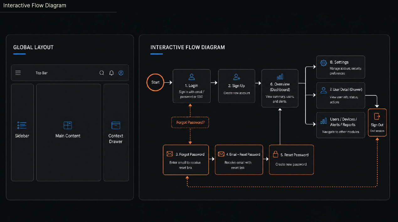
Interactive Flow Diagram
This flow helped define the structure of the product experience so users move through a clearer path from login and setup to dashboard, settings, user details, and recovery.
Before and After
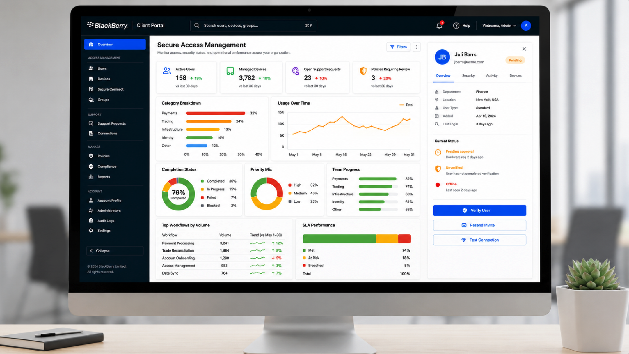
Instead of dense data lists, I grouped related data and used infographics for easier scanning. The goal was not to replace detail; it was to create a better path from overview to detail. Top metrics give immediate context so users can see what matters first, then drill into the table or details when needed.
Empty States
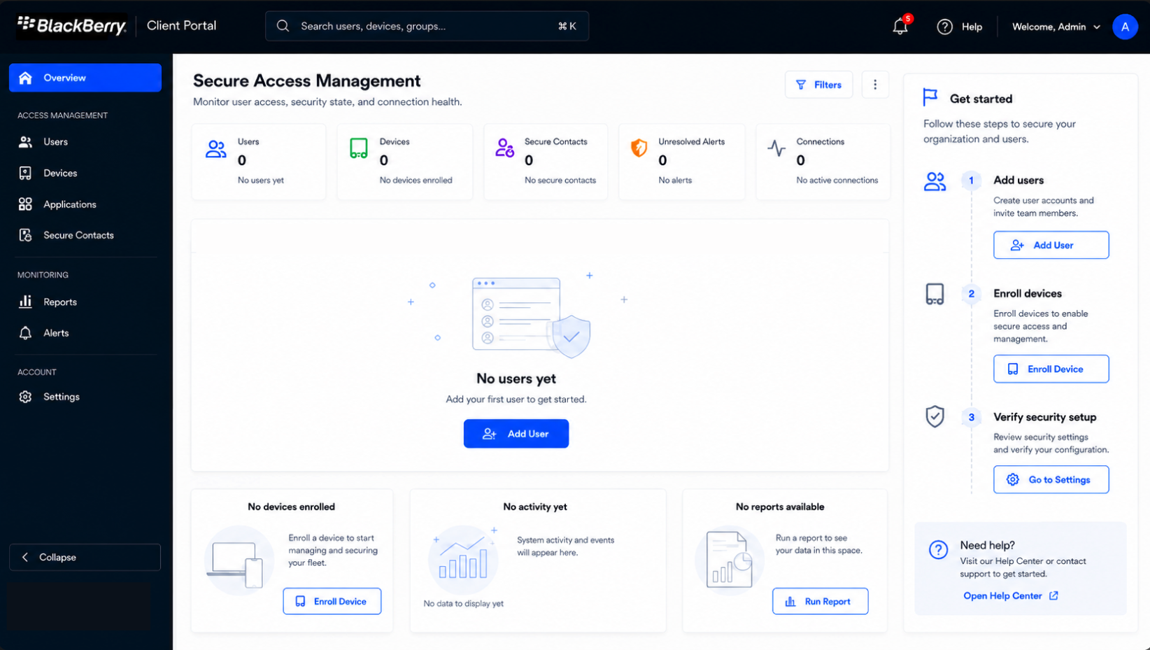
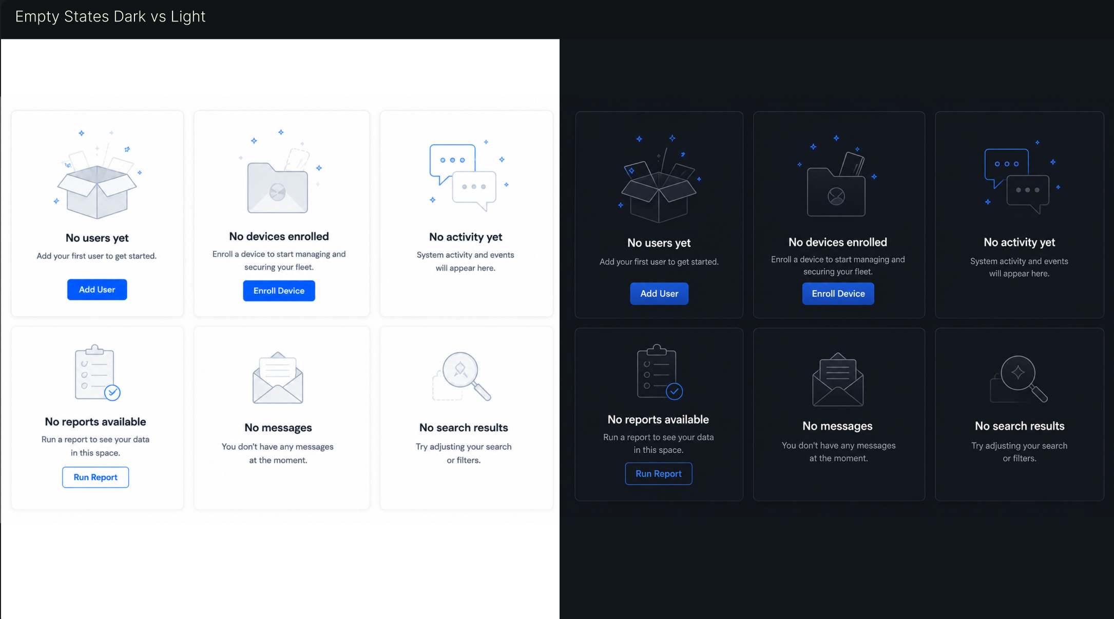
Empty states became part of the guidance system. The interface needed to explain what happened, what to expect, and what action was available without relying only on color or dense instructions.
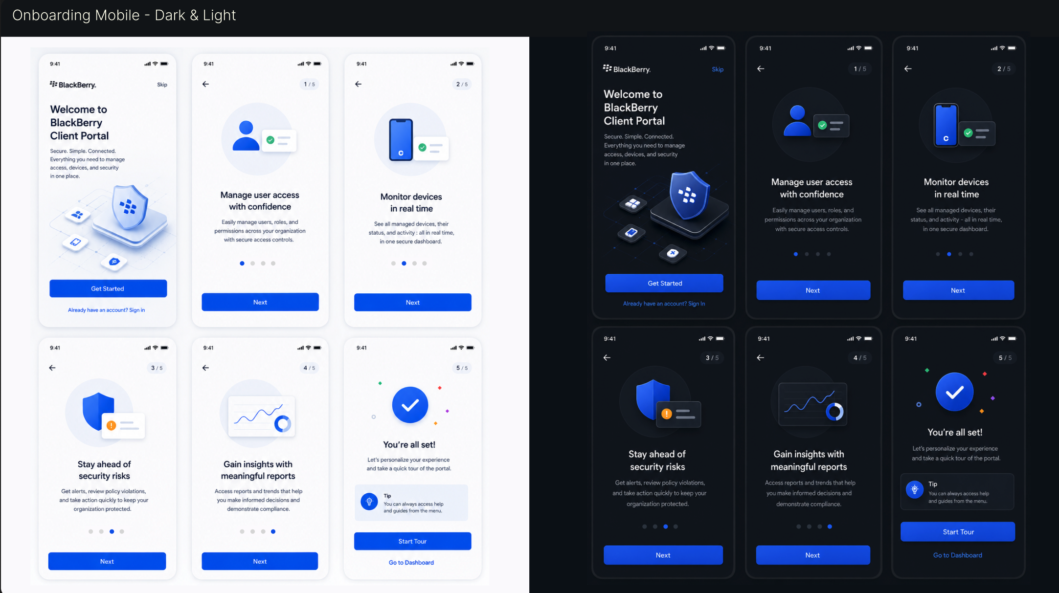
The onboarding flow introduced the portal with a calmer sequence, making the product feel secure, simple, and connected before users reached the dashboard.
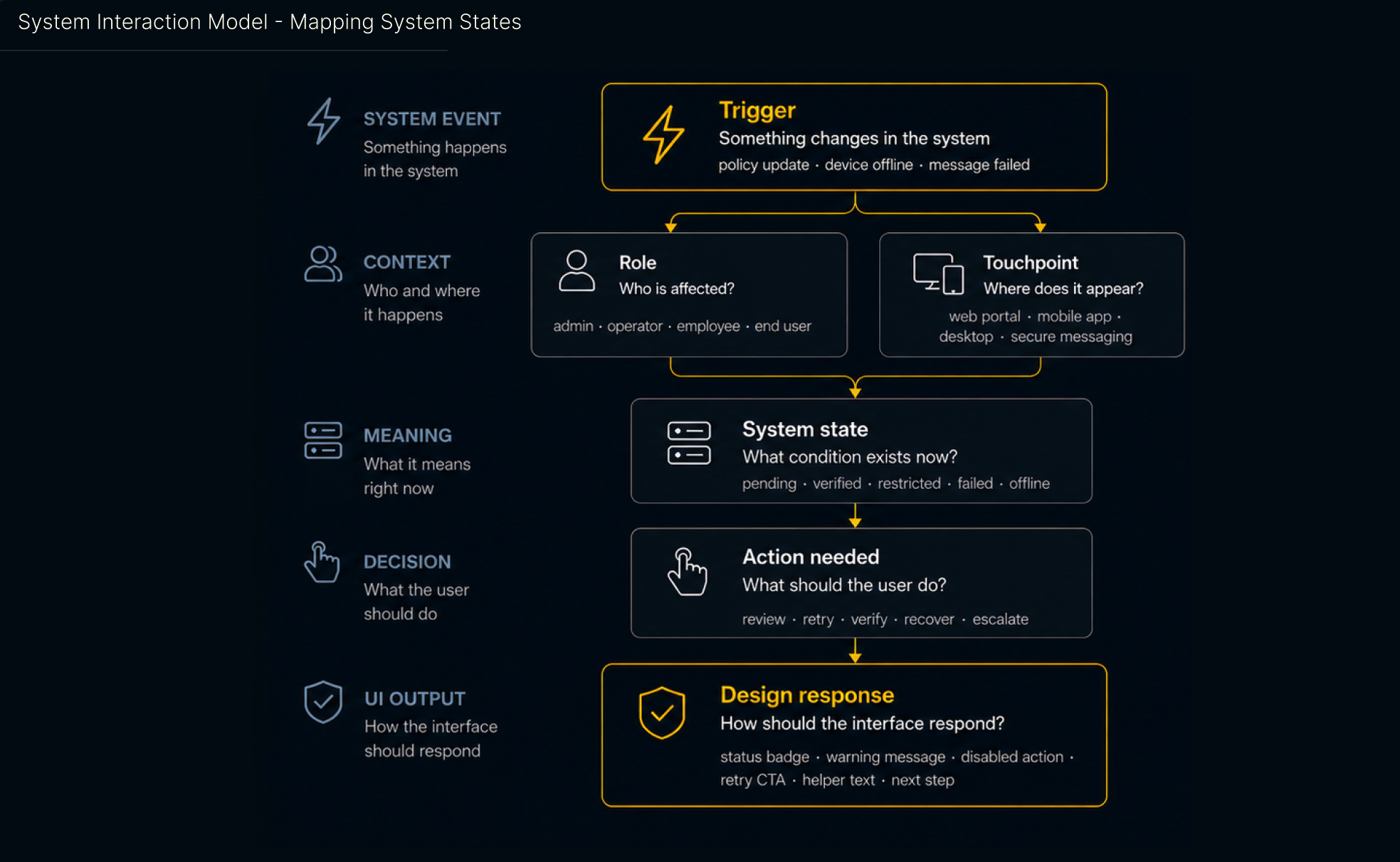
System Interaction Model
This model helped clarify how the product should respond when something changes in the system: who is affected, where it appears, what condition exists now, what action is needed, and how the interface should communicate the response.
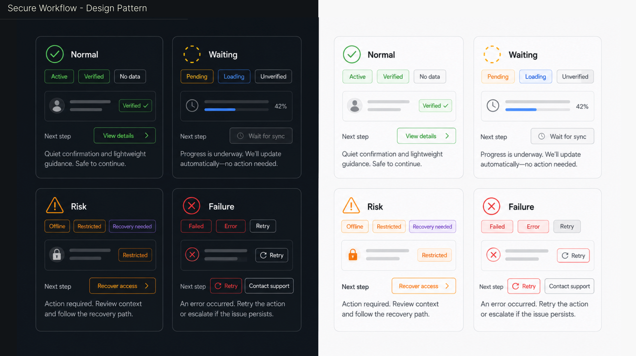
Secure Workflow Pattern
The state pattern helped users understand when they could continue, when the system was still working, when action was required, and when they needed to retry or escalate.
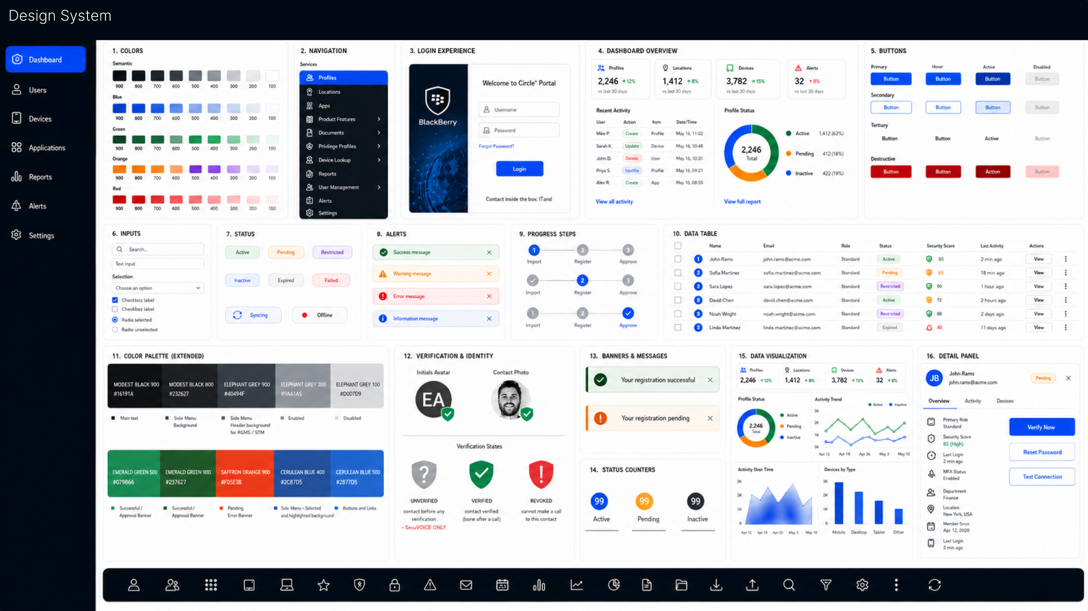
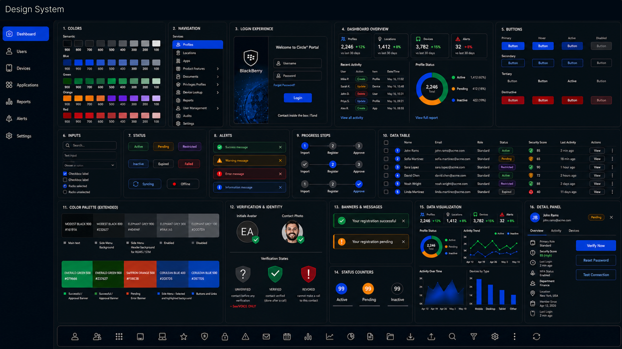
Design System
The design system translated research and audit findings into reusable components, state patterns, color roles, typography, touch targets, and dashboard structures that could scale across products.
Impact and Outcomes
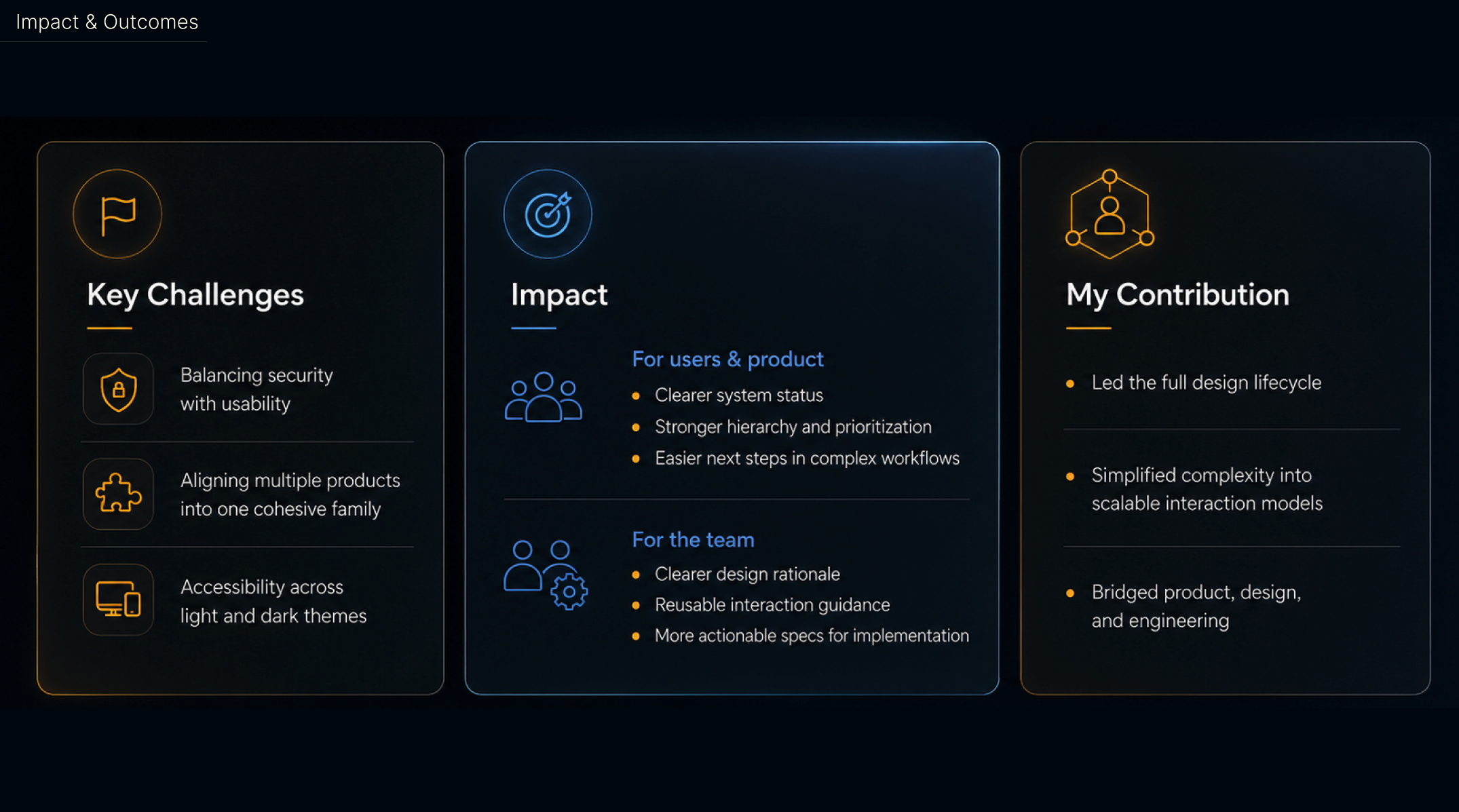
The work simplified complexity into reusable interaction models, clarified system status, strengthened hierarchy and prioritization, and created more actionable specifications for implementation.
Security and communication states became easier to scan, compare, and act on under pressure.
Teams gained shared patterns for status, recovery, accessibility, and cross-platform behavior.
Design rationale translated into more actionable specs for product and engineering teams.
OTHER PROJECTS
 Interaction Design
WBD HUD
A dense game HUD system focused on navigation clarity, tile maps, accessibility, and reusable patterns.
Interaction Design
WBD HUD
A dense game HUD system focused on navigation clarity, tile maps, accessibility, and reusable patterns.
 Interaction Design
Smart TV UX
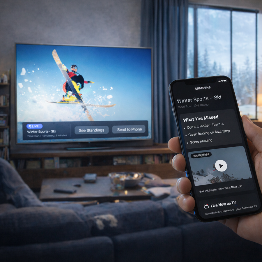
Visual-first interaction concepts for cross-device TV experiences and re-engagement flows.
Interaction Design
Smart TV UX
Visual-first interaction concepts for cross-device TV experiences and re-engagement flows.
 Accessibility
Dark Theme
BlackBerry dark and light theme guidelines shaped around contrast, readability, and inclusive UX.
Accessibility
Dark Theme
BlackBerry dark and light theme guidelines shaped around contrast, readability, and inclusive UX.
 Branding
BlackBerry Brand
Packaging and brand marketing guidelines across product, print, and visual identity touchpoints.
Branding
BlackBerry Brand
Packaging and brand marketing guidelines across product, print, and visual identity touchpoints.
 Illustration
Empty Data
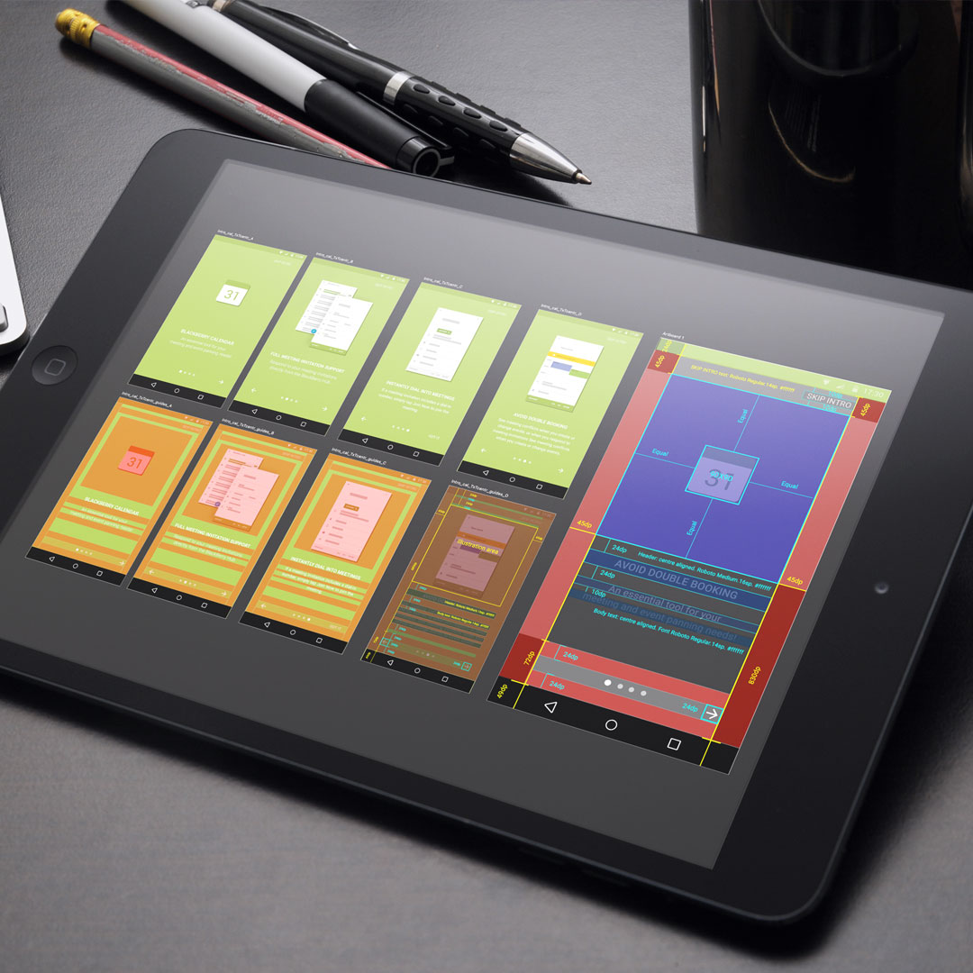
Onboarding and empty-state illustrations that guide users through first-use product moments.
Illustration
Empty Data
Onboarding and empty-state illustrations that guide users through first-use product moments.
 Branding
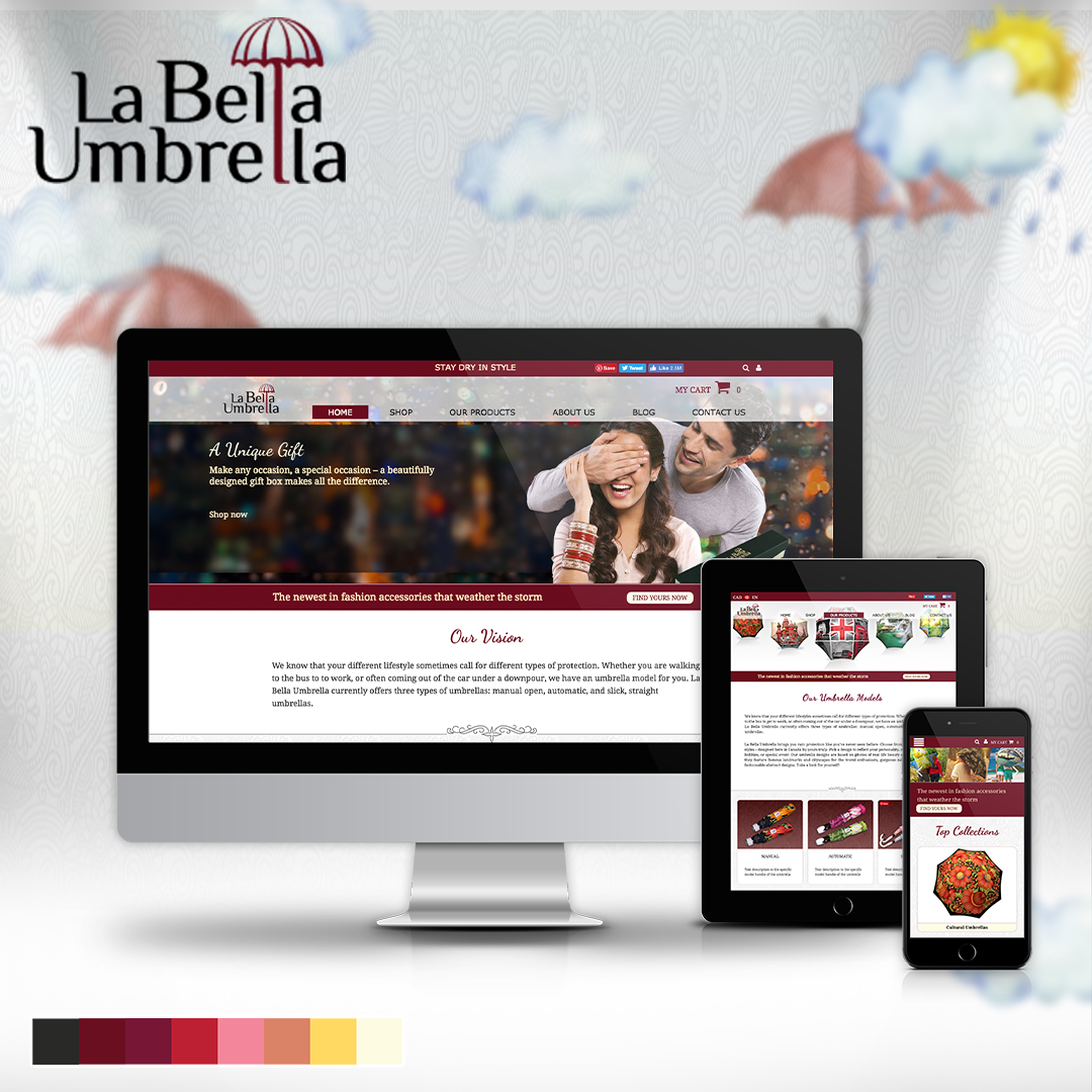
Labella Umbrella
A responsive online store direction combining brand storytelling, layouts, and product imagery.
Branding
Labella Umbrella
A responsive online store direction combining brand storytelling, layouts, and product imagery.
 UX Research
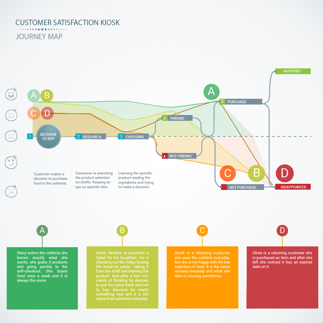
Customer Kiosk
A service kiosk and app concept for measuring customer satisfaction and operational feedback.
UX Research
Customer Kiosk
A service kiosk and app concept for measuring customer satisfaction and operational feedback.
 Interaction Design
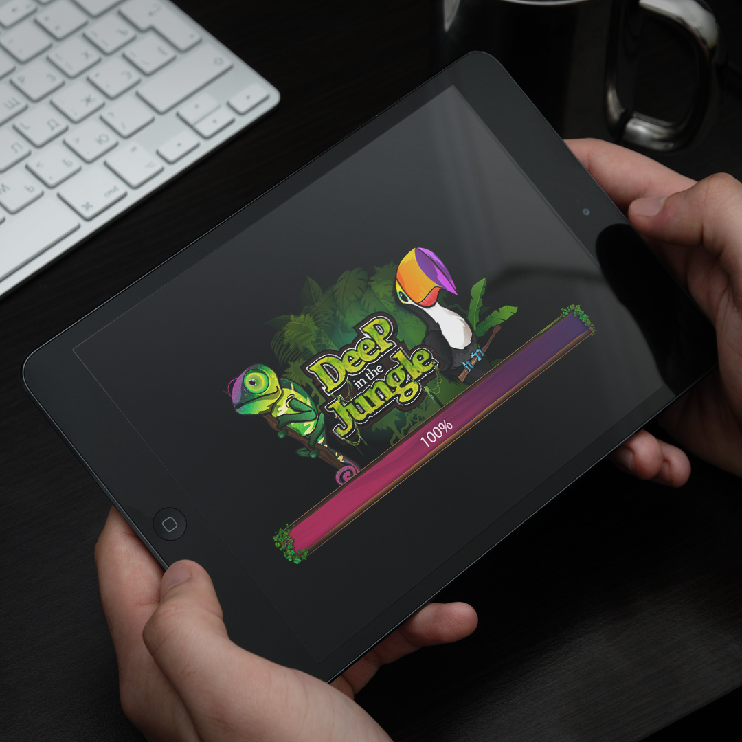
Wizits Game
A mobile game interface with character art, themed screens, animation, and playful UX systems.
Interaction Design
Wizits Game
A mobile game interface with character art, themed screens, animation, and playful UX systems.
 Interaction Design
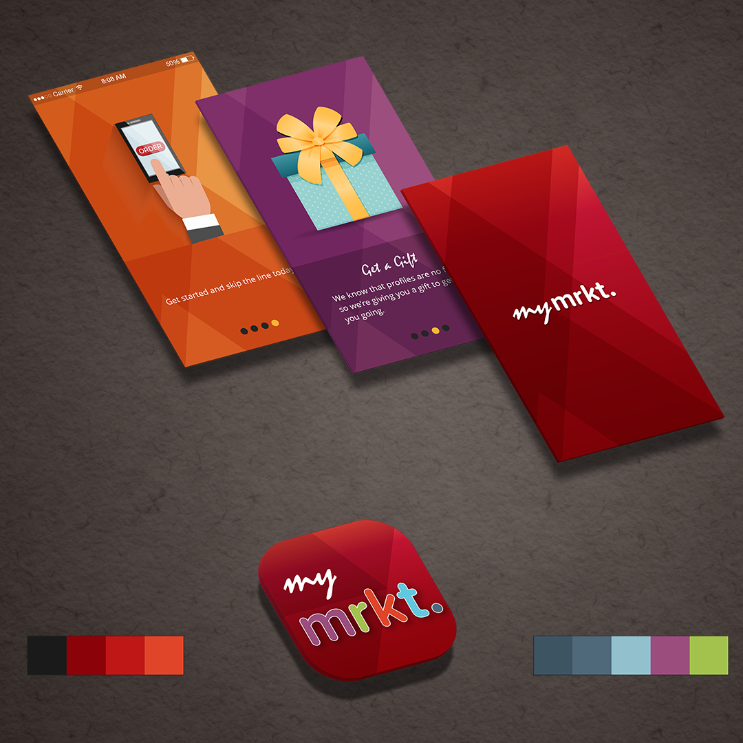
TJX Market
A multi-brand retail app concept exploring navigation, product discovery, and mobile shopping.
Interaction Design
TJX Market
A multi-brand retail app concept exploring navigation, product discovery, and mobile shopping.
 Branding
SharpLight
Beauty spa campaign materials spanning print design, promotional layouts, and branded visuals.
Branding
SharpLight
Beauty spa campaign materials spanning print design, promotional layouts, and branded visuals.
 Branding
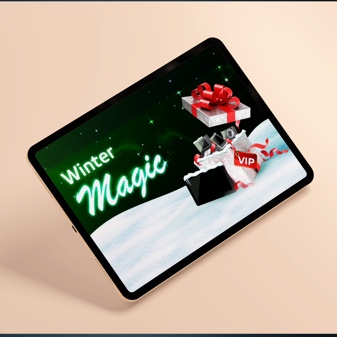
Bwin Promo
A festive gaming promotion with campaign concepts, interface graphics, and seasonal art direction.
Branding
Bwin Promo
A festive gaming promotion with campaign concepts, interface graphics, and seasonal art direction.
 Data Visualization
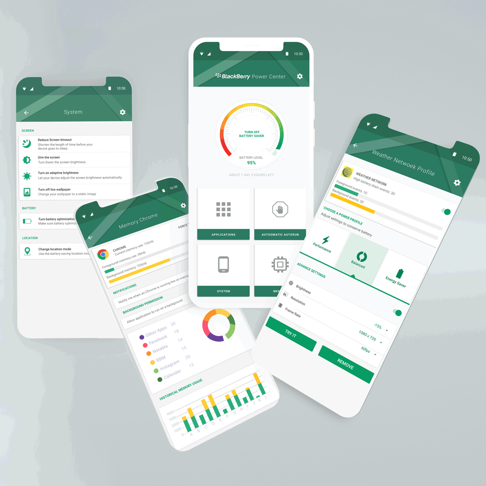
Power Center
Battery app interaction design with information architecture, visual states, and usage insights.
Data Visualization
Power Center
Battery app interaction design with information architecture, visual states, and usage insights.
 Illustration
Interior Art
Interior and architectural illustrations using 3D composition, rooms, textures, and visual mood.
Illustration
Interior Art
Interior and architectural illustrations using 3D composition, rooms, textures, and visual mood.
 Physical + Digital Experience
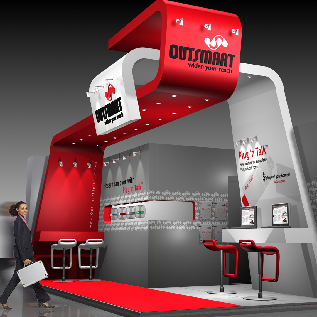
3D Exhibition
Exhibition work connecting brand identity, spatial planning, interactive kiosks, product displays, and service conversations.
Physical + Digital Experience
3D Exhibition
Exhibition work connecting brand identity, spatial planning, interactive kiosks, product displays, and service conversations.