
BlackBerry
Dark & Light Themes · Accessibility · Design System · HUB+ Products
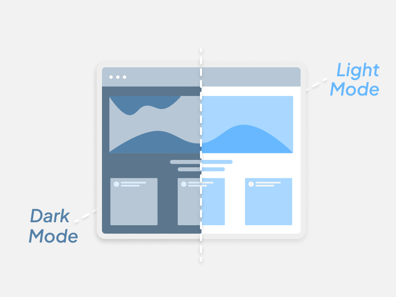
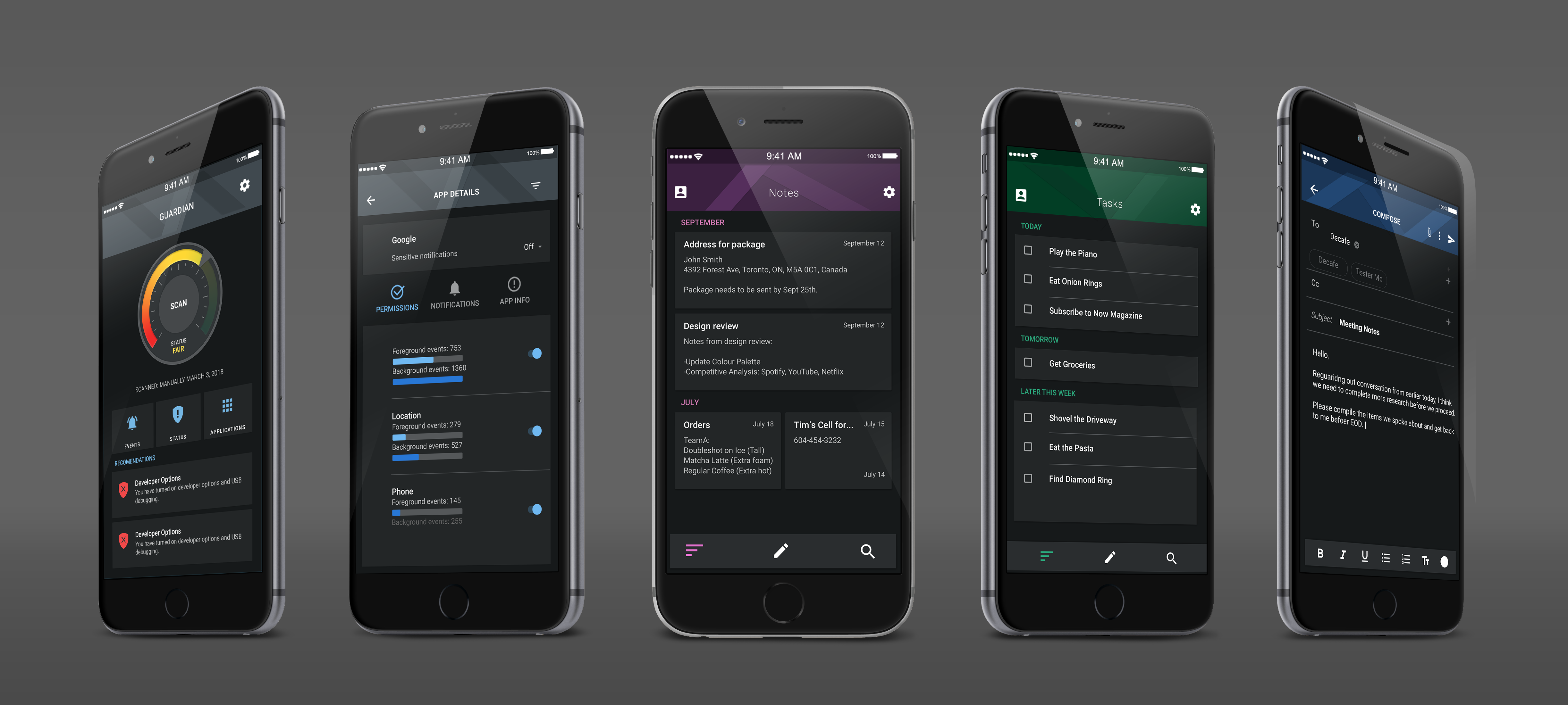
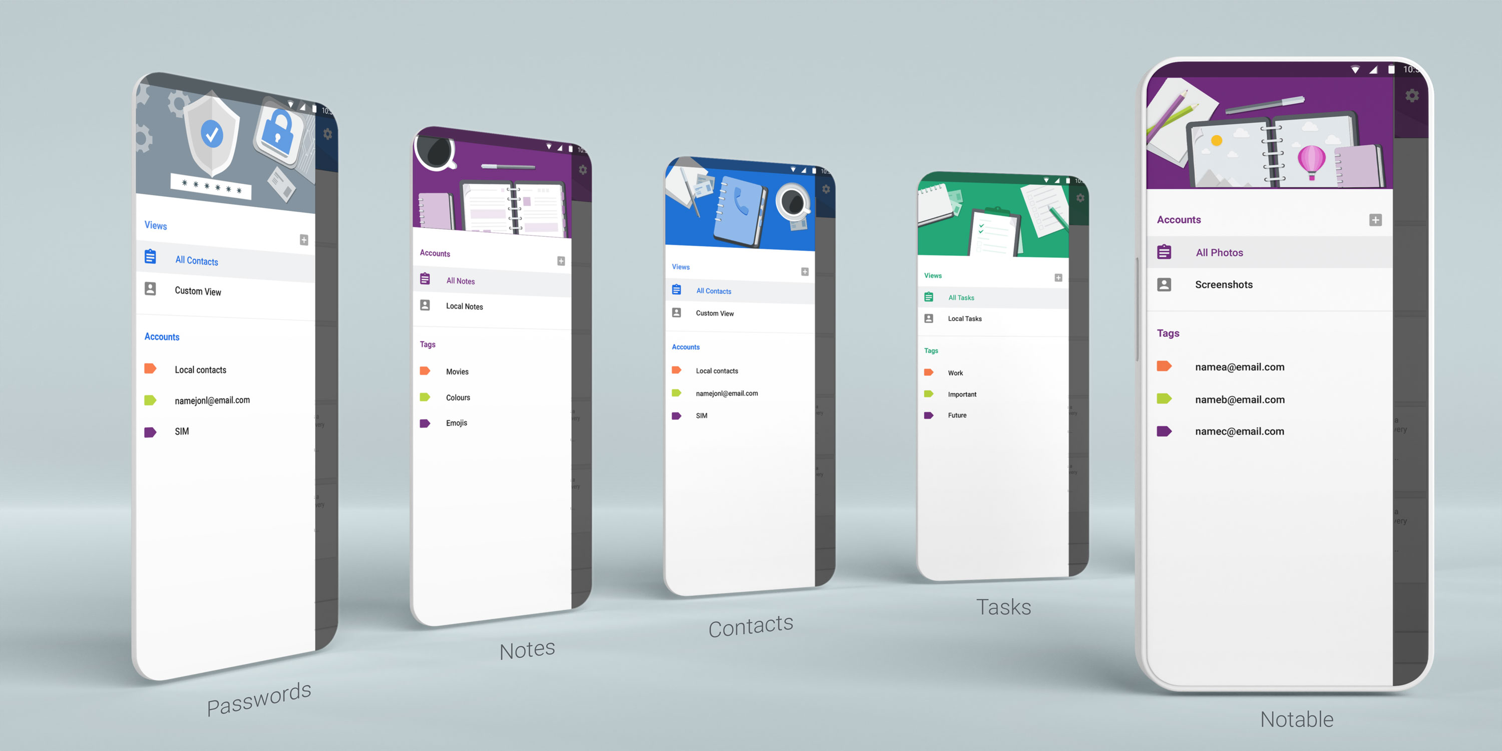

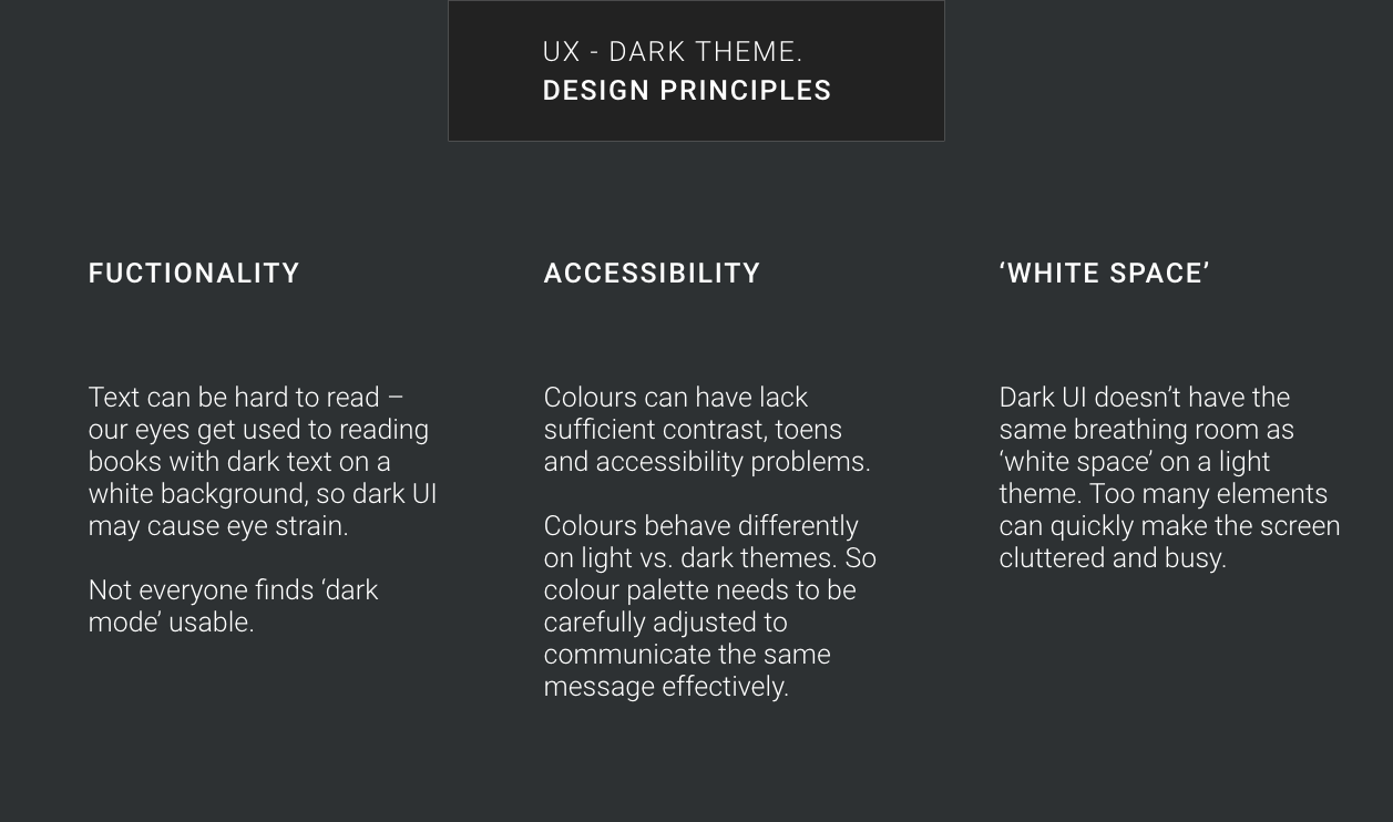
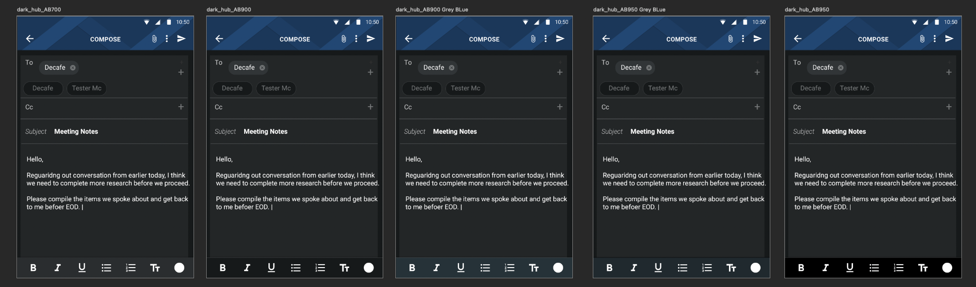
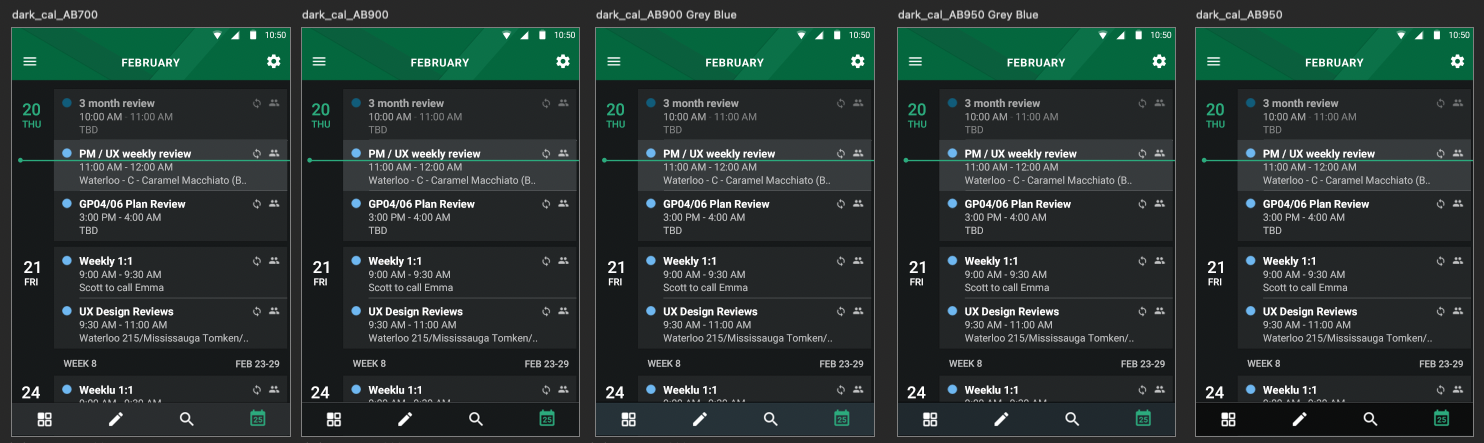
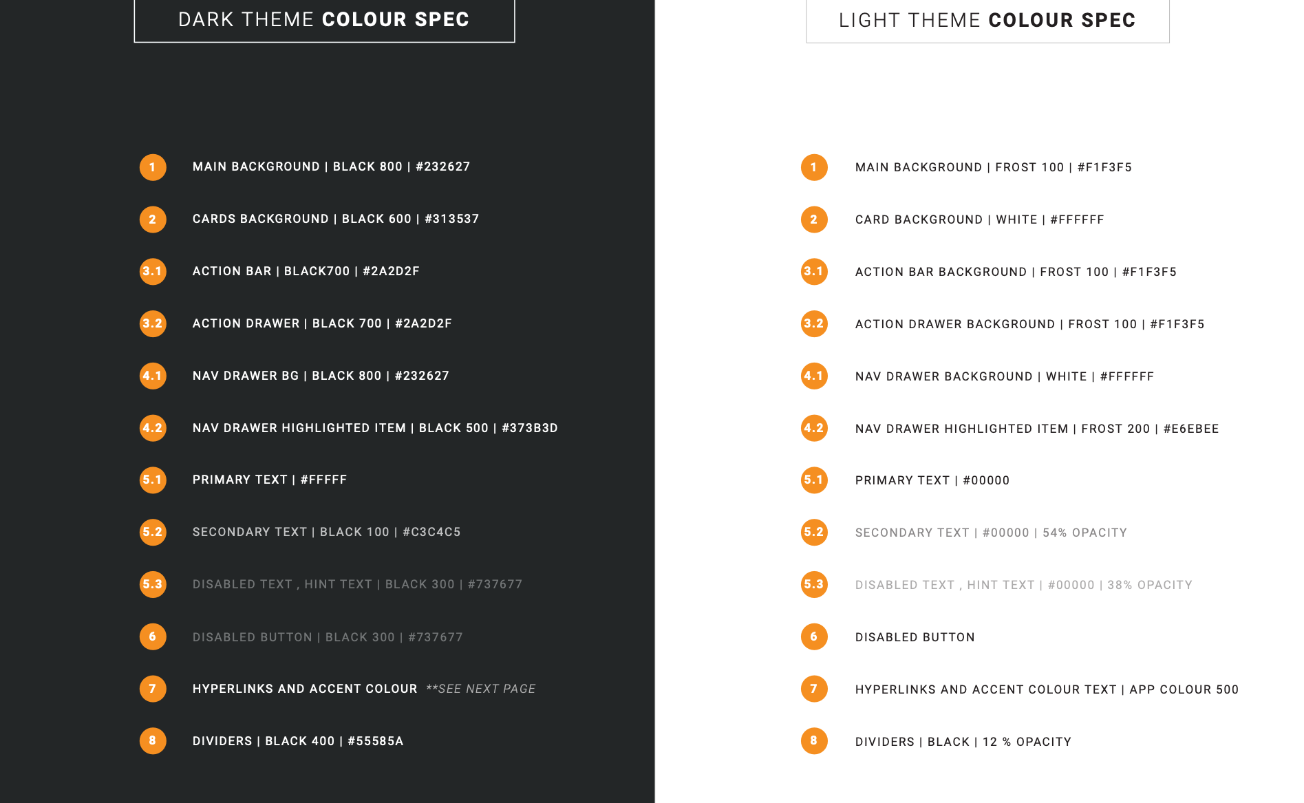
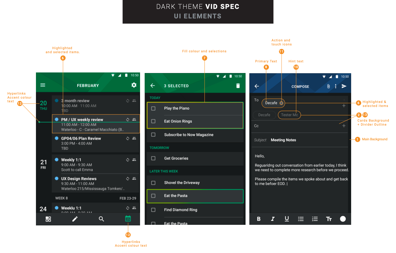
Creating an inclusive experience with careful consideration of color exploration and an understanding of various design principles that prioritize accessibility and diminish the reliance on color as the sole conveyor of critical information.

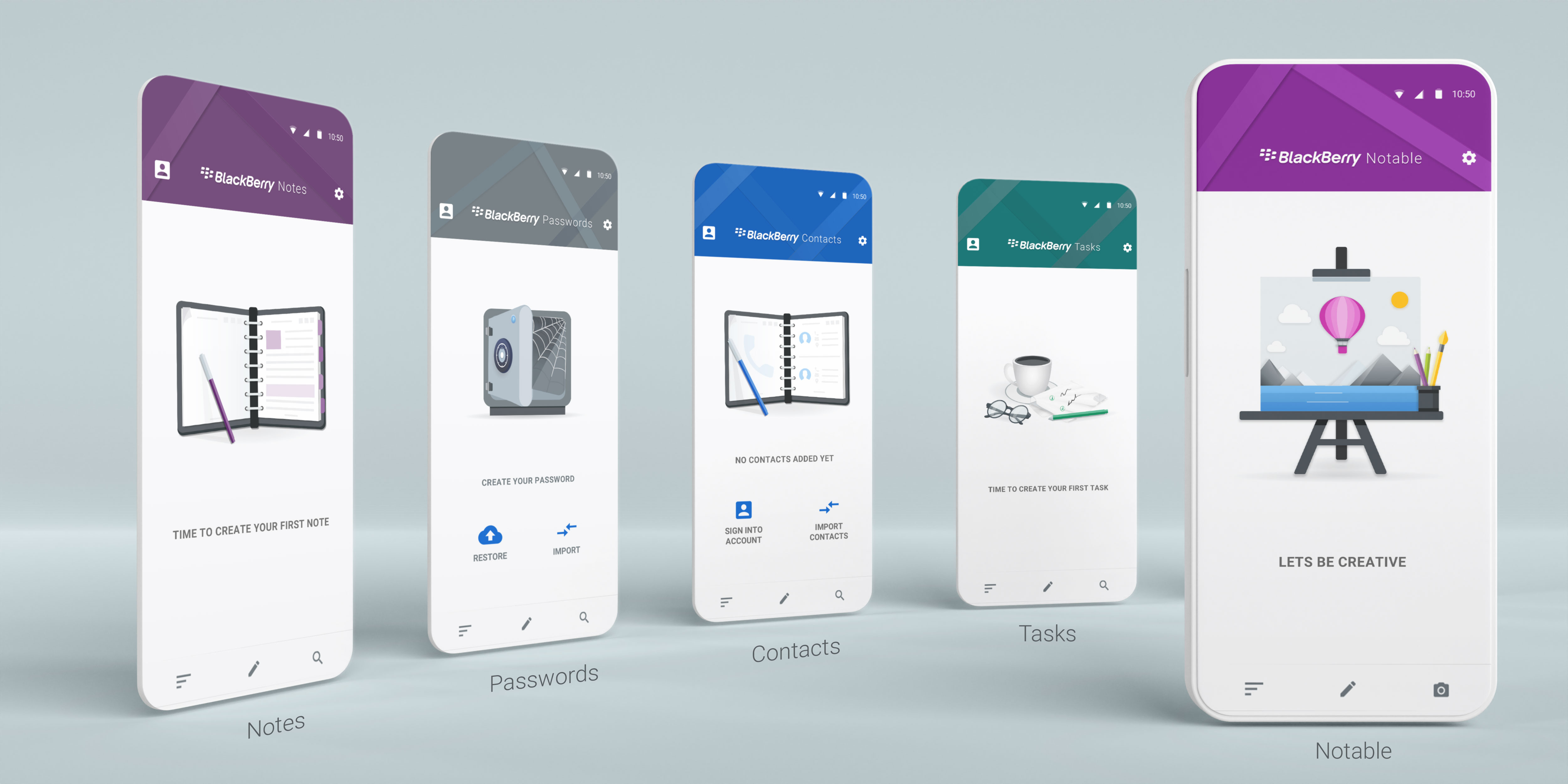
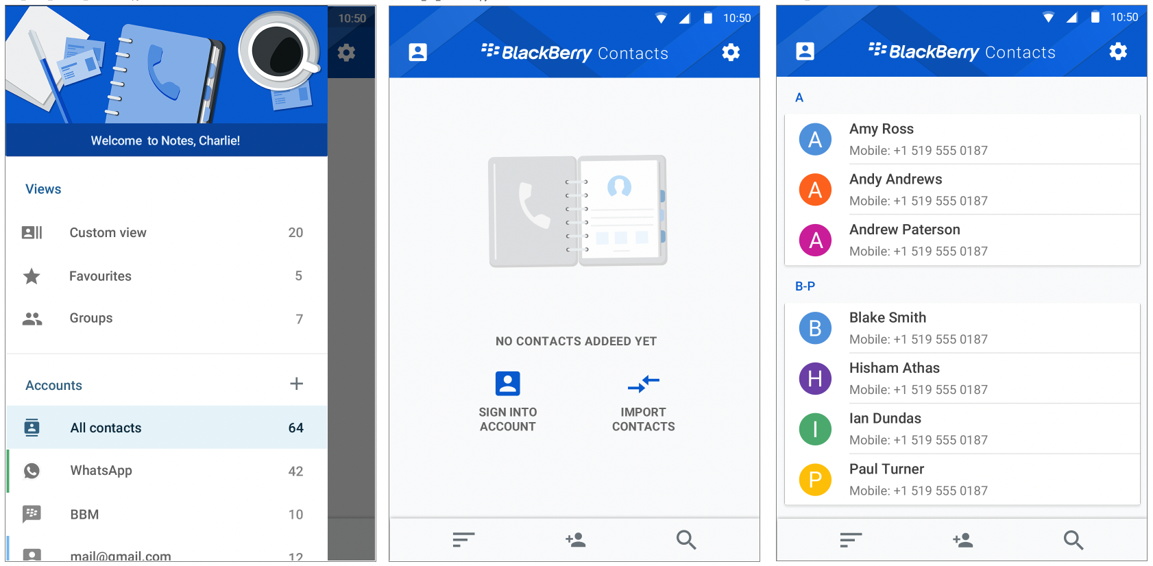
Explore here more Illusrrtations & Onboarding screens
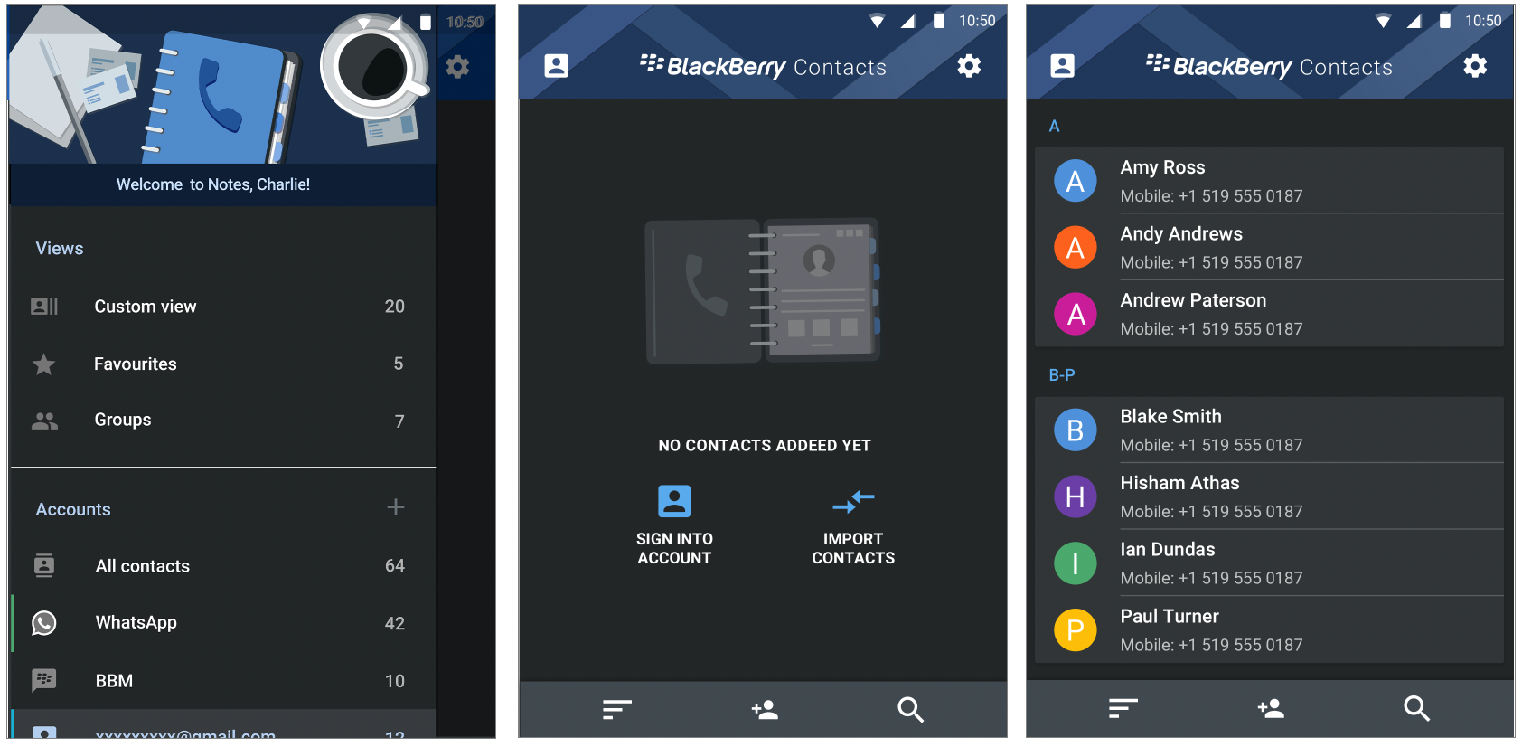
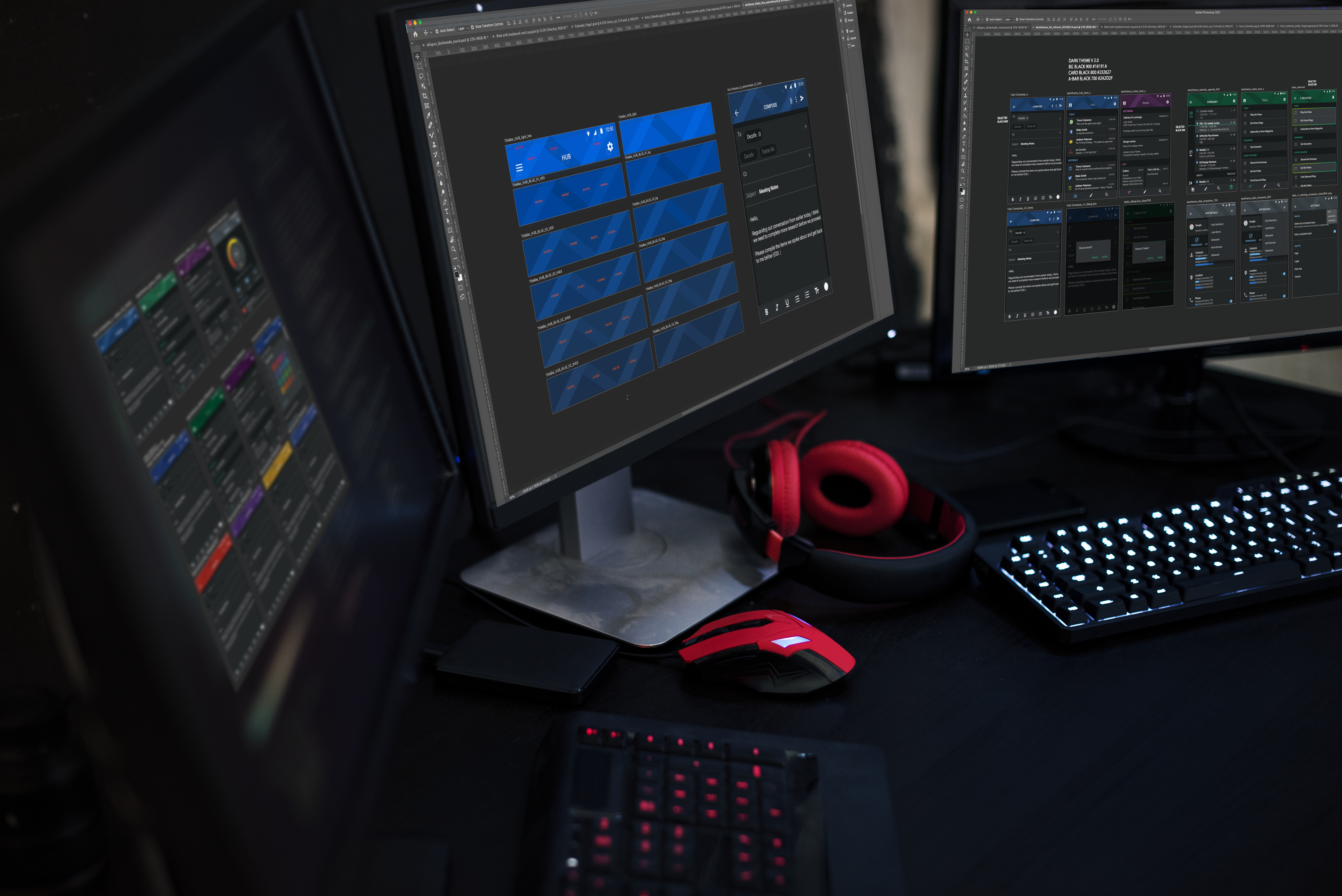
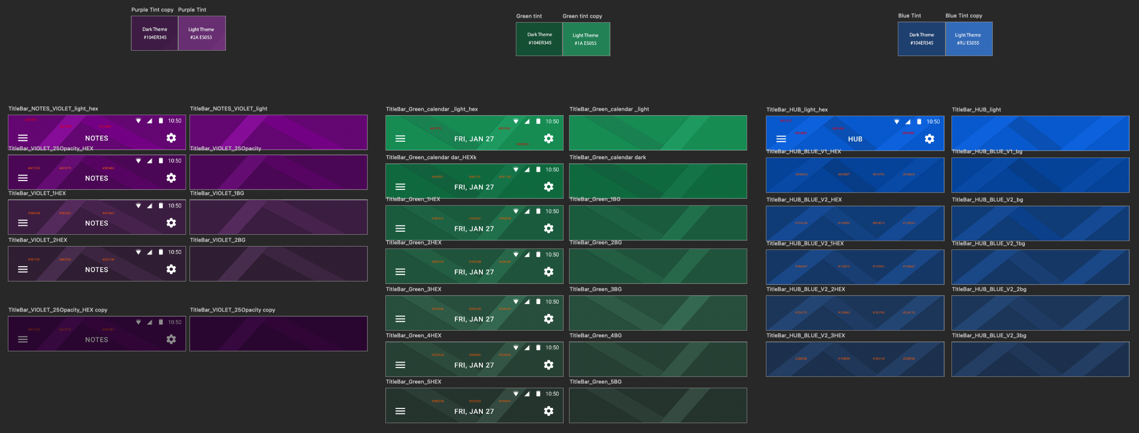
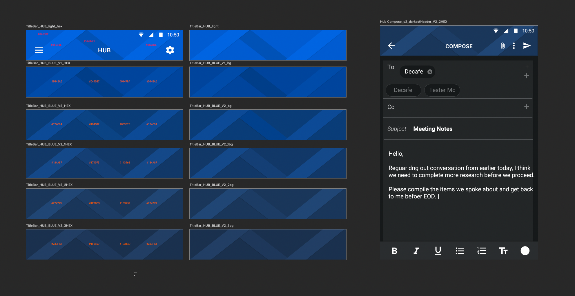
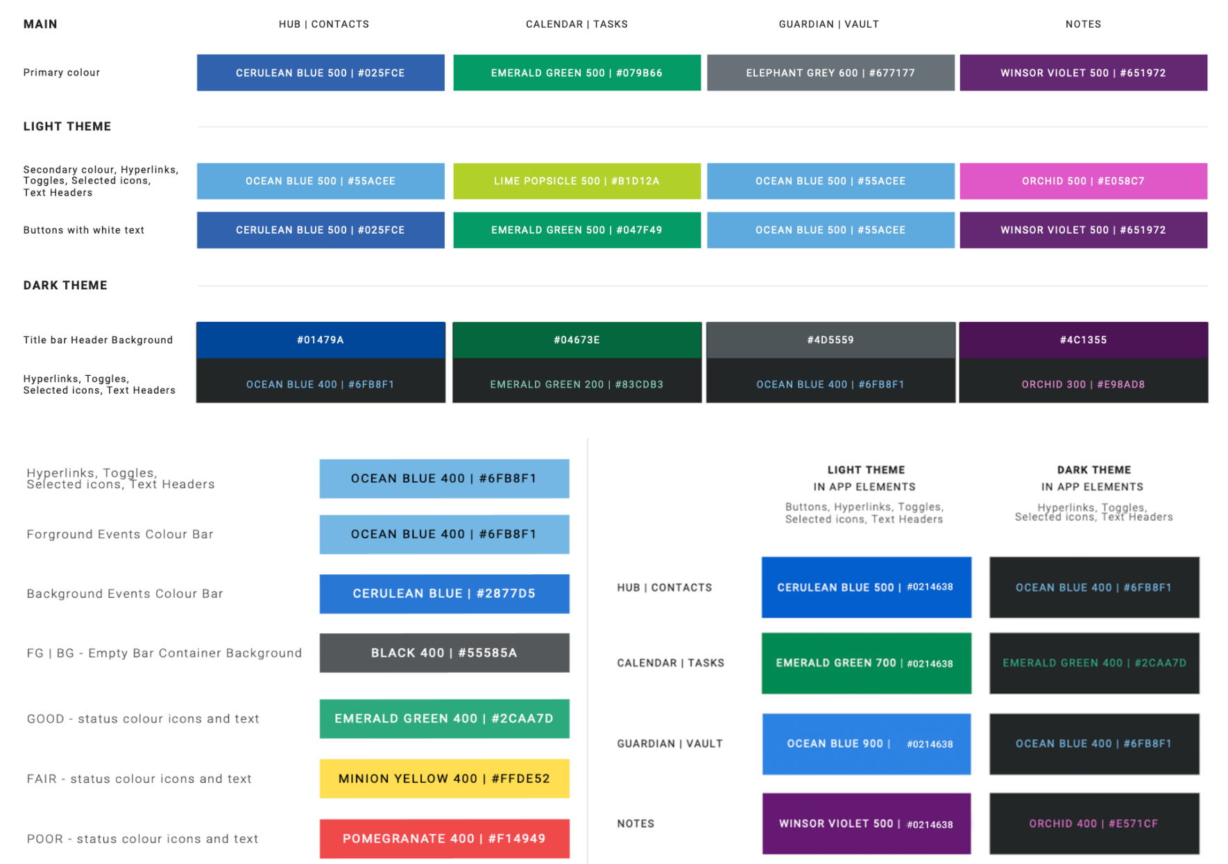
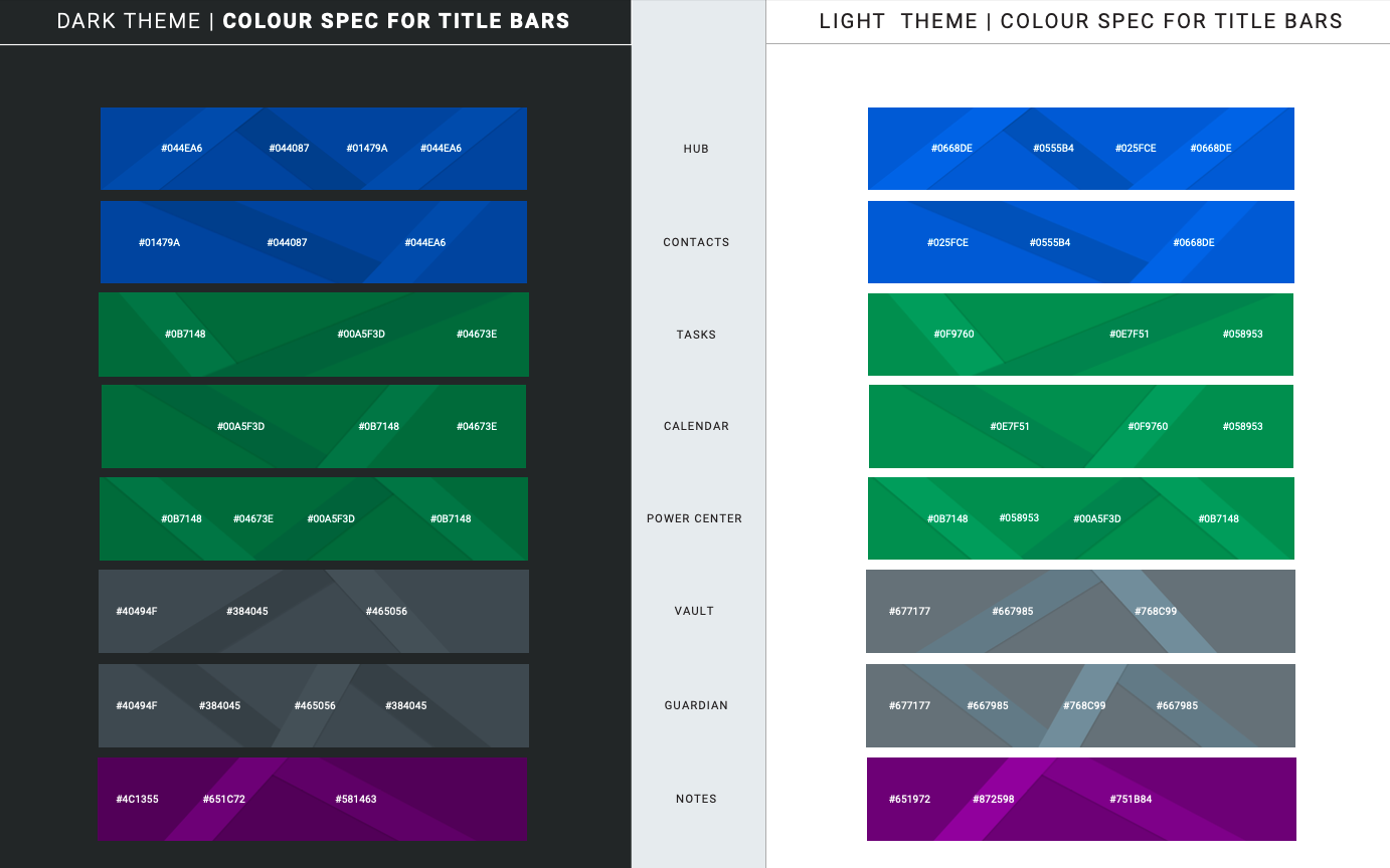
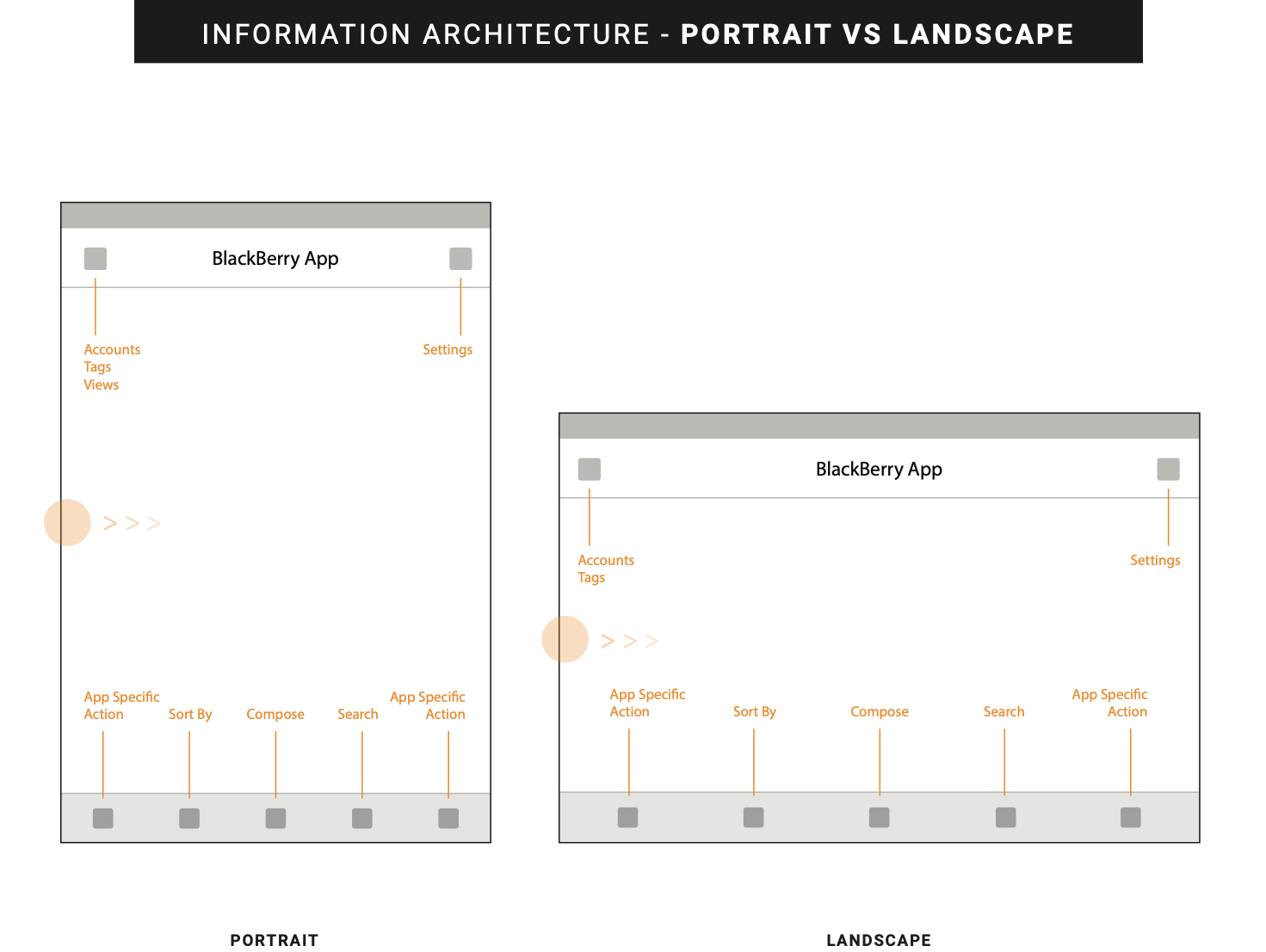
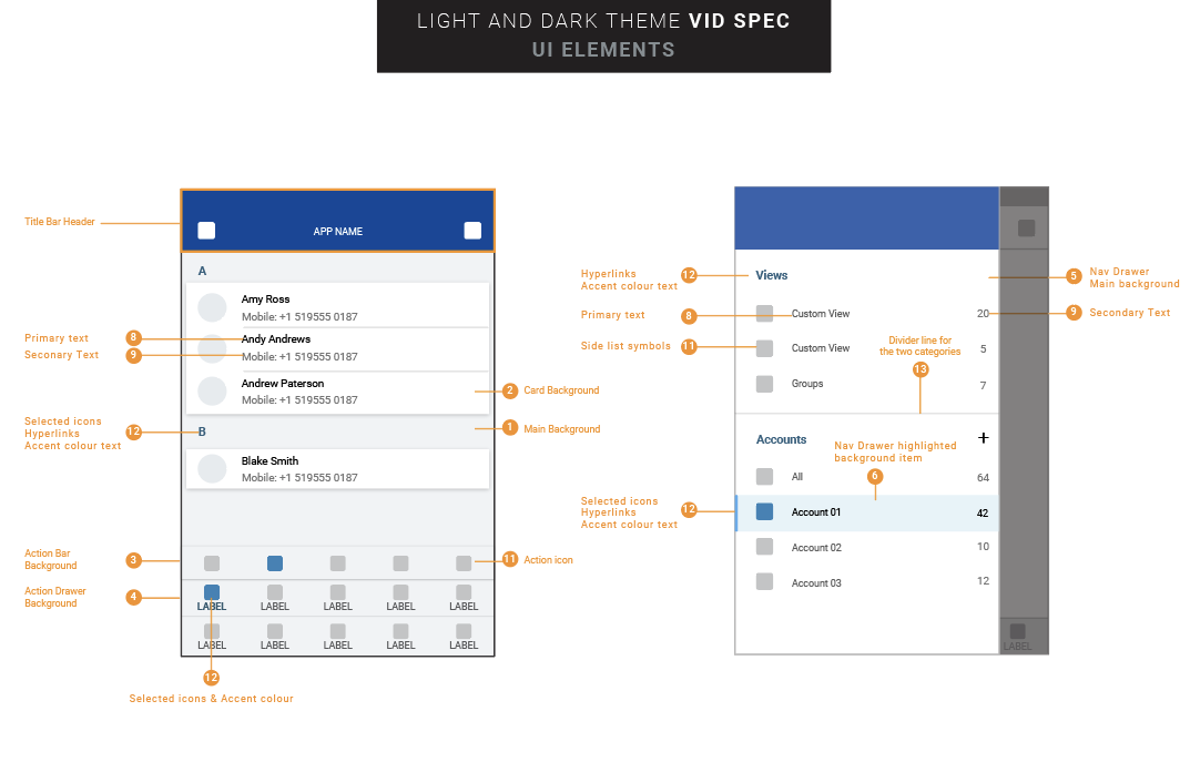
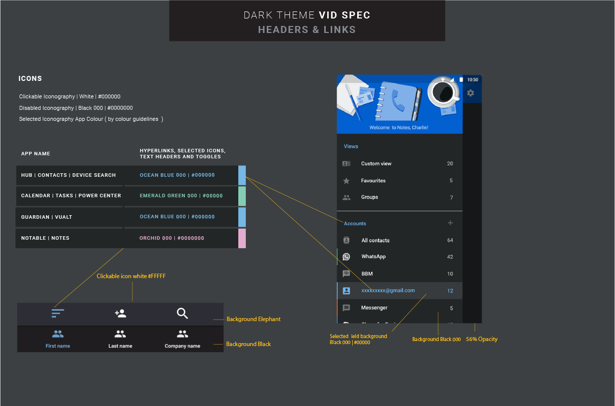
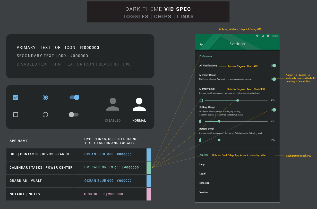
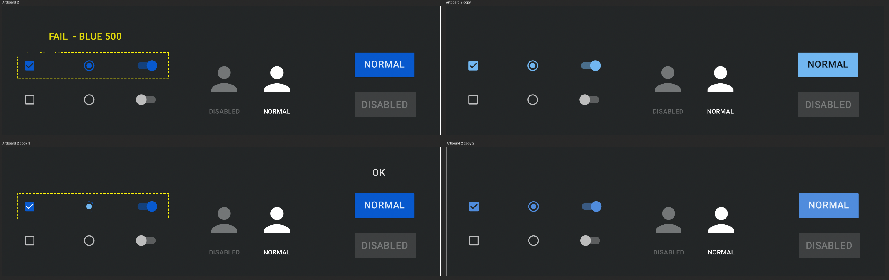
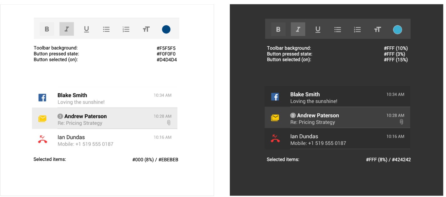
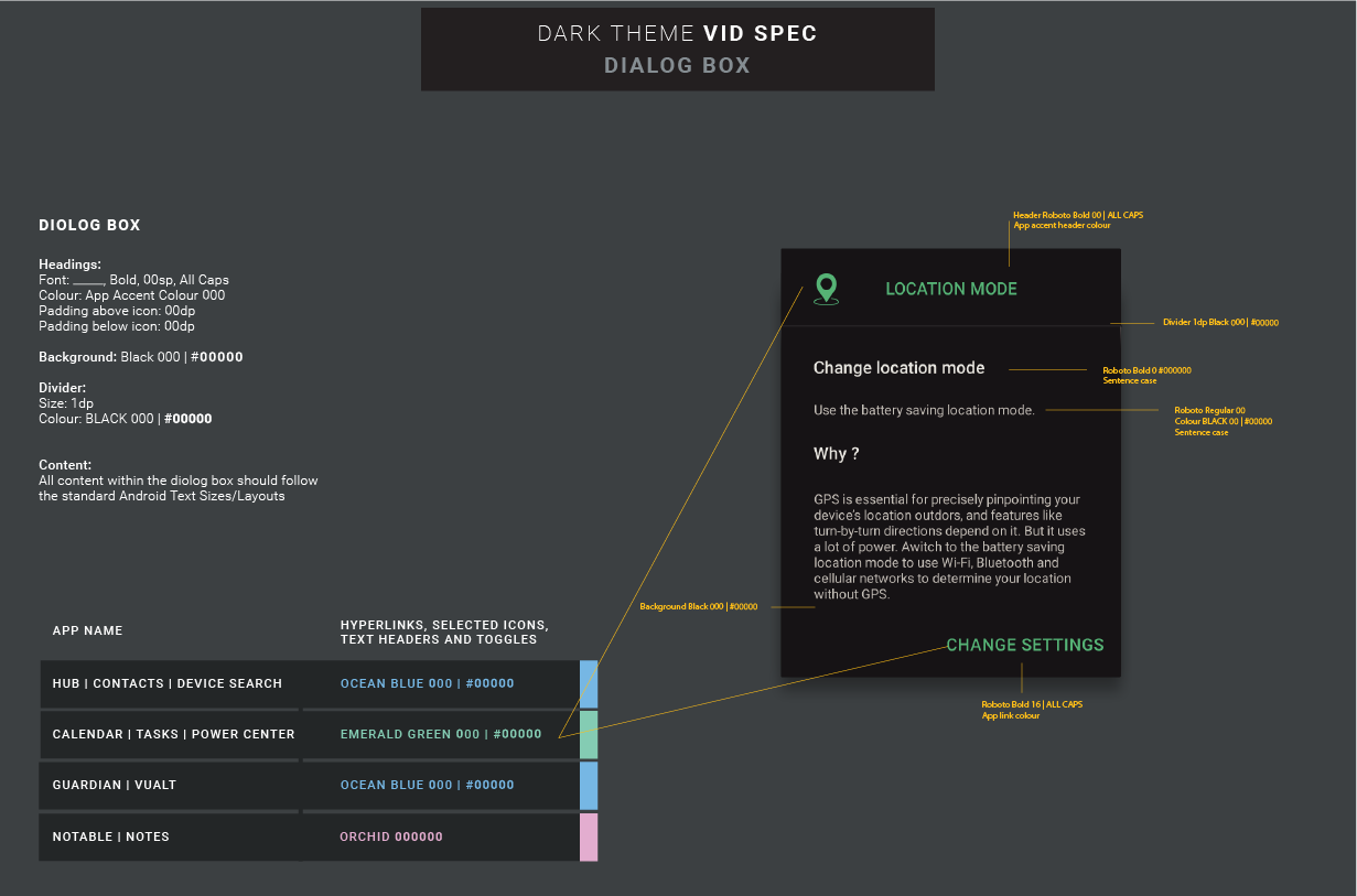
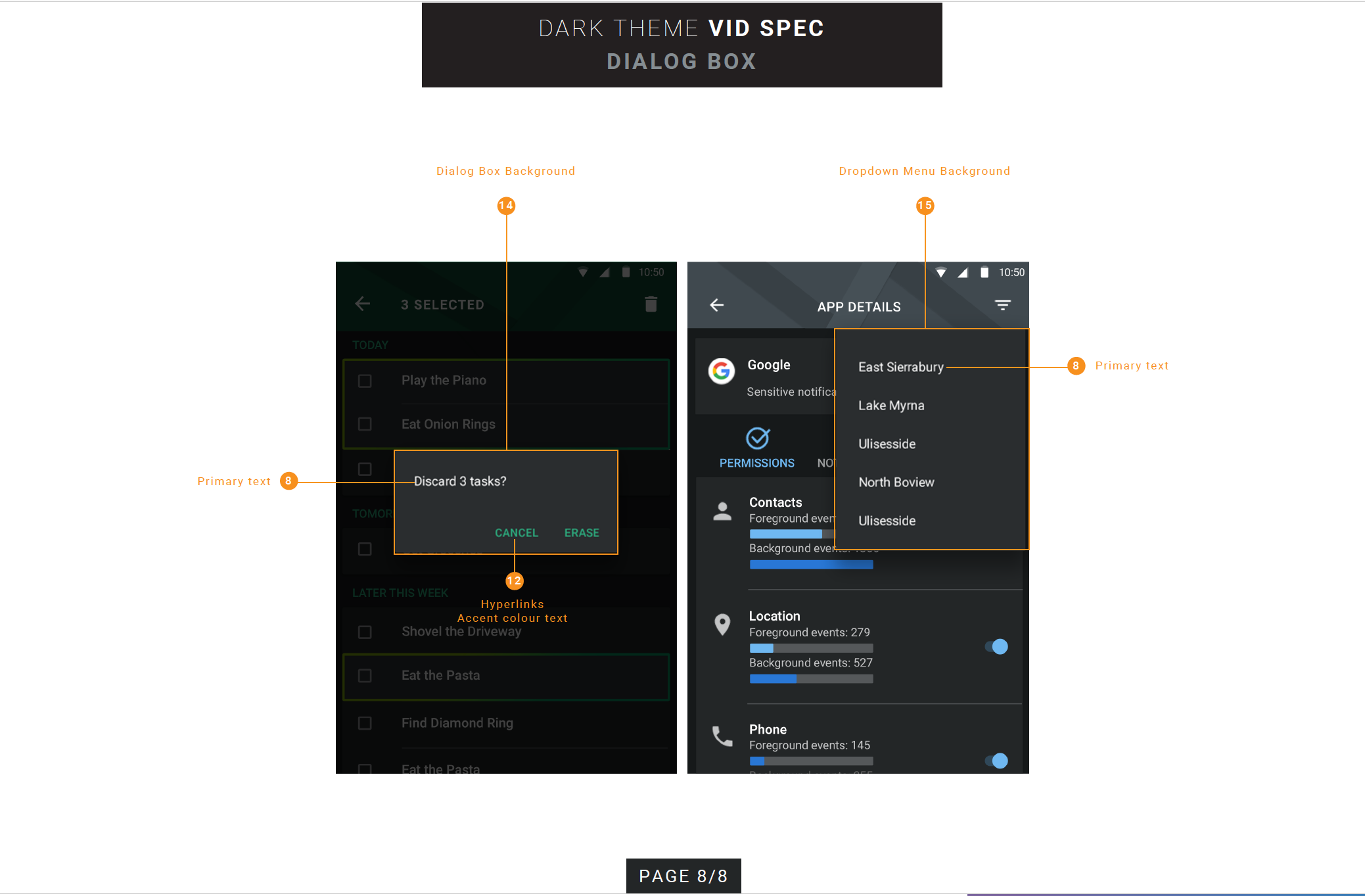
Designing accessible products requires balancing brand expression, usability, and real-world constraints across diverse users and environments. While leading the Dark Theme Guidelines for BlackBerry products, I researched industry standards and accessibility requirements to address challenges unique to dark and light interfaces—particularly around contrast, color perception, and long-duration use.
Rather than treating dark mode as a visual preference, this work focused on building a flexible, standards-compliant theming system that supports both dark and light modes, allowing users to choose what works best for them. The outcome was a more inclusive, scalable design approach that improved accessibility, preserved brand integrity, and reinforced user trust across BlackBerry’s productivity ecosystem.
OTHER PROJECTS
 Interaction Design
WBD HUD
A dense game HUD system focused on navigation clarity, tile maps, accessibility, and reusable patterns.
Interaction Design
WBD HUD
A dense game HUD system focused on navigation clarity, tile maps, accessibility, and reusable patterns.
 Interaction Design
Smart TV UX
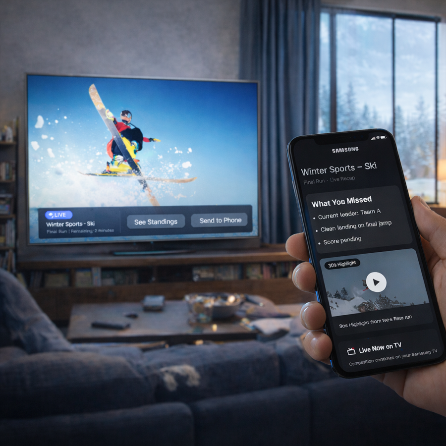
Visual-first interaction concepts for cross-device TV experiences and re-engagement flows.
Interaction Design
Smart TV UX
Visual-first interaction concepts for cross-device TV experiences and re-engagement flows.
 Branding
BlackBerry Brand
Packaging and brand marketing guidelines across product, print, and visual identity touchpoints.
Branding
BlackBerry Brand
Packaging and brand marketing guidelines across product, print, and visual identity touchpoints.
 Design Systems
Design System
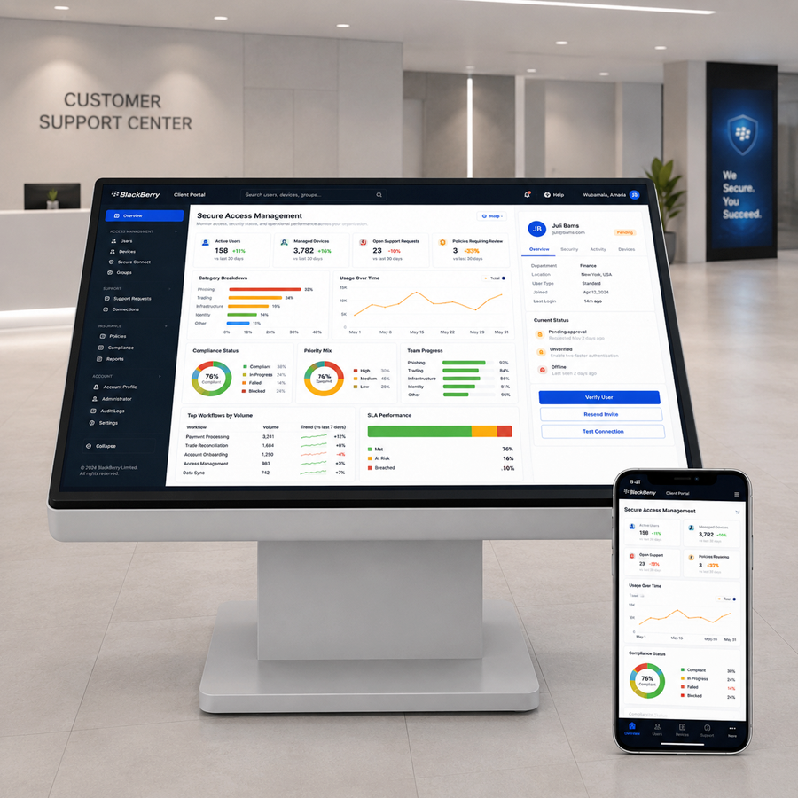
Enterprise web UI guidelines for dashboards, components, empty states, and accessibility rules.
Design Systems
Design System
Enterprise web UI guidelines for dashboards, components, empty states, and accessibility rules.
 Illustration
Empty Data
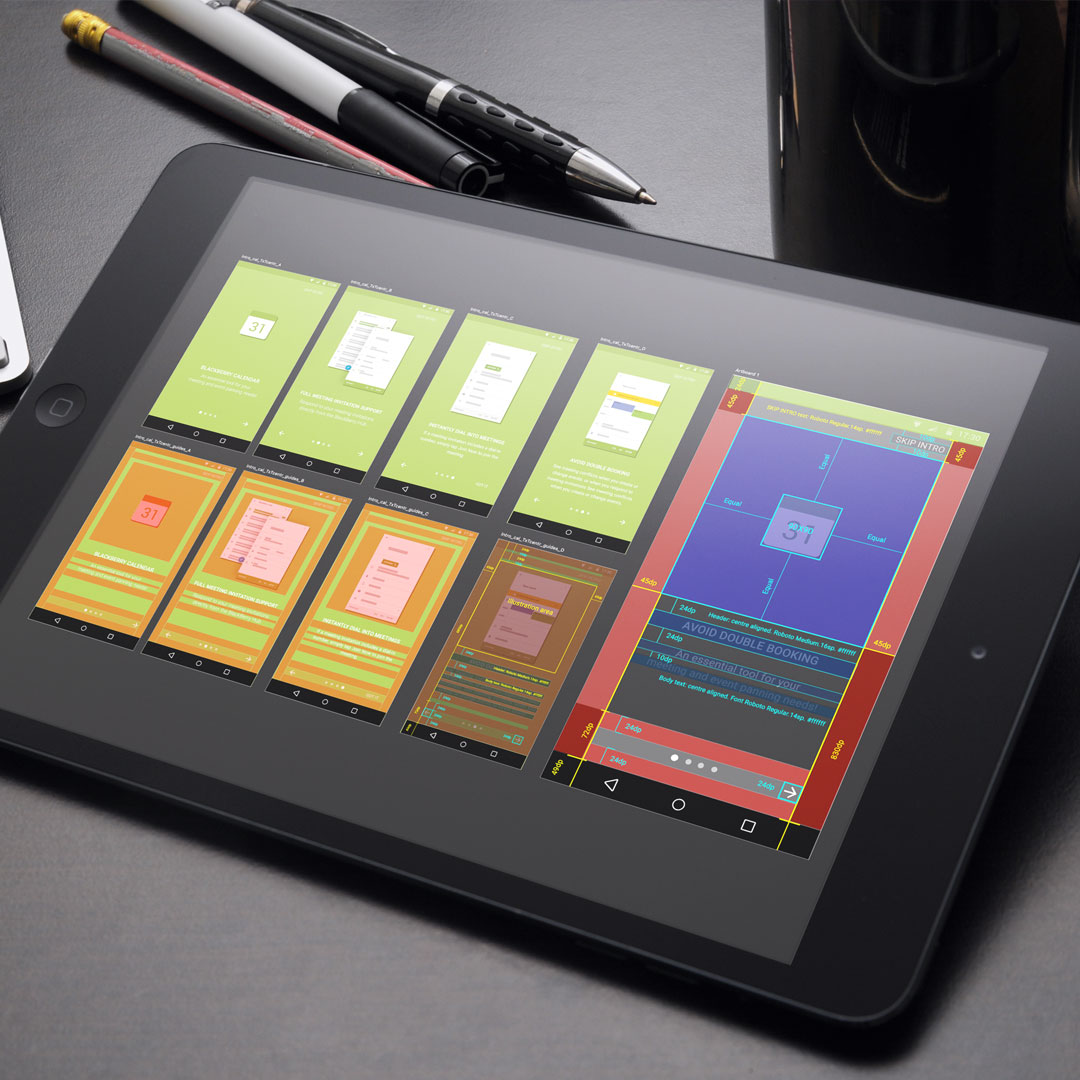
Onboarding and empty-state illustrations that guide users through first-use product moments.
Illustration
Empty Data
Onboarding and empty-state illustrations that guide users through first-use product moments.
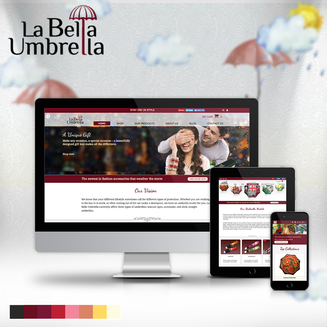 Branding
Labella Umbrella
A responsive online store direction combining brand storytelling, layouts, and product imagery.
Branding
Labella Umbrella
A responsive online store direction combining brand storytelling, layouts, and product imagery.
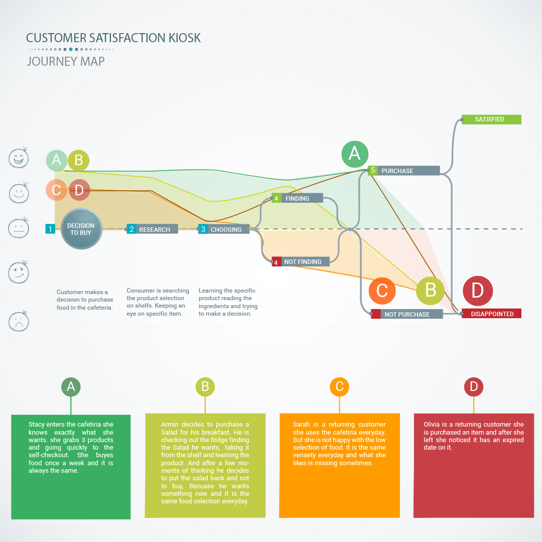 UX Research
Customer Kiosk
A service kiosk and app concept for measuring customer satisfaction and operational feedback.
UX Research
Customer Kiosk
A service kiosk and app concept for measuring customer satisfaction and operational feedback.
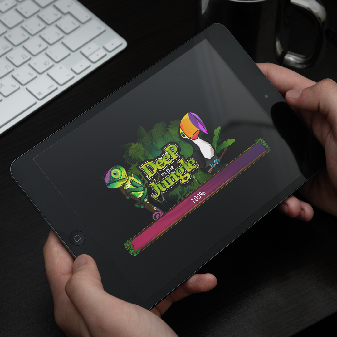 Interaction Design
Wizits Game
A mobile game interface with character art, themed screens, animation, and playful UX systems.
Interaction Design
Wizits Game
A mobile game interface with character art, themed screens, animation, and playful UX systems.
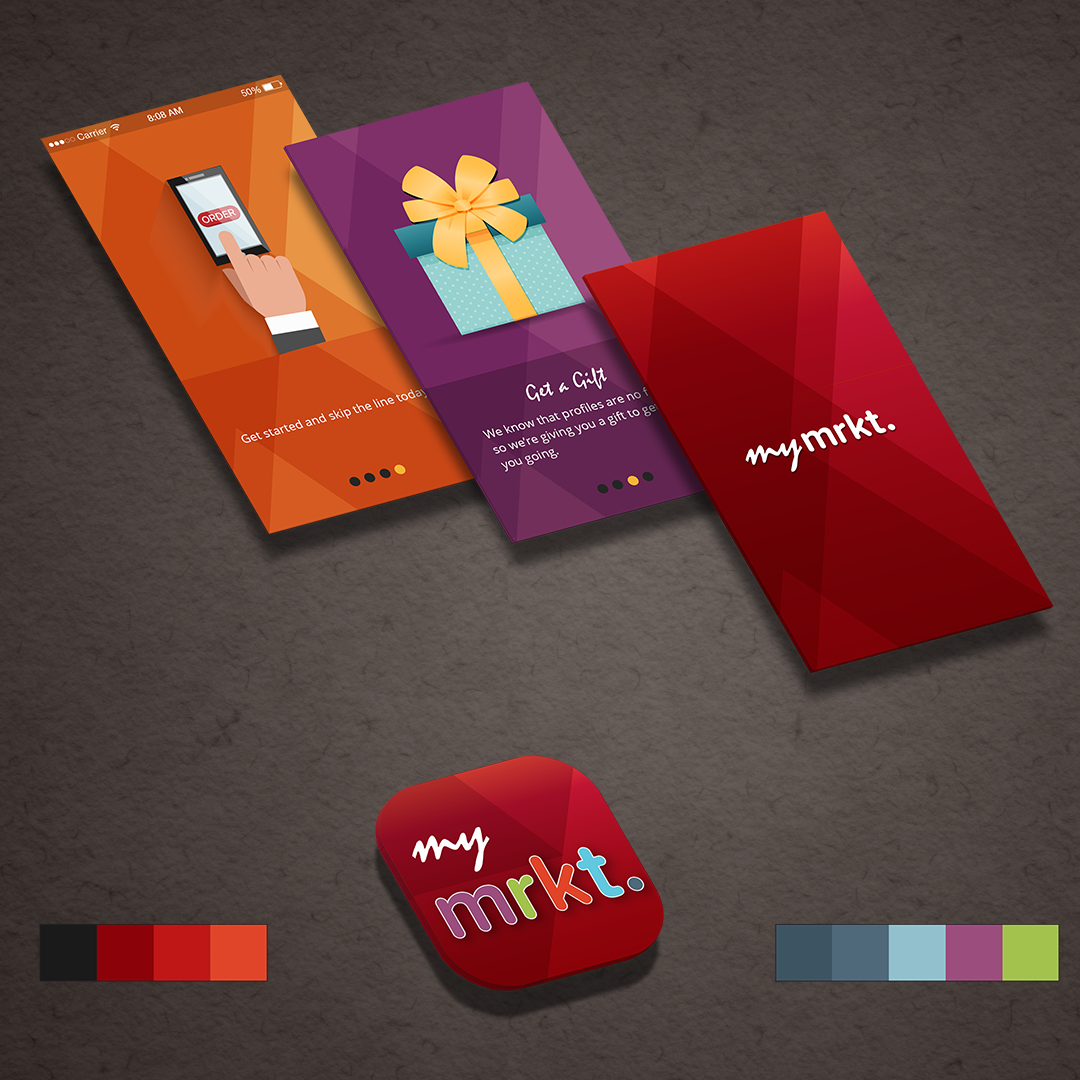 Interaction Design
TJX Market
A multi-brand retail app concept exploring navigation, product discovery, and mobile shopping.
Interaction Design
TJX Market
A multi-brand retail app concept exploring navigation, product discovery, and mobile shopping.
 Branding
SharpLight
Beauty spa campaign materials spanning print design, promotional layouts, and branded visuals.
Branding
SharpLight
Beauty spa campaign materials spanning print design, promotional layouts, and branded visuals.
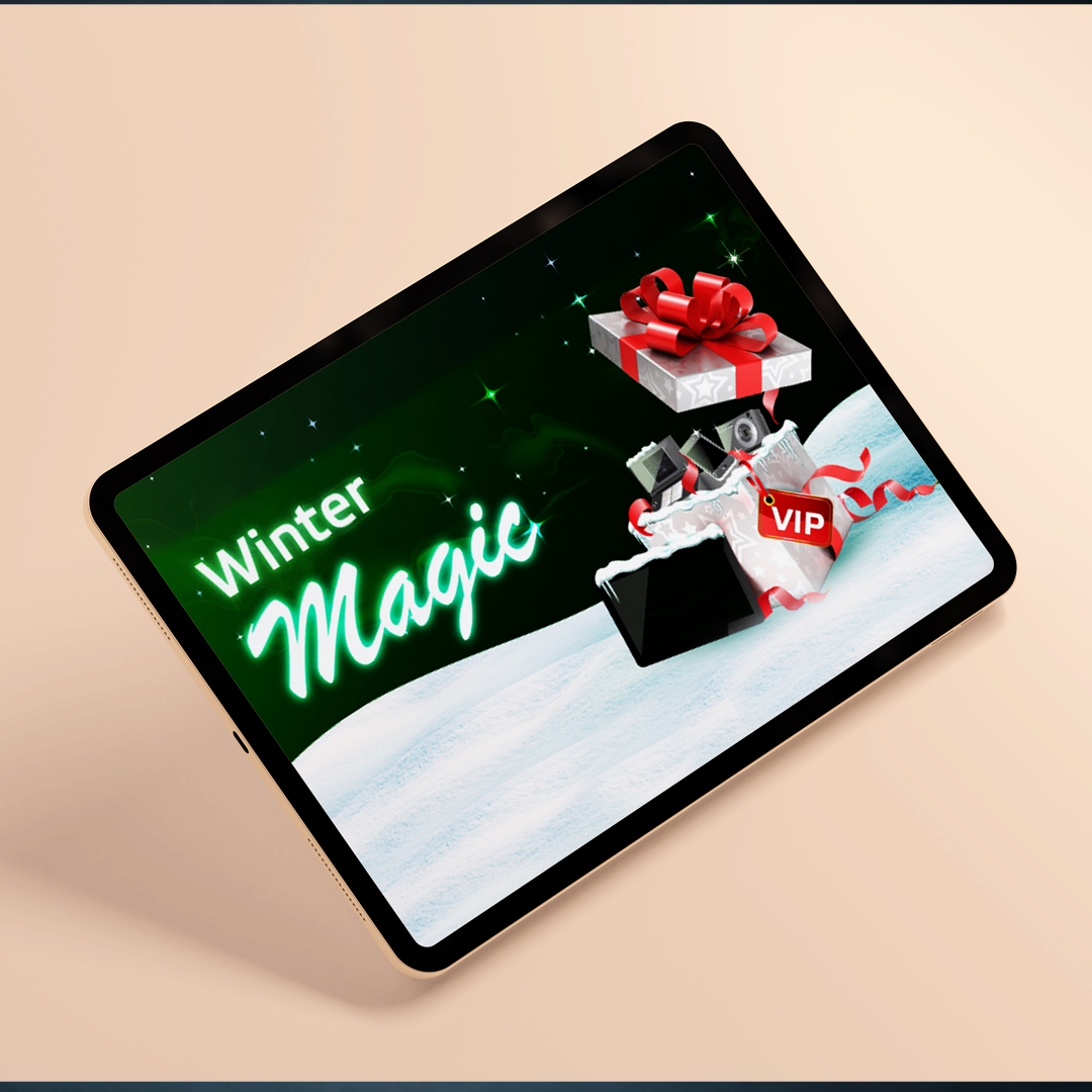 Branding
Bwin Promo
A festive gaming promotion with campaign concepts, interface graphics, and seasonal art direction.
Branding
Bwin Promo
A festive gaming promotion with campaign concepts, interface graphics, and seasonal art direction.
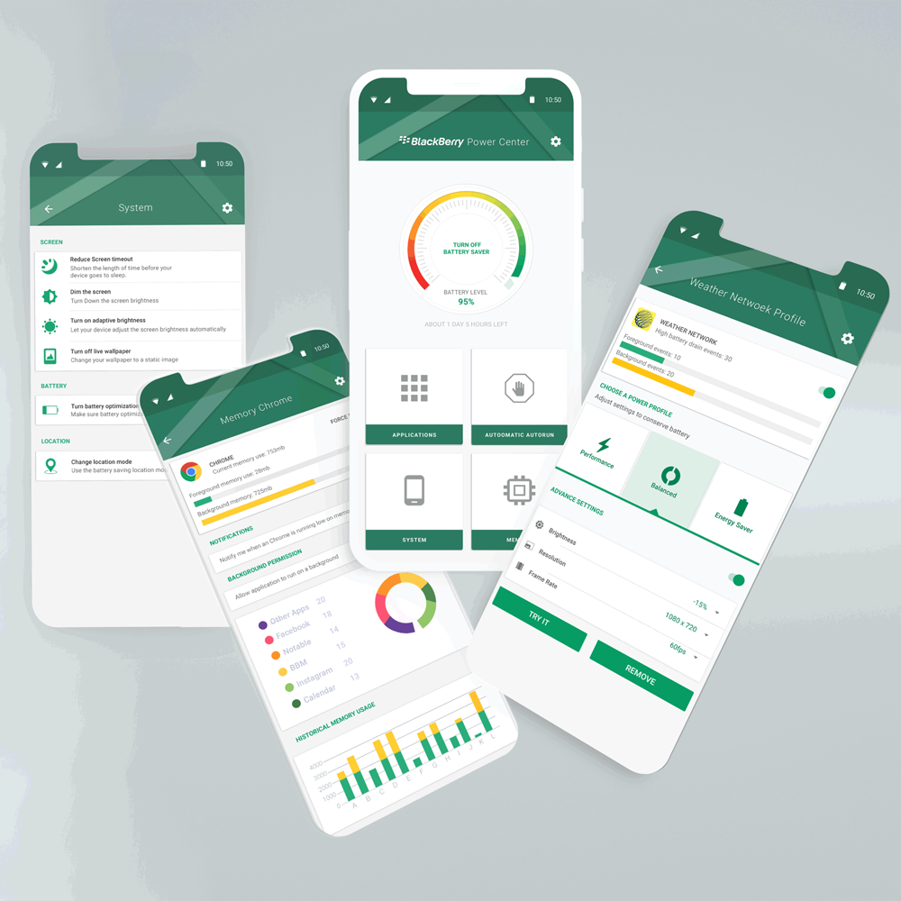 Data Visualization
Power Center
Battery app interaction design with information architecture, visual states, and usage insights.
Data Visualization
Power Center
Battery app interaction design with information architecture, visual states, and usage insights.
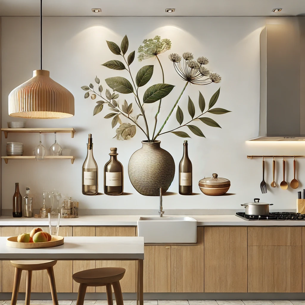 Illustration
Interior Art
Interior and architectural illustrations using 3D composition, rooms, textures, and visual mood.
Illustration
Interior Art
Interior and architectural illustrations using 3D composition, rooms, textures, and visual mood.
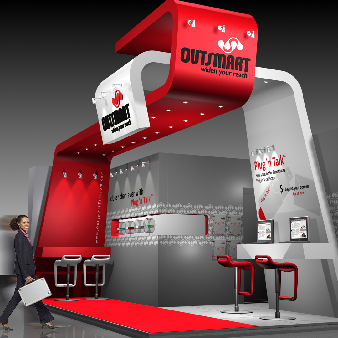 Physical + Digital Experience
3D Exhibition
Exhibition work connecting brand identity, spatial planning, interactive kiosks, product displays, and service conversations.
Physical + Digital Experience
3D Exhibition
Exhibition work connecting brand identity, spatial planning, interactive kiosks, product displays, and service conversations.