
BlackBerry
Brand Marketing · Packaging Systems · Identity Standards · Print Design
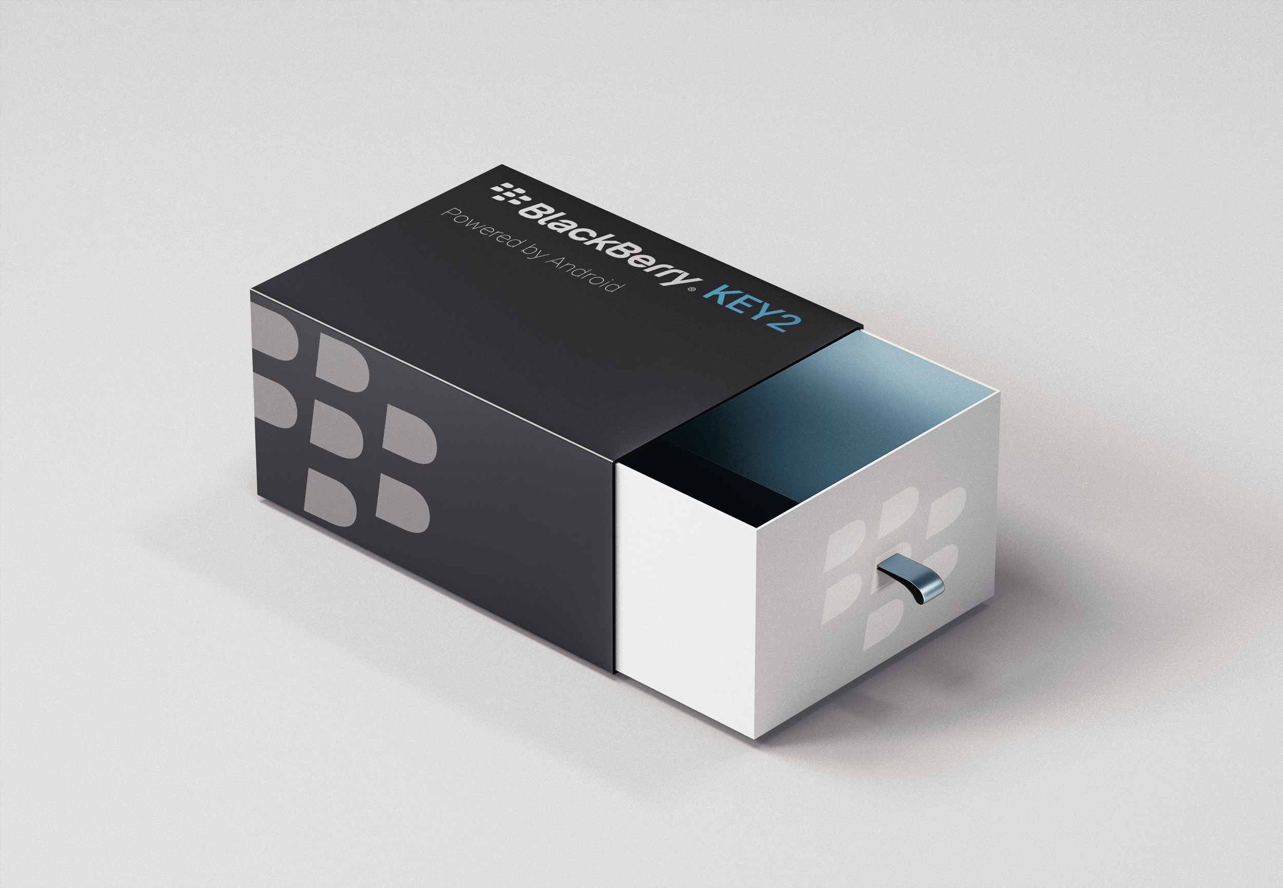
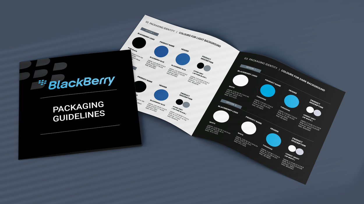
While working in BlackBerry, I had the opportunity to work across different channels in the company, both on the UX side and the Brand side. I was involved in working on Brand identity, layout and industry Standards. One of the examples is the Packaging Design Guidelines I was designing for partners and suppliers.
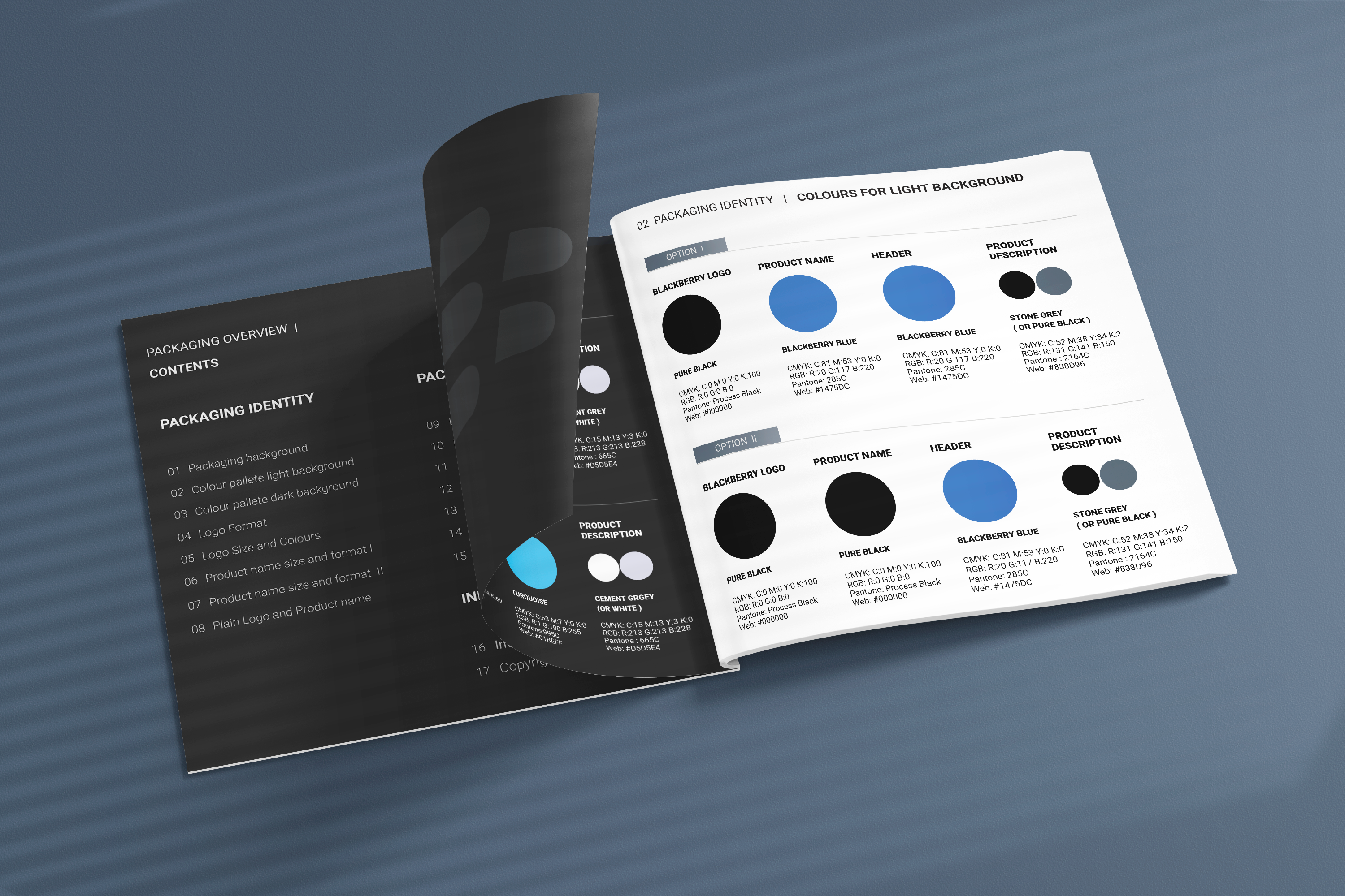
BlackBerry logo Format consists of two elements with a unique piece of artwork. I was considering color pallete for both light and dark backgrounds, specifying the proportion and arrangement of the EMBLEM design and the Word Mark specification determined. Considering all the aspects that can impact the Brand power. Elements like; logo size, colors, minimum size and critical spacing for Trademark and Copymark. Industry certifications trademark rights and Copyrights. Leaving placeholders for Logo and partners’ product name, header, size, and format description.
Partners can have different needs and requirements and might use a diverse range of packaging types and sizes.
I needed to solve a problem creating design guidelines for multiple options and layouts that partners can use for any packaging size.
I was creating a simple layout with all the elements and examples
that demonstrate visual scalability and placement.
In the Design guidelines booklet, I was considering on both the fixed elements, Brand consistency and Typography. Together with what and how can be used, on the flexible areas, and how elements can be placed on the top, bottom and sides of the packaging. With demonstrating examples for placement of Barcode and package LOGO.
Separately, I focused on examples for front packaging design that demonstrates visual scalability and placements. Sizing and ratio for fixed elements like the Logo format, product name, header text and Image placement. Presenting examples for both dark and light backgrounds.
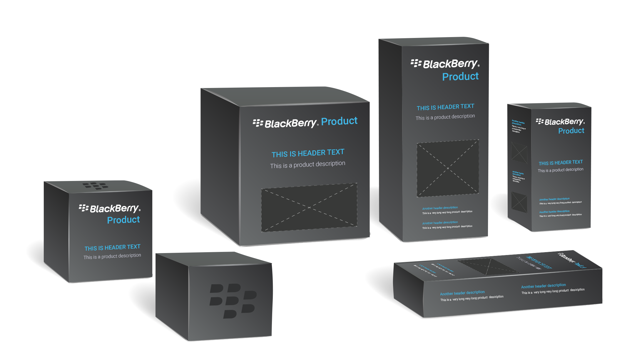
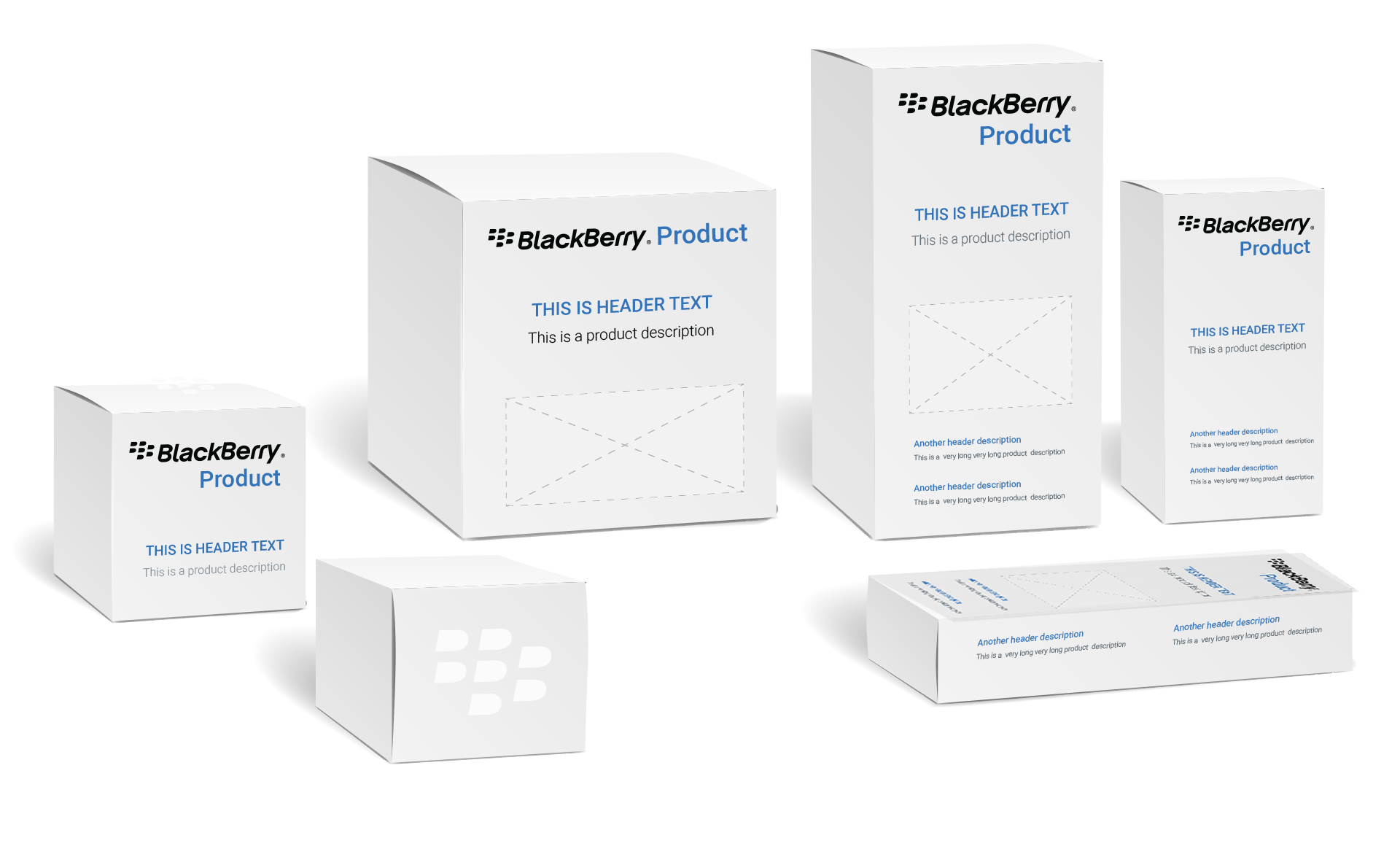
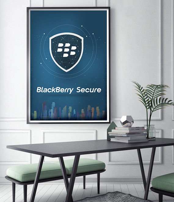
Other examples include Posters and Wallpaper designed for Office use and Marketing purposes.

OTHER PROJECTS
 Interaction Design
WBD HUD
A dense game HUD system focused on navigation clarity, tile maps, accessibility, and reusable patterns.
Interaction Design
WBD HUD
A dense game HUD system focused on navigation clarity, tile maps, accessibility, and reusable patterns.
 Interaction Design
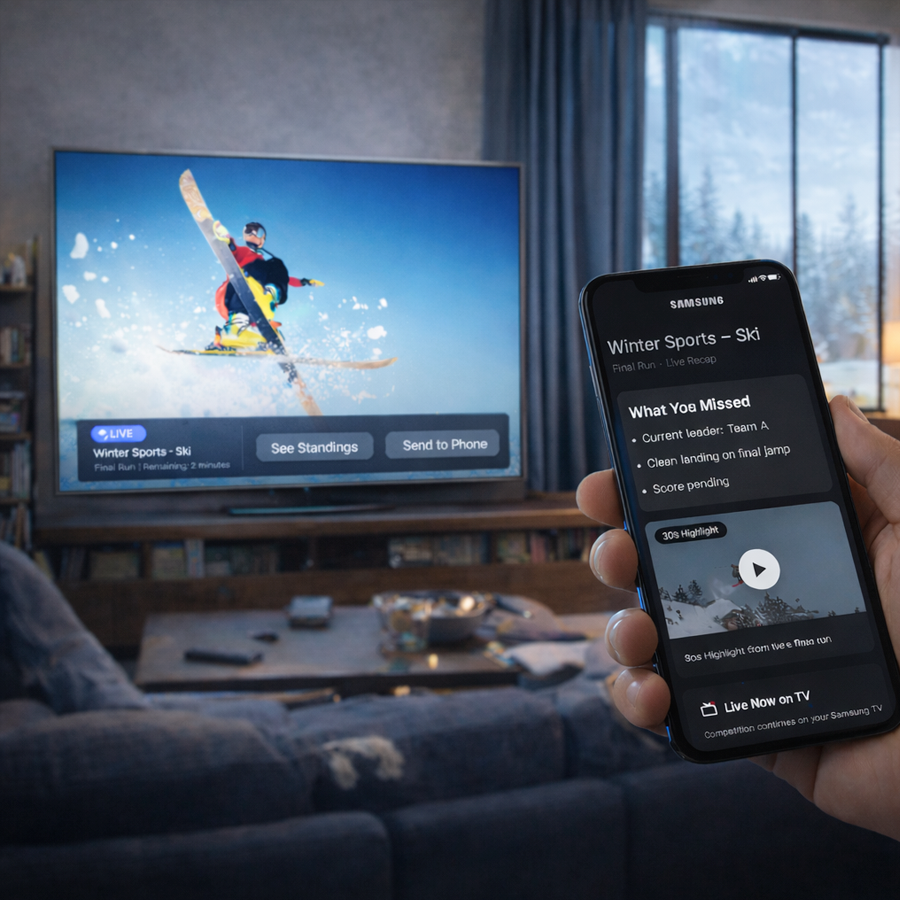
Smart TV UX
Visual-first interaction concepts for cross-device TV experiences and re-engagement flows.
Interaction Design
Smart TV UX
Visual-first interaction concepts for cross-device TV experiences and re-engagement flows.
 Accessibility
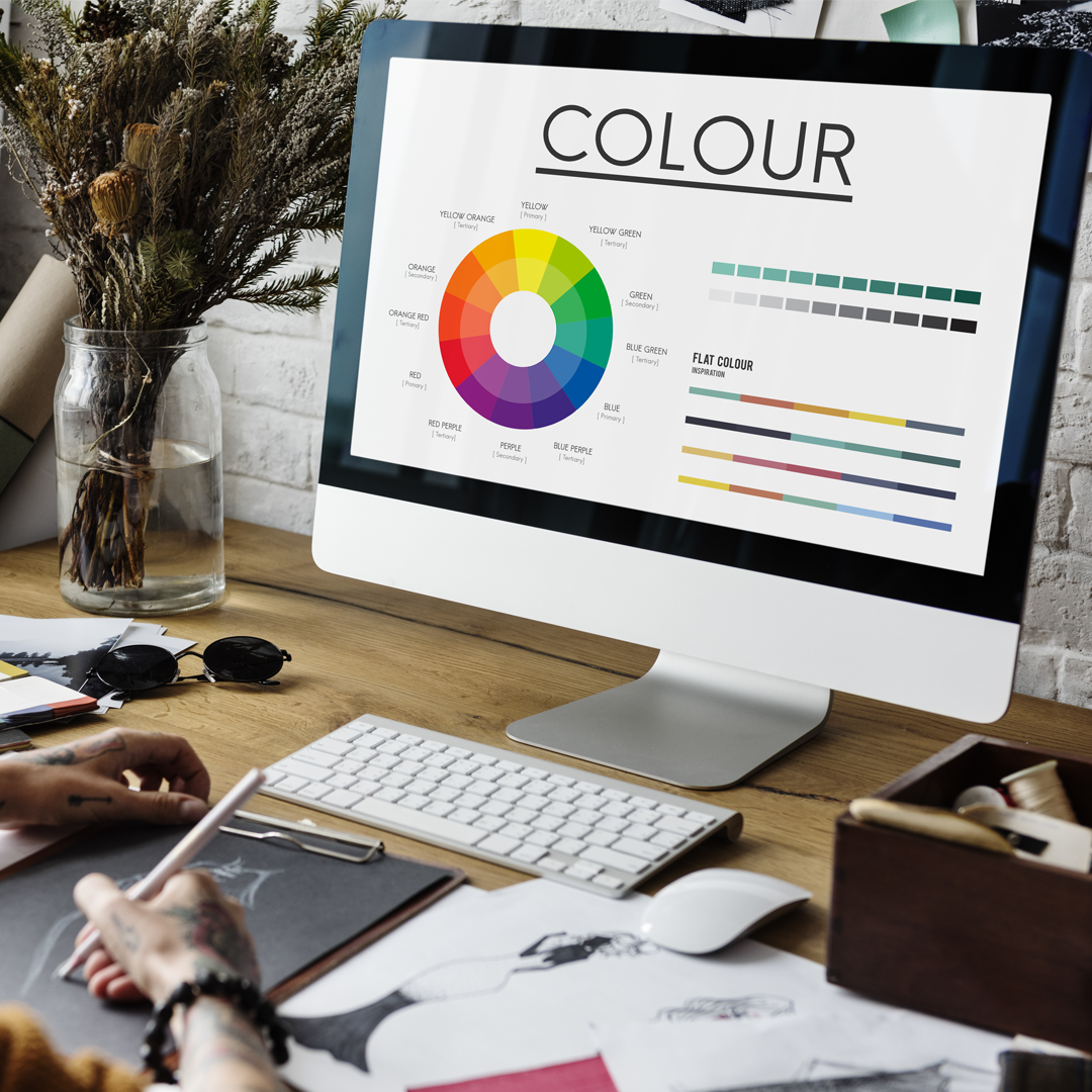
Dark Theme
BlackBerry dark and light theme guidelines shaped around contrast, readability, and inclusive UX.
Accessibility
Dark Theme
BlackBerry dark and light theme guidelines shaped around contrast, readability, and inclusive UX.
 Design Systems
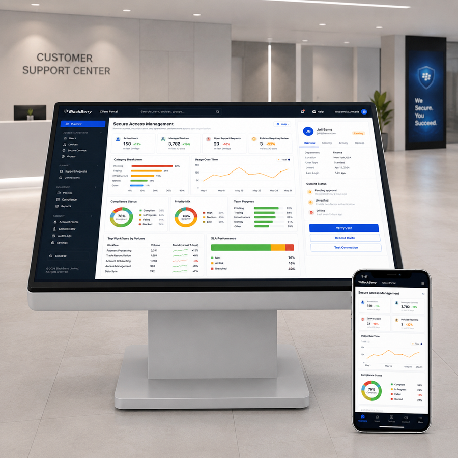
Design System
Enterprise web UI guidelines for dashboards, components, empty states, and accessibility rules.
Design Systems
Design System
Enterprise web UI guidelines for dashboards, components, empty states, and accessibility rules.
 Illustration
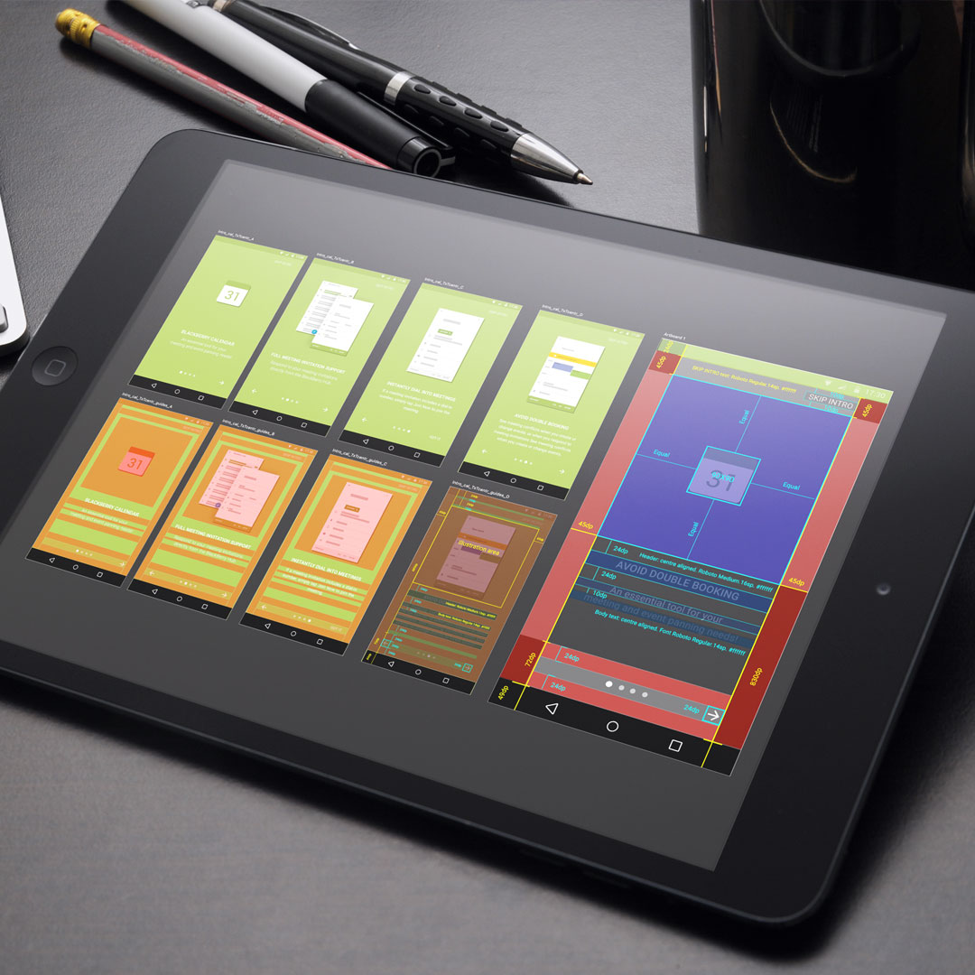
Empty Data
Onboarding and empty-state illustrations that guide users through first-use product moments.
Illustration
Empty Data
Onboarding and empty-state illustrations that guide users through first-use product moments.
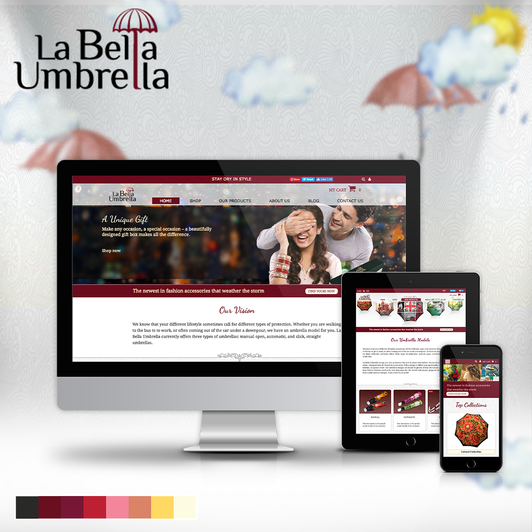 Branding
Labella Umbrella
A responsive online store direction combining brand storytelling, layouts, and product imagery.
Branding
Labella Umbrella
A responsive online store direction combining brand storytelling, layouts, and product imagery.
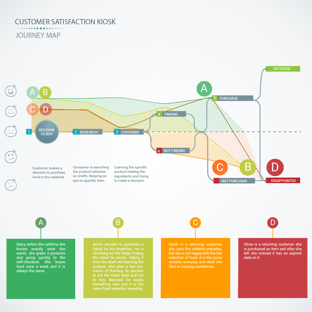 UX Research
Customer Kiosk
A service kiosk and app concept for measuring customer satisfaction and operational feedback.
UX Research
Customer Kiosk
A service kiosk and app concept for measuring customer satisfaction and operational feedback.
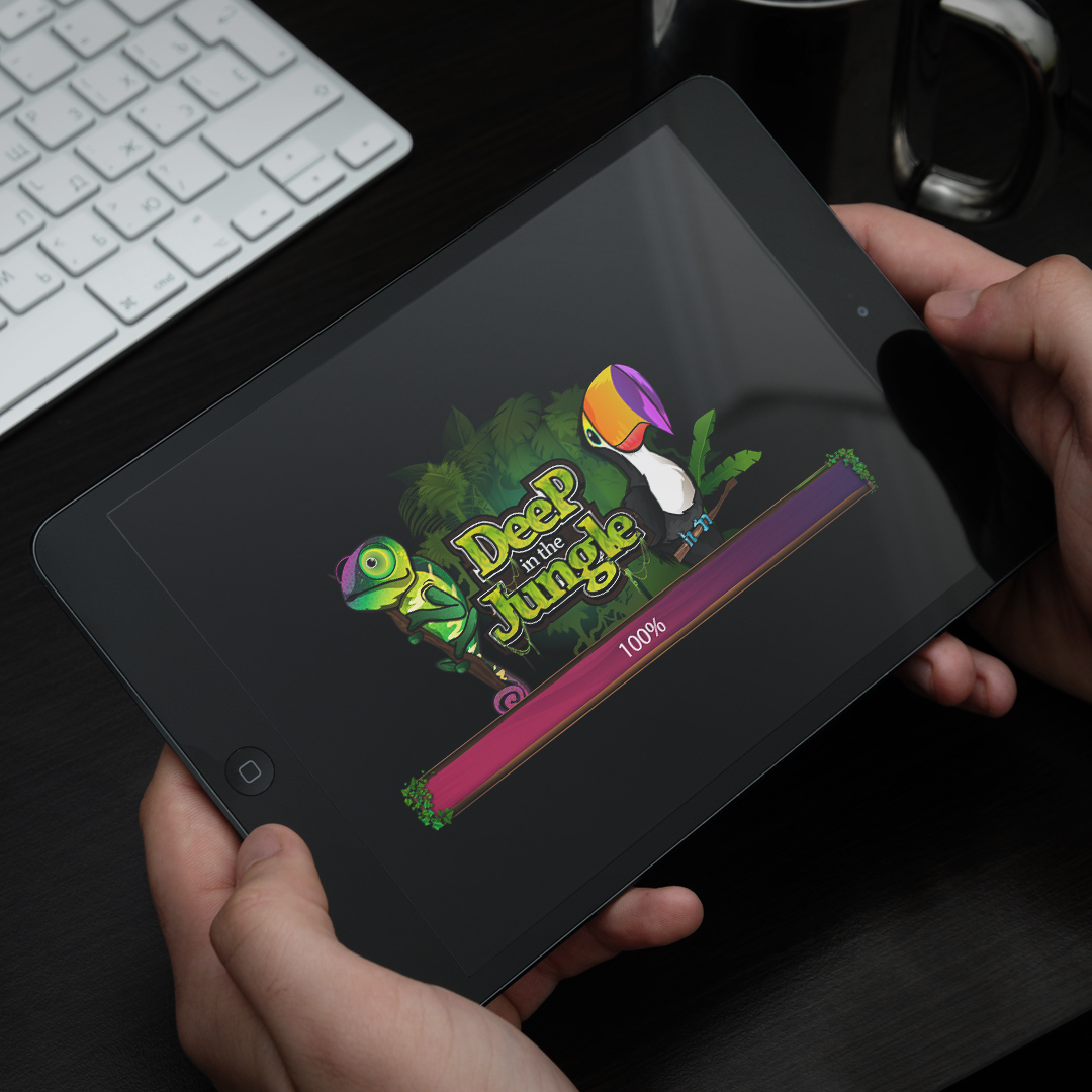 Interaction Design
Wizits Game
A mobile game interface with character art, themed screens, animation, and playful UX systems.
Interaction Design
Wizits Game
A mobile game interface with character art, themed screens, animation, and playful UX systems.
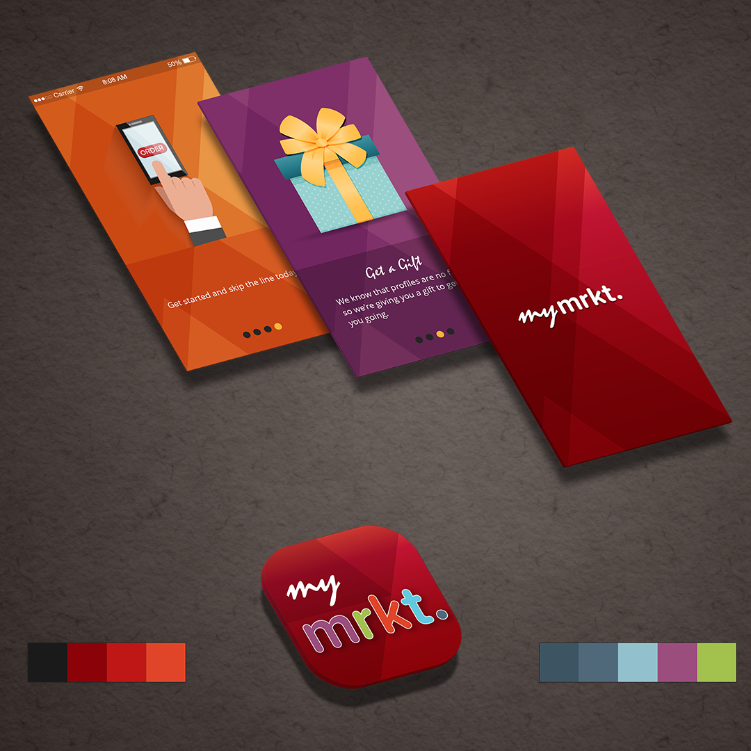 Interaction Design
TJX Market
A multi-brand retail app concept exploring navigation, product discovery, and mobile shopping.
Interaction Design
TJX Market
A multi-brand retail app concept exploring navigation, product discovery, and mobile shopping.
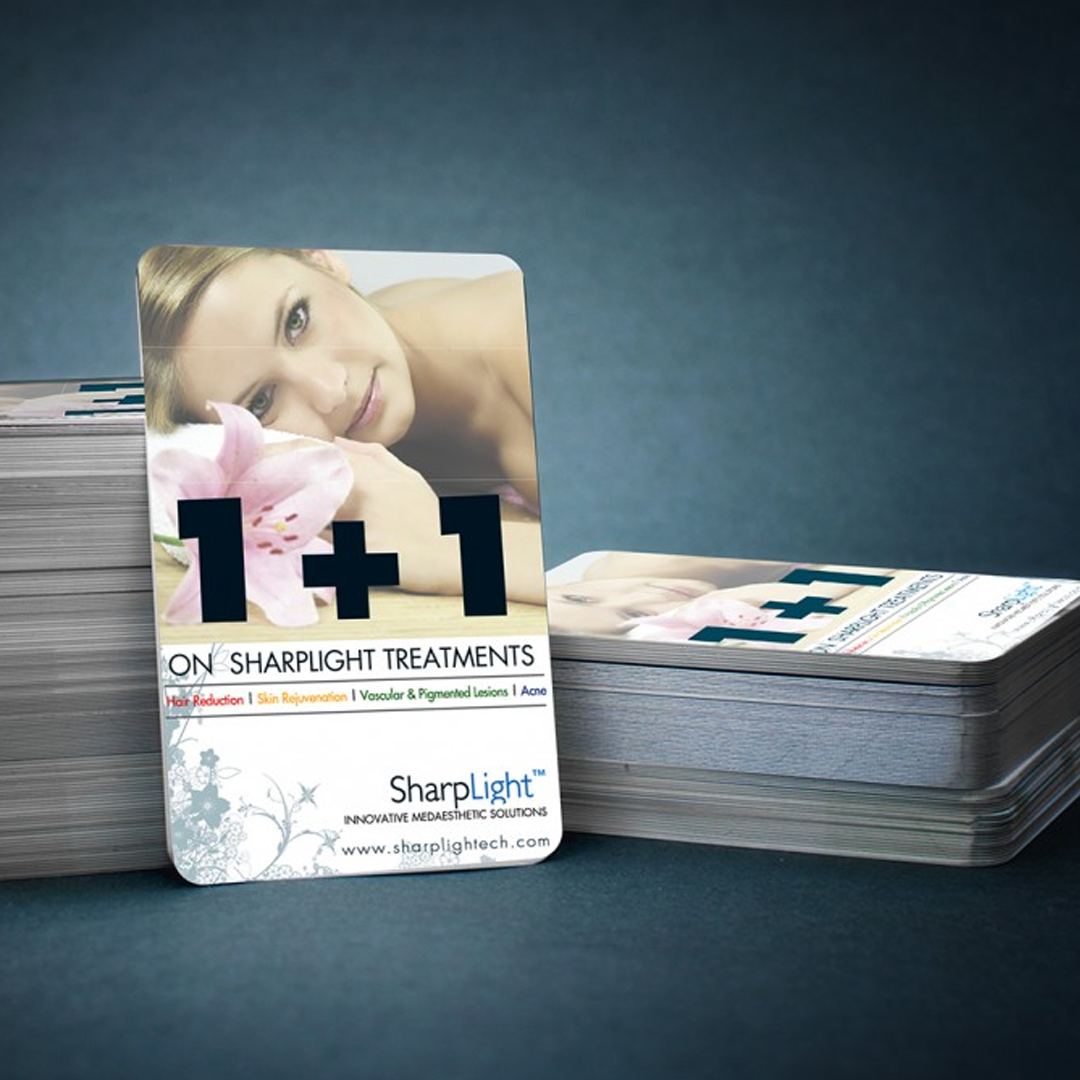 Branding
SharpLight
Beauty spa campaign materials spanning print design, promotional layouts, and branded visuals.
Branding
SharpLight
Beauty spa campaign materials spanning print design, promotional layouts, and branded visuals.
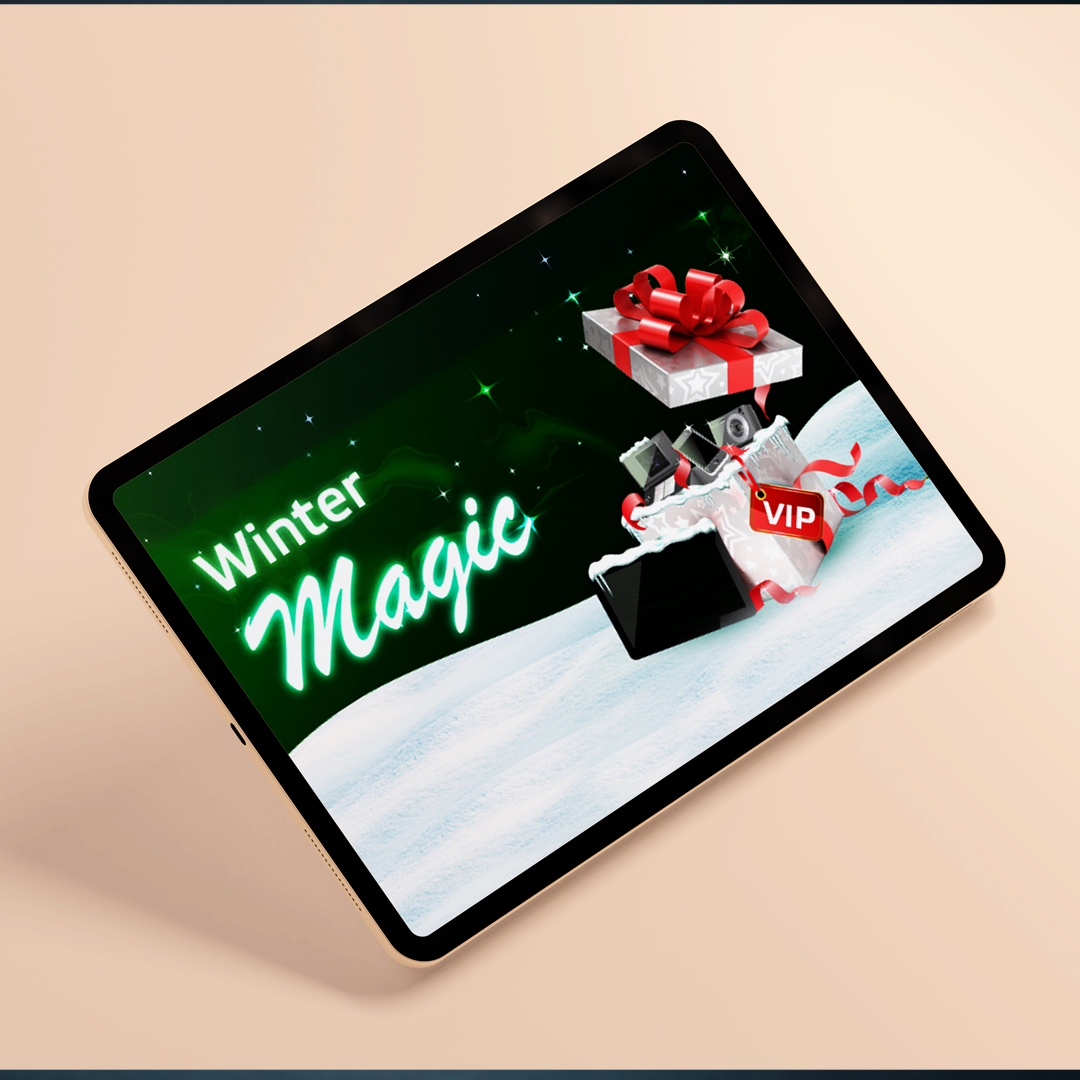 Branding
Bwin Promo
A festive gaming promotion with campaign concepts, interface graphics, and seasonal art direction.
Branding
Bwin Promo
A festive gaming promotion with campaign concepts, interface graphics, and seasonal art direction.
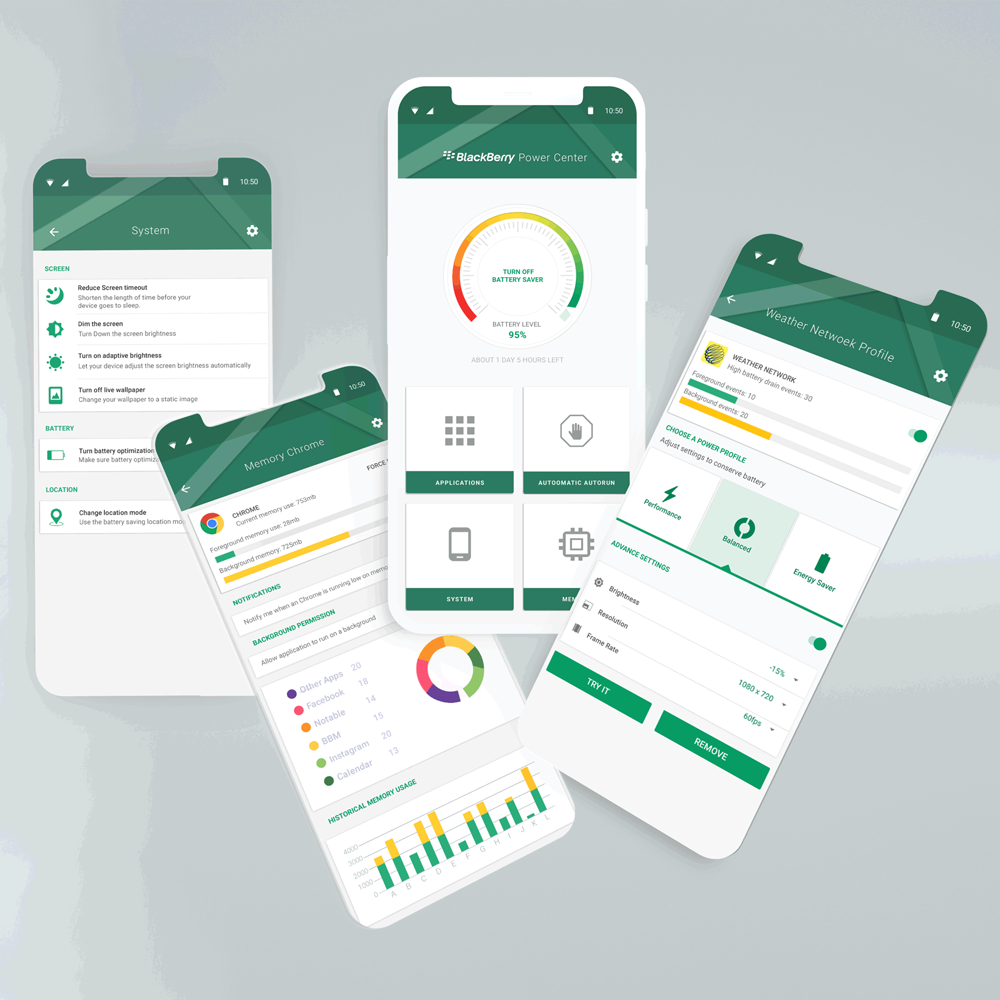 Data Visualization
Power Center
Battery app interaction design with information architecture, visual states, and usage insights.
Data Visualization
Power Center
Battery app interaction design with information architecture, visual states, and usage insights.
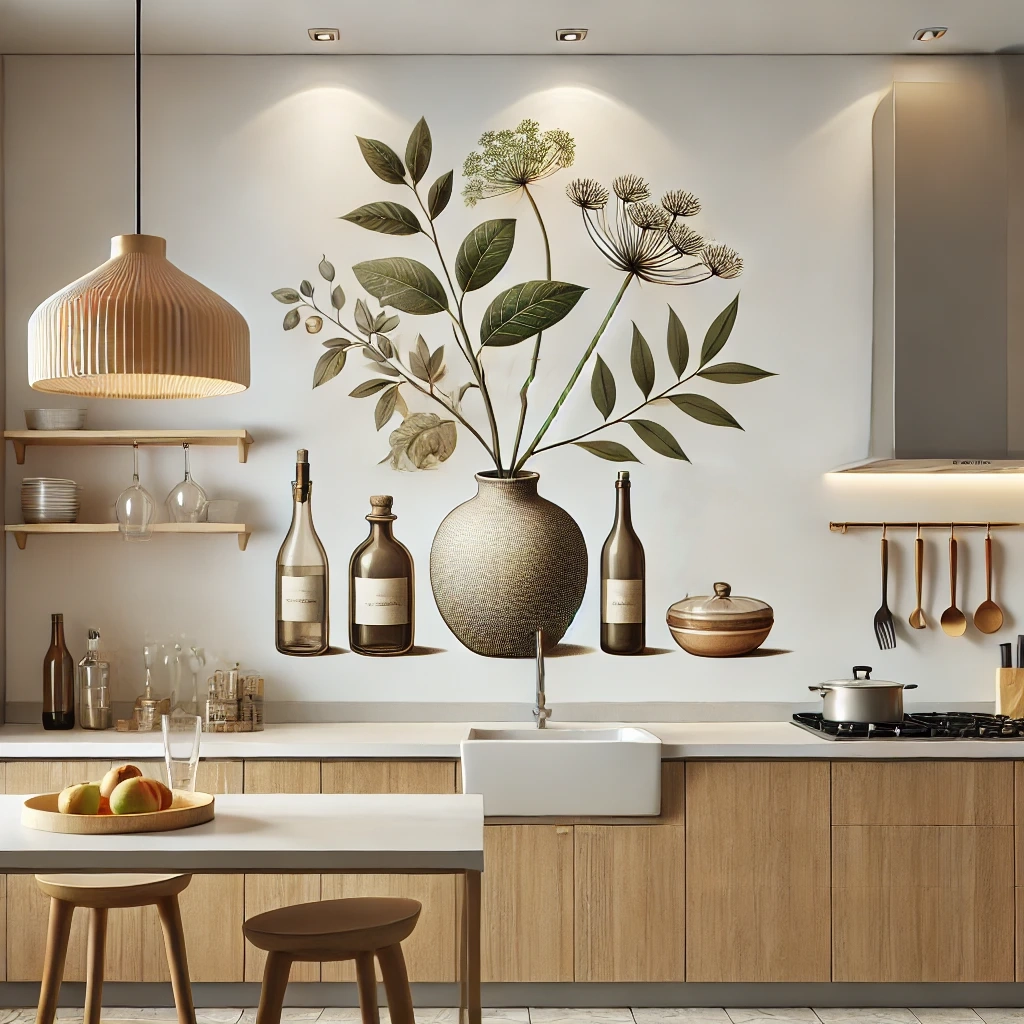 Illustration
Interior Art
Interior and architectural illustrations using 3D composition, rooms, textures, and visual mood.
Illustration
Interior Art
Interior and architectural illustrations using 3D composition, rooms, textures, and visual mood.
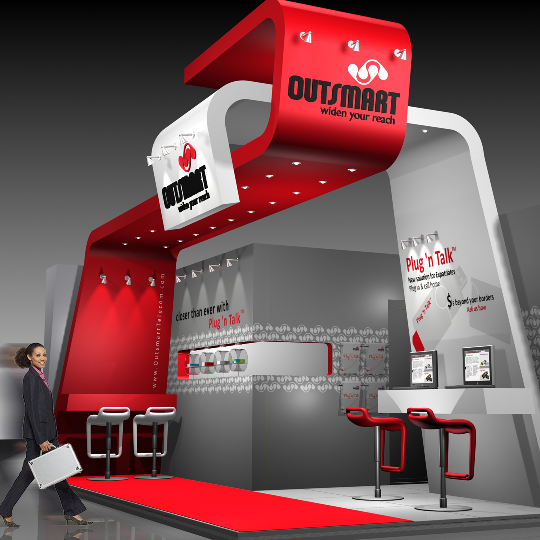 Physical + Digital Experience
3D Exhibition
Exhibition work connecting brand identity, spatial planning, interactive kiosks, product displays, and service conversations.
Physical + Digital Experience
3D Exhibition
Exhibition work connecting brand identity, spatial planning, interactive kiosks, product displays, and service conversations.