
Role
Exhibition and spatial design
3D Exhibition Design
Spatial UX · Brand Experience · Interactive Kiosks · Service Touchpoints
Exhibition and spatial design
Concept development, spatial planning, sketching, 3D modeling, and exhibition design
Translated brand identity considering physical 3D exhibition space with interactive digital touchpoints
Product discovery, digtial and in person interactions, service support, and client connections
Kiosks, touchscreens, product displays, sales areas, service seating
Overview
This work was completed during my architecture and exhibition-design work at Barzilai Design Studio. I contributed to concept development, sketches, spatial planning, 3D modeling, brand elements, and exhibition graphics for international audiences.
Translating a brand identity into an experience system that guides people through physical spaces, digital exploration points, product information, and conversation areas.
The Design Challenge
The exhibition needed to communicate the company's identity, present products clearly, support digital exploration, and create space for both quick visitor interactions and longer sales or service conversations.
The work combined the concerns of spatial design and UX: visibility, wayfinding, interaction points, information hierarchy, and the transition from self-directed exploration to human conversation.
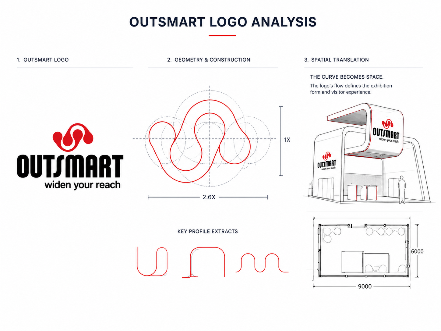
From Logo to Spatial Concept
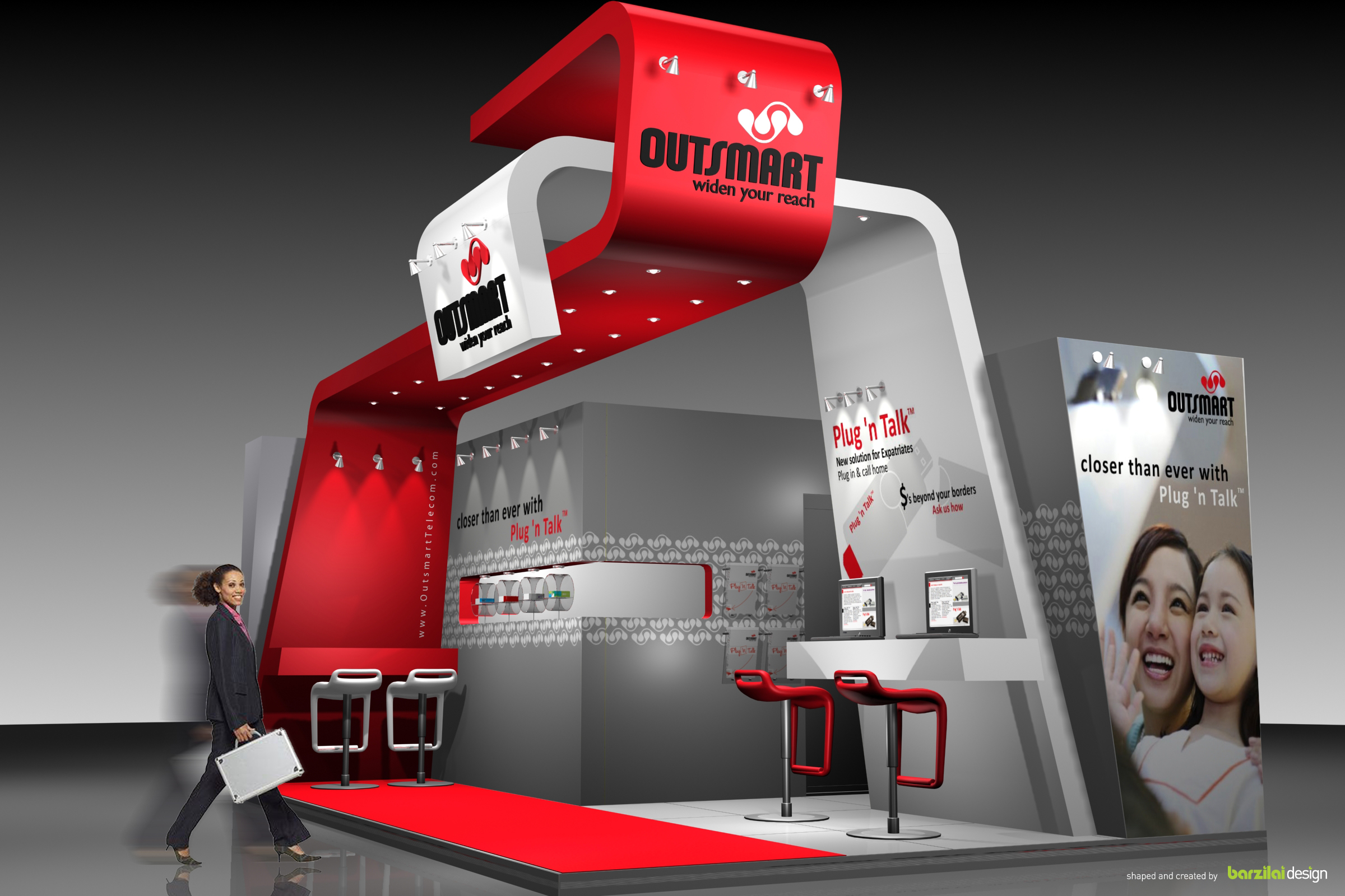
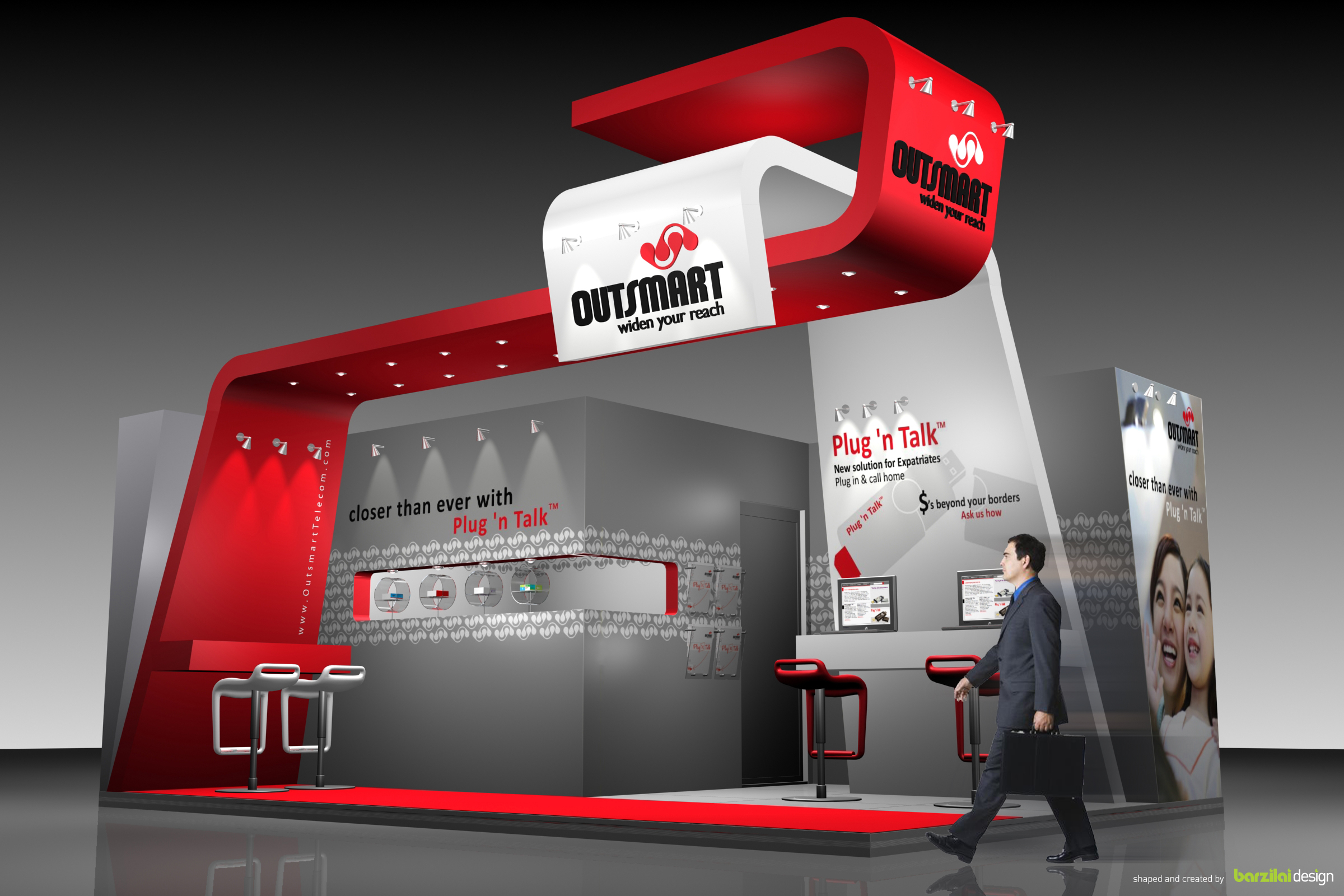
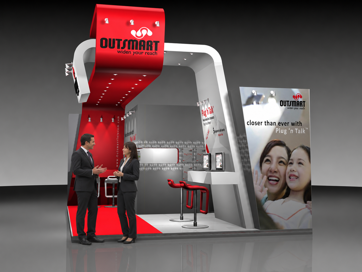
The Outsmart exhibition concept connected brand identity, spatial form, product information, interactive screens, and conversation areas into one visitor experience for 3GSM World Congress in Barcelona, Spain.
Study the visual form of the mark: curves, repeated shapes, angles, proportions, and the red-and-white brand rhythm.
Extract shapes and test how a flat identity could become walls, openings, overhead forms, and display moments.
Translate the selected geometry into a booth footprint, structural volume, product wall, and service counter.
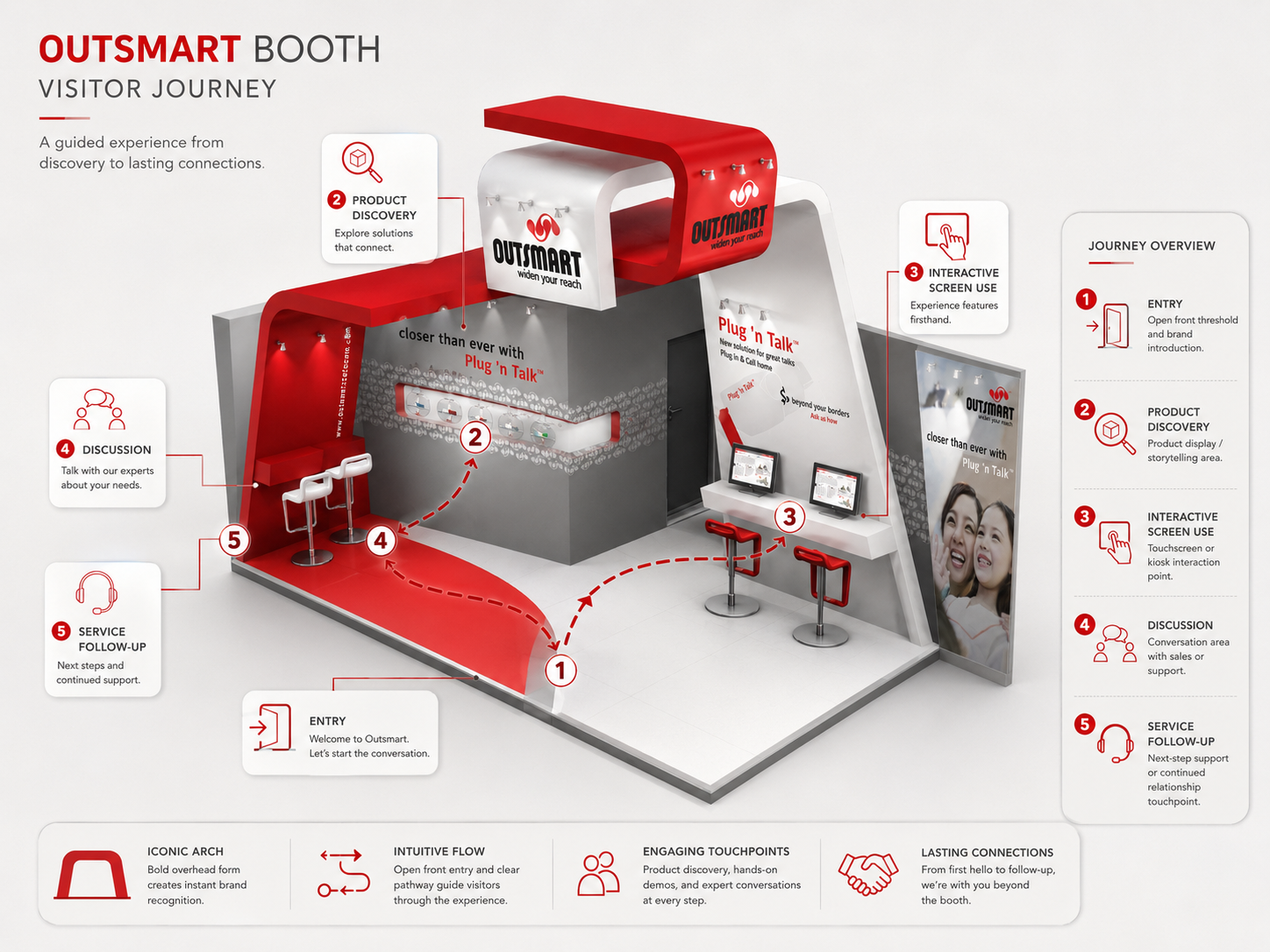
Plan how people enter, scan, explore product information, use screens, sit, discuss, and continue the relationship.
The form organized movement from the open aisle into product exploration, touchscreens, and seated conversations.
Large brand surfaces worked from a distance, while product graphics, displays, and screen content supported closer inspection.
Kiosks, touchscreens, product walls, and service seating were planned as connected parts of the same visitor journey.
Designing the Visitor Journey
Visitors could read the brand from the aisle, enter the space through a clear visual path, explore products through displays and screens, then move into sales or service conversations when they needed more context.
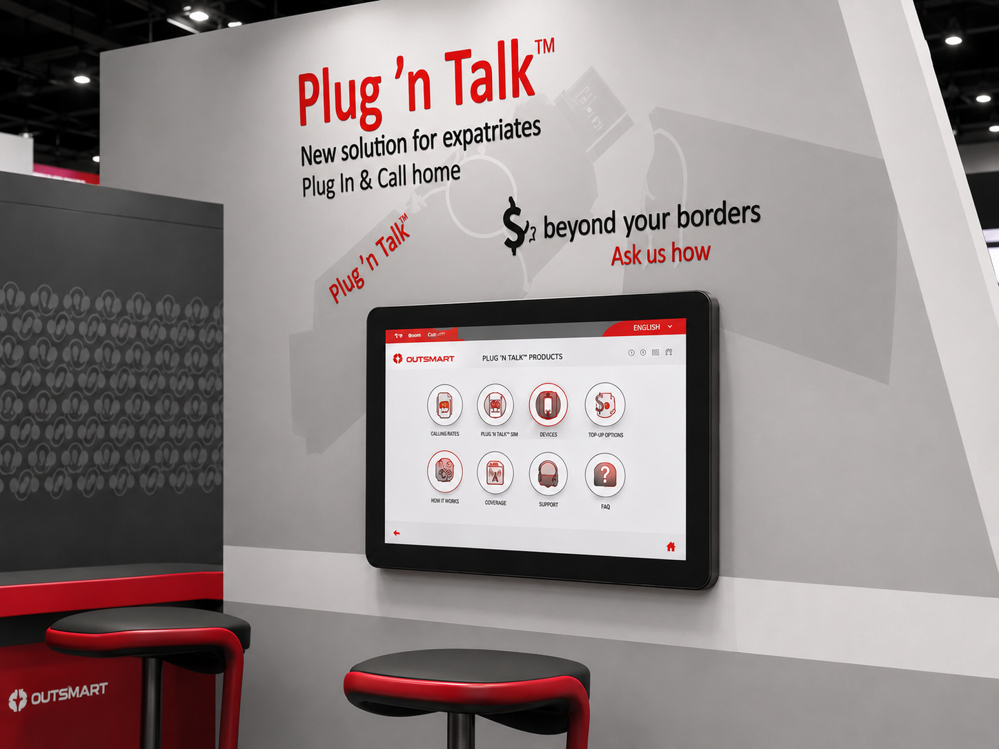
Touchscreens, kiosks, and interactive product information extended the physical booth into a self-guided information layer.
Product displays supported quick scanning and self-directed discovery before a visitor needed staff support.
Touchscreens and kiosks let visitors access additional product information at the point of interest.
Sales seating and counters created natural places for deeper conversations after initial exploration.
Service areas allowed visitors to ask questions, continue the relationship, and move from interest to next steps.
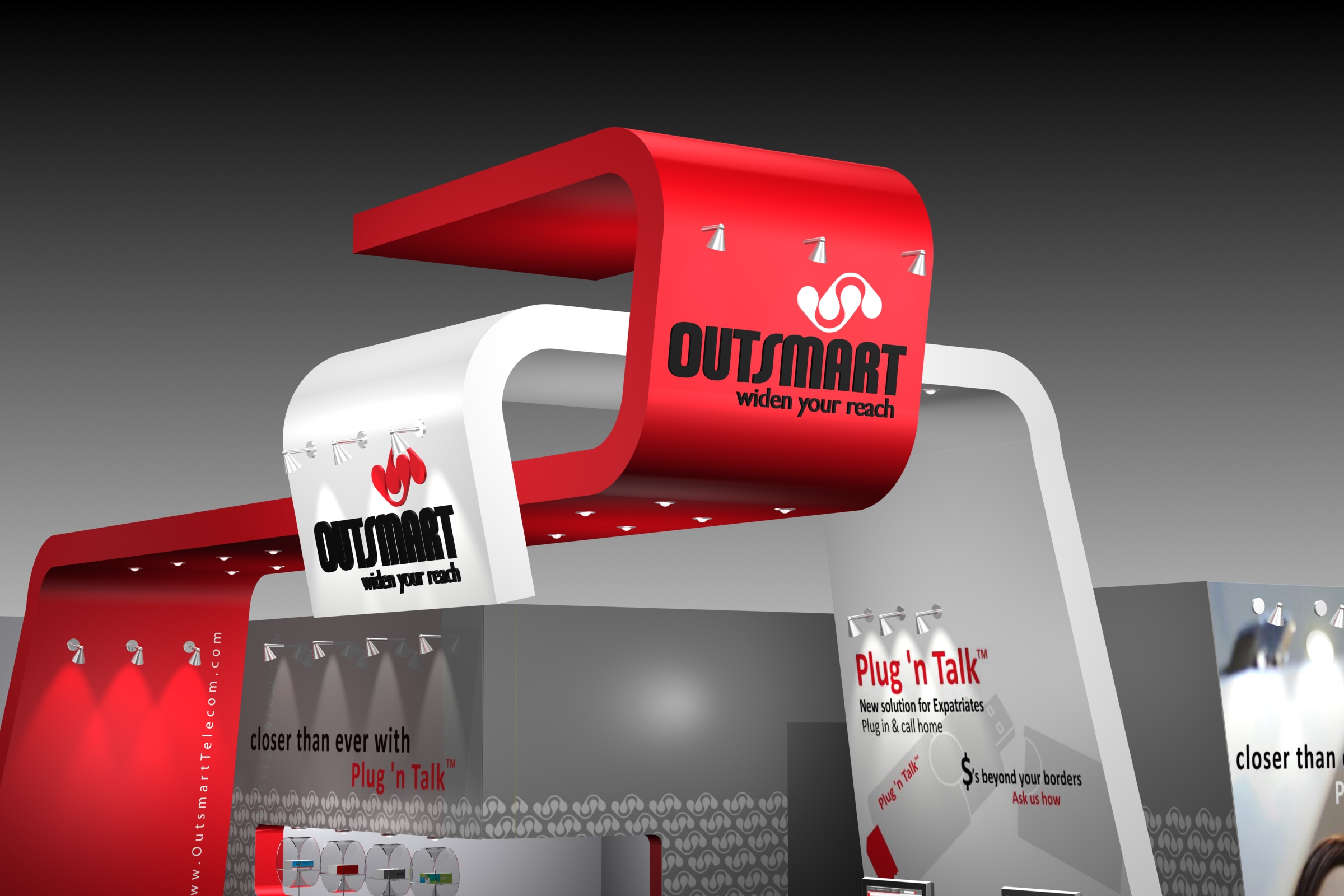
The strong overhead form and repeated brand geometry made the booth recognizable within a dense exhibition hall.
Design Decisions and Outcome
The company mark informed the booth's visible shape, not just the graphics applied to it.
Screens and kiosks supported product exploration at the moment visitors were already looking, touching, and asking questions.
Conversation areas were planned as part of the experience, giving sales and support interactions a clear place in the journey.
Kramer Electronics Exhibition
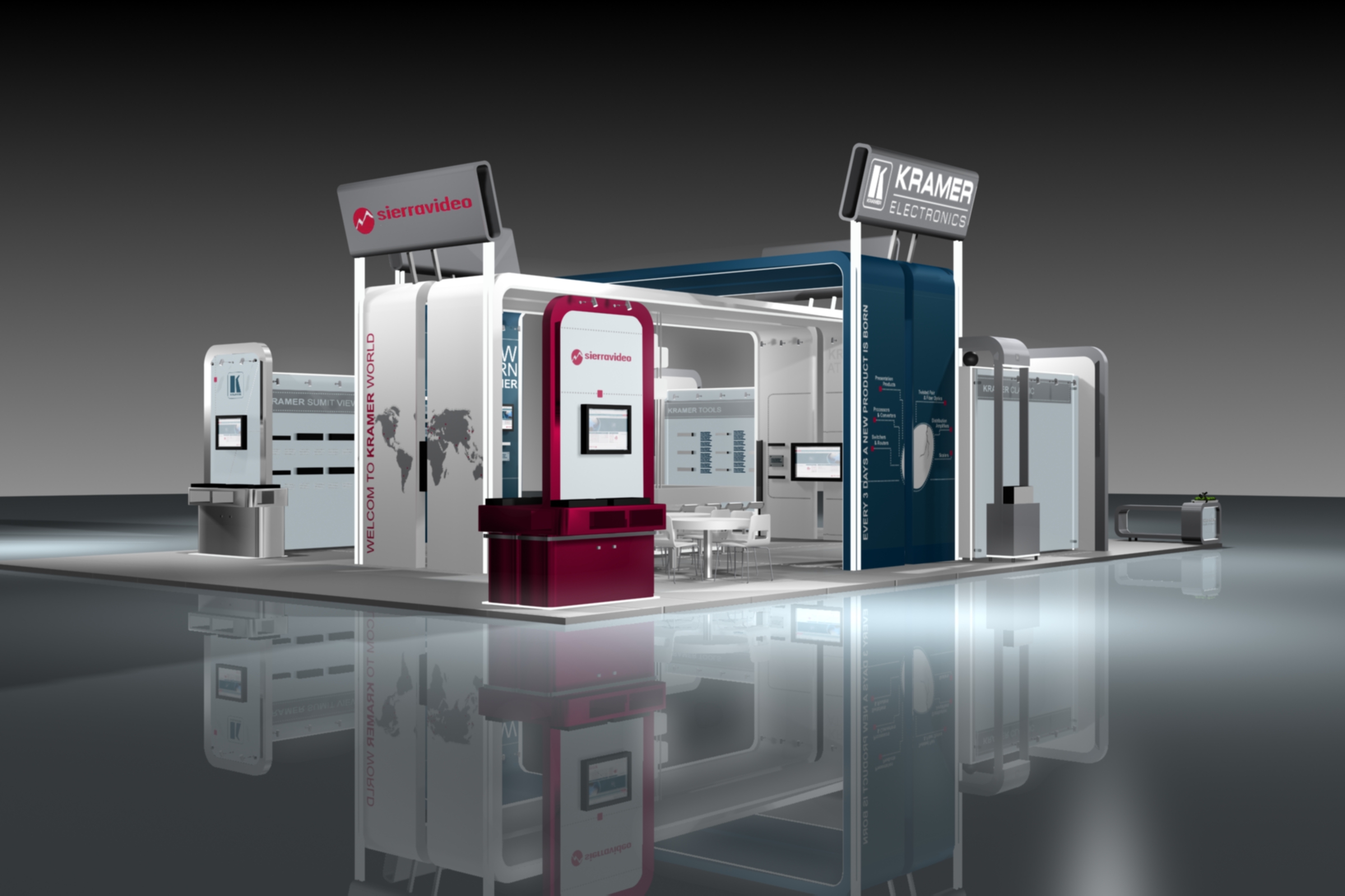
Kramer Electronics had a large product portfolio and needed a portable exhibition environment that could organize multiple departments while staying open, visible, and useful for business visitors.
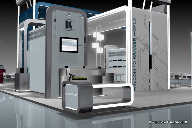
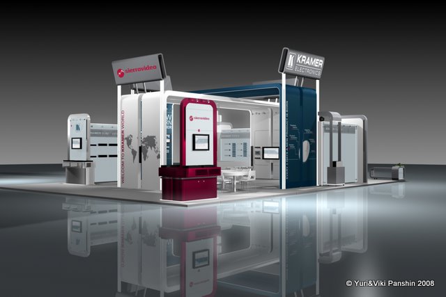
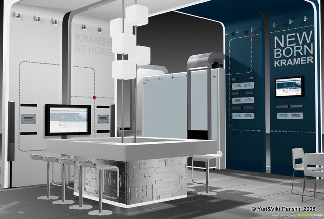
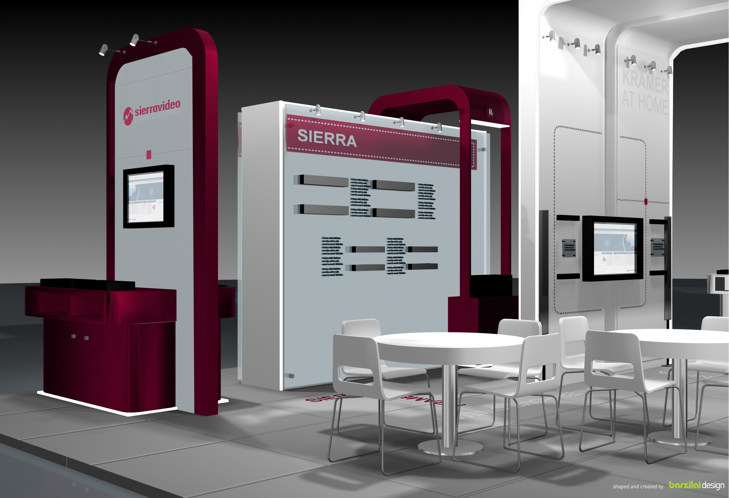
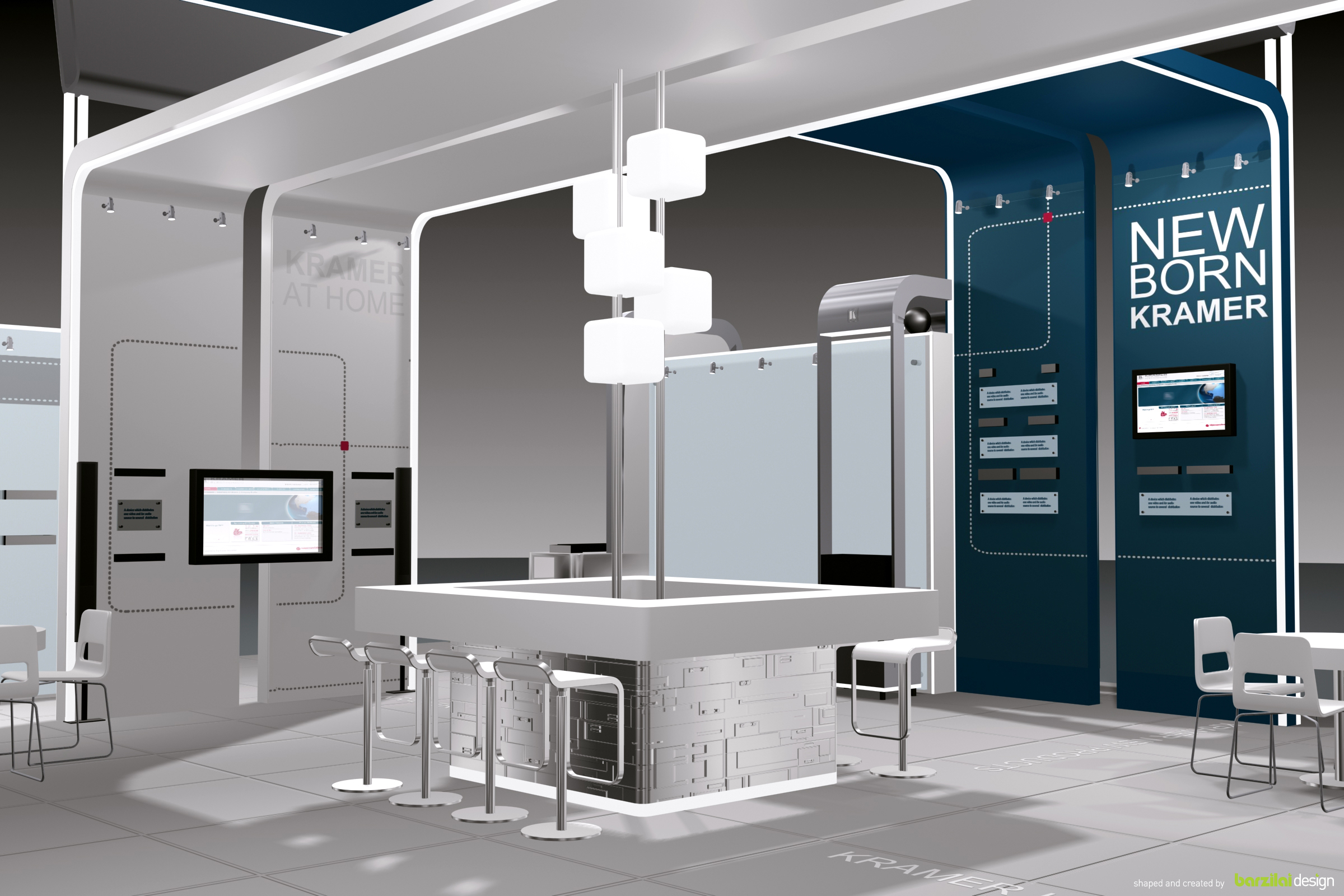
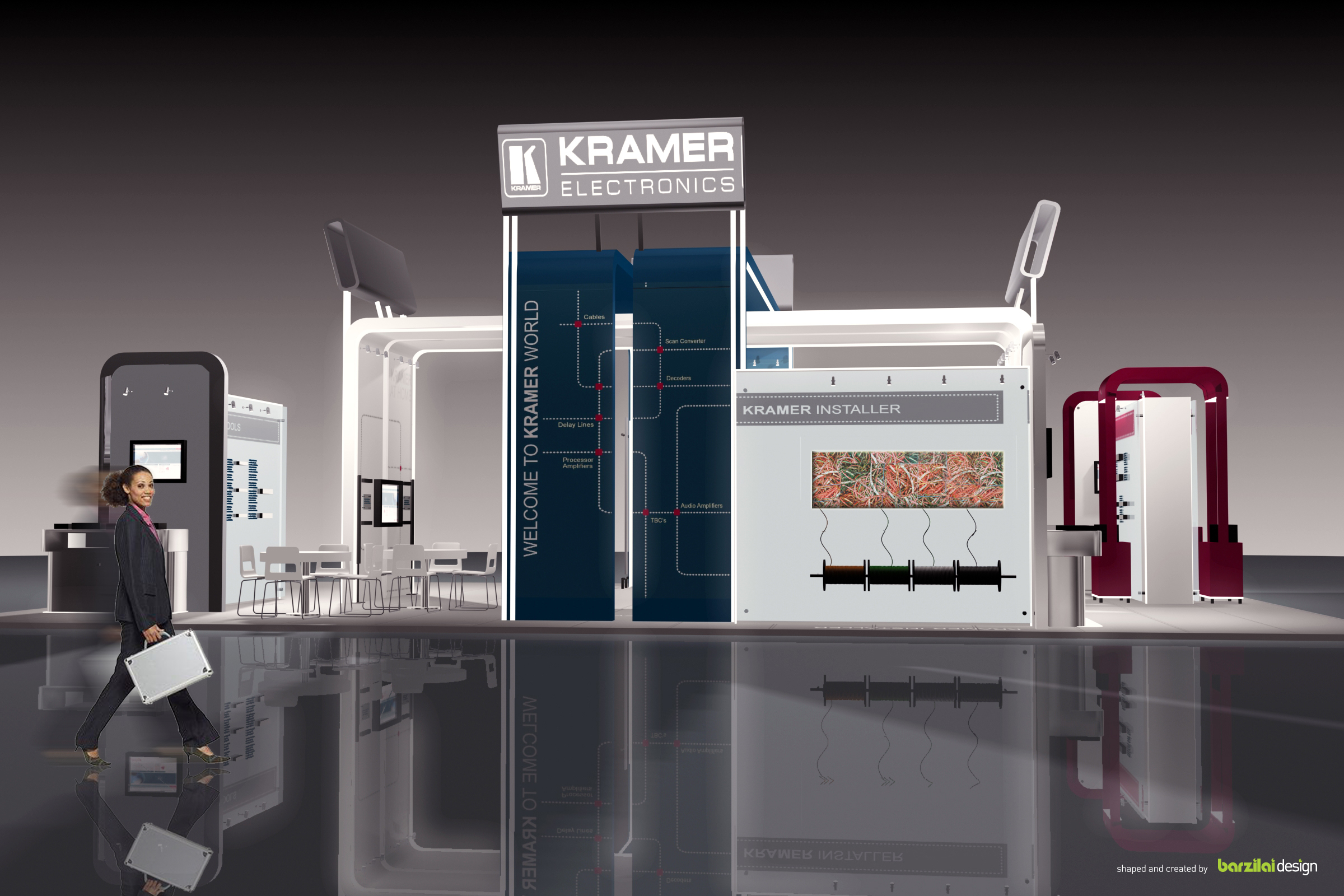
Designed within Barzilai Design Studio, the concept included Kramer Tools, Kramer Home, new collections, a meeting area, a welcome stand, a central bar, screens on multiple sides, hidden storage, and a dedicated area for the SierraVideo sub-brand.
The Design Challenge
The challenge was to design a booth that could be disassembled and transported while still feeling like a cohesive branded environment. It needed to attract visitors, support product demos, hide storage, and create comfortable places for business conversations.
Developing the Spatial System
The concept balanced a clear central gathering point with perimeter product zones, visible digital displays, and branded thresholds that helped visitors understand where to go next.
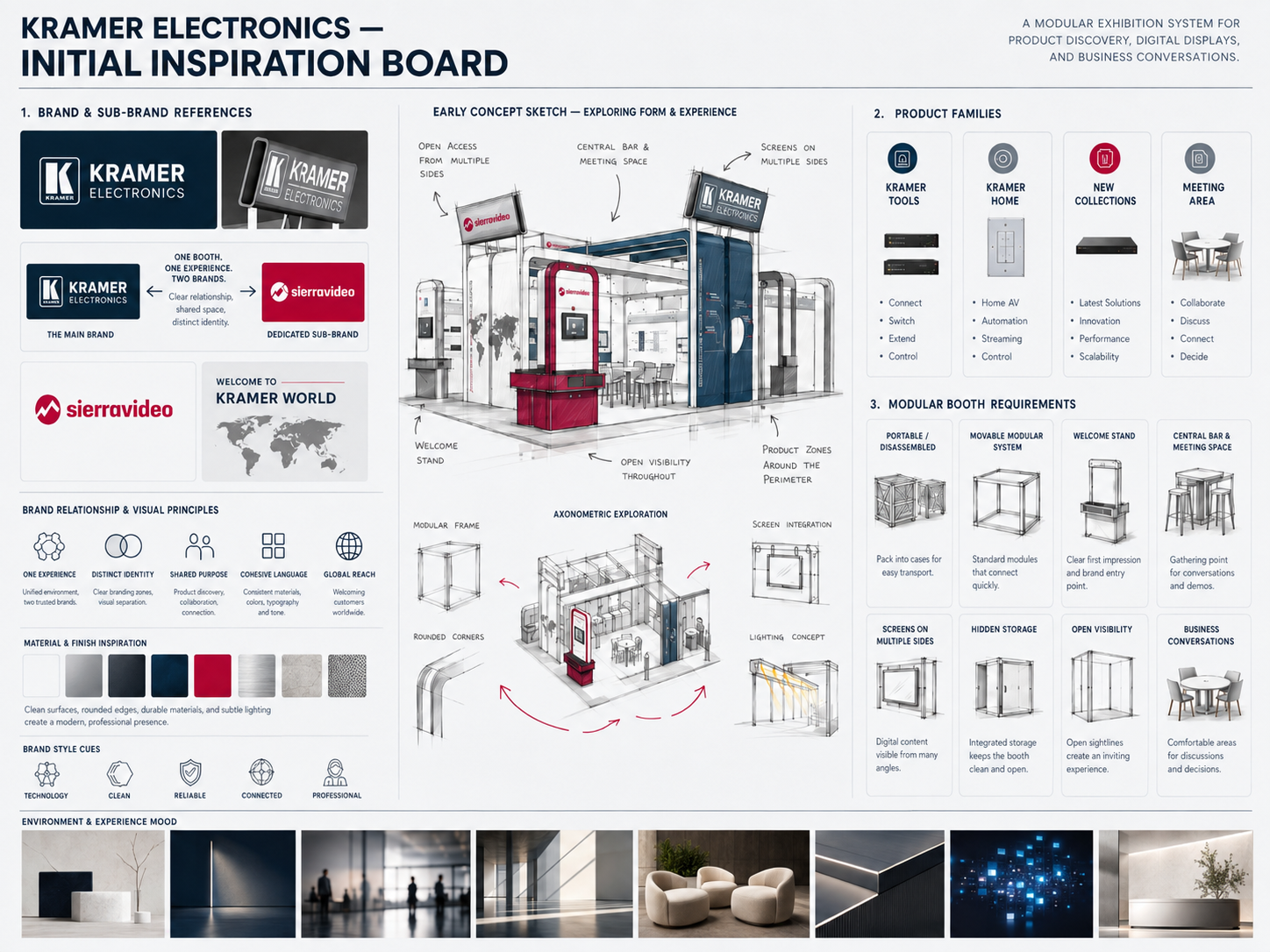
Start from Kramer brand requirements, product families, and the need for a portable exhibition structure.
Explore how departments, screens, storage, seating, and the SierraVideo area could fit into one navigable layout.
Separate product families while keeping sightlines open from the central meeting and bar area.
Invite people in from multiple sides, let them discover products independently, then guide them toward demos and discussions.
Final Spatial Concept
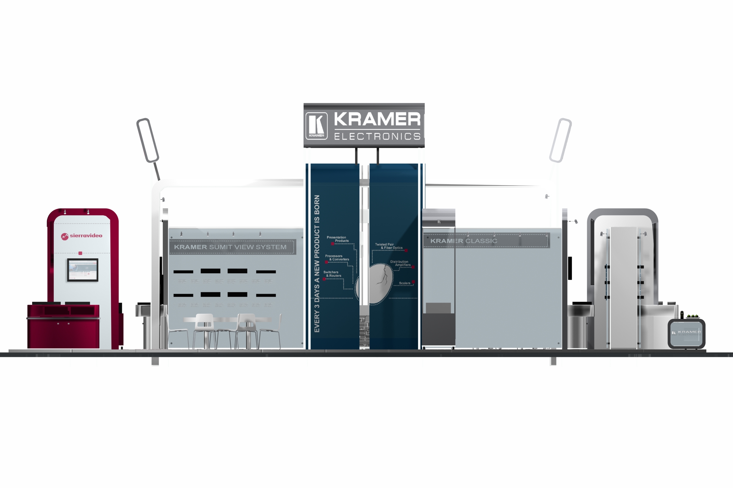
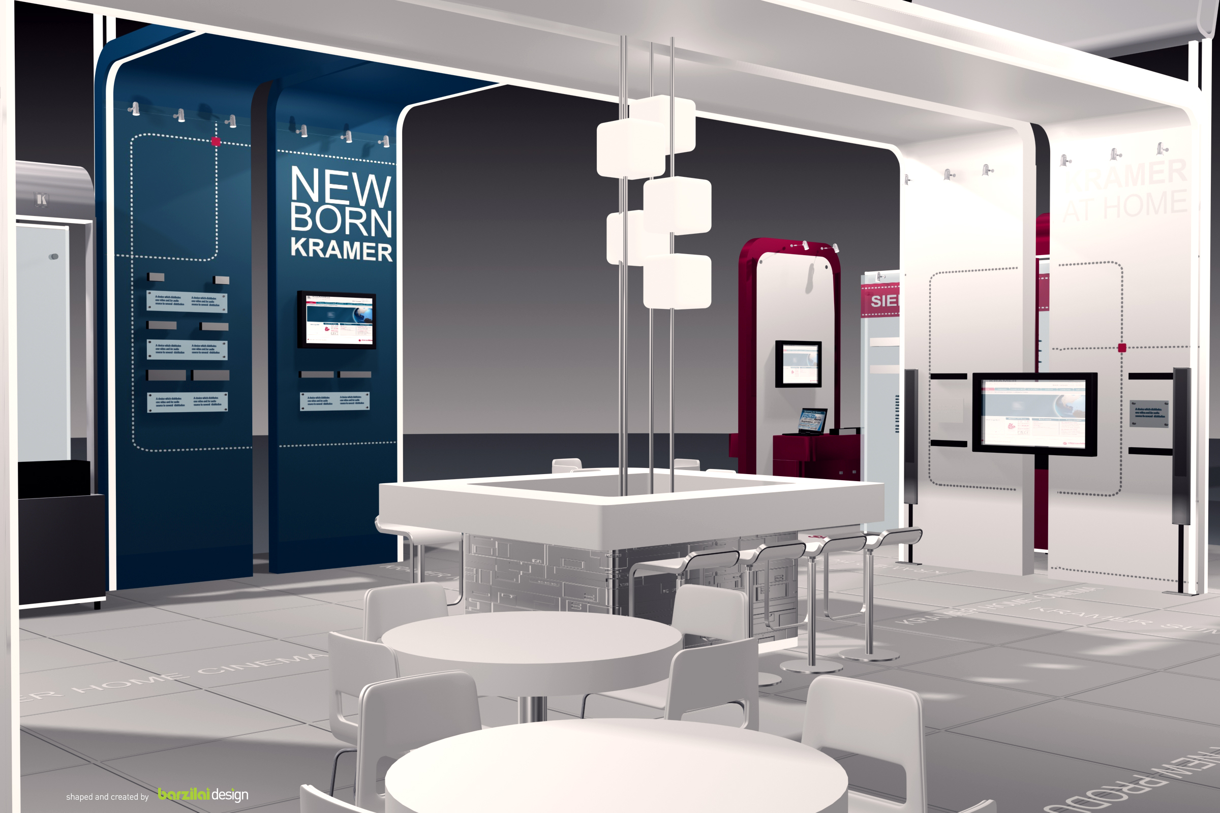
Together, the views show the exhibition as a product interface: each side exposes different information, screens, departments, and entry points while the center remains available for conversation.
OTHER PROJECTS
 Interaction Design
WBD HUD
A dense game HUD system focused on navigation clarity, tile maps, accessibility, and reusable patterns.
Interaction Design
WBD HUD
A dense game HUD system focused on navigation clarity, tile maps, accessibility, and reusable patterns.
 Interaction Design
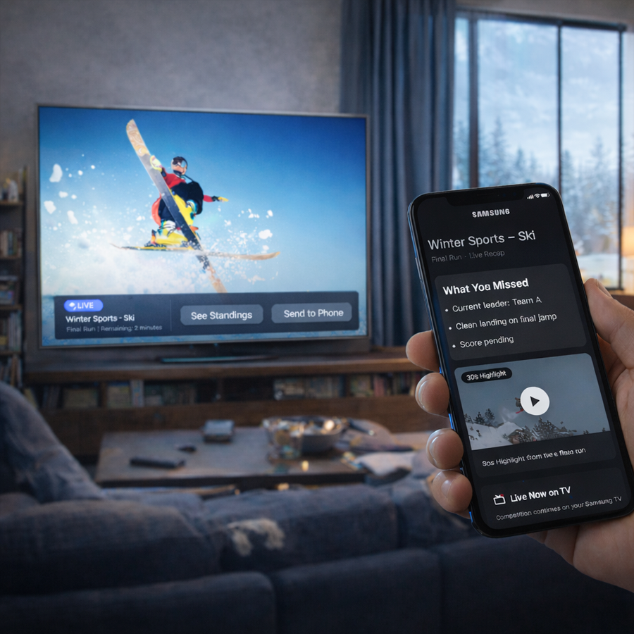
Smart TV UX
Visual-first interaction concepts for cross-device TV experiences and re-engagement flows.
Interaction Design
Smart TV UX
Visual-first interaction concepts for cross-device TV experiences and re-engagement flows.
 Accessibility
Dark Theme
BlackBerry dark and light theme guidelines shaped around contrast, readability, and inclusive UX.
Accessibility
Dark Theme
BlackBerry dark and light theme guidelines shaped around contrast, readability, and inclusive UX.
 Branding
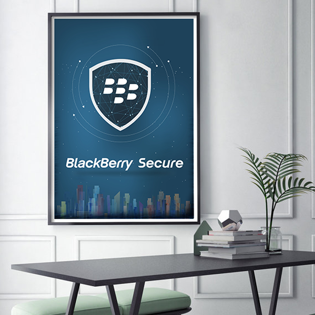
BlackBerry Brand
Packaging and brand marketing guidelines across product, print, and visual identity touchpoints.
Branding
BlackBerry Brand
Packaging and brand marketing guidelines across product, print, and visual identity touchpoints.
 Design Systems
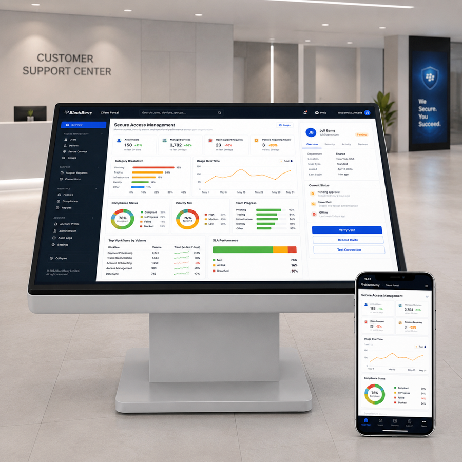
Design System
Enterprise web UI guidelines for dashboards, components, empty states, and accessibility rules.
Design Systems
Design System
Enterprise web UI guidelines for dashboards, components, empty states, and accessibility rules.
 Illustration
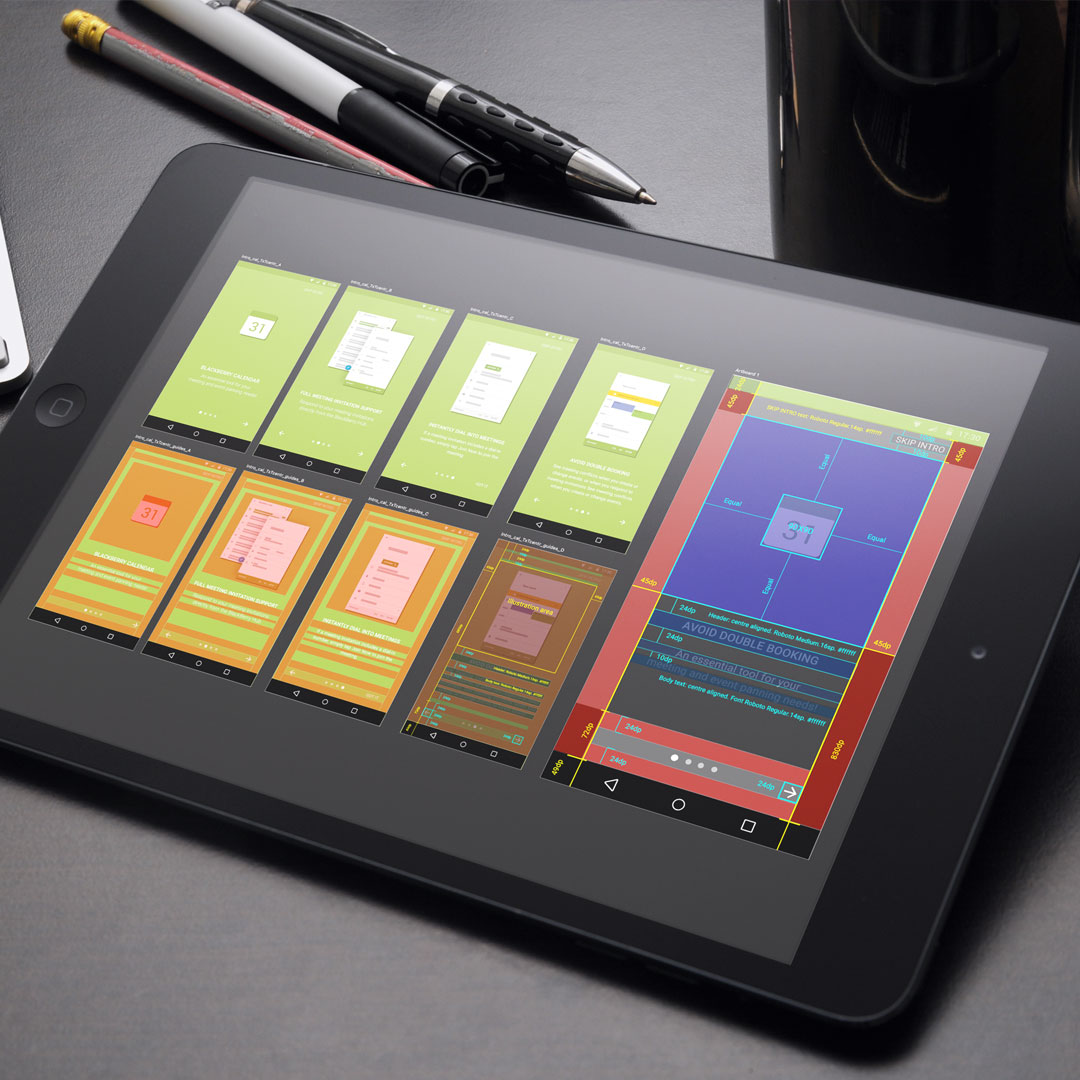
Empty Data
Onboarding and empty-state illustrations that guide users through first-use product moments.
Illustration
Empty Data
Onboarding and empty-state illustrations that guide users through first-use product moments.
 Branding
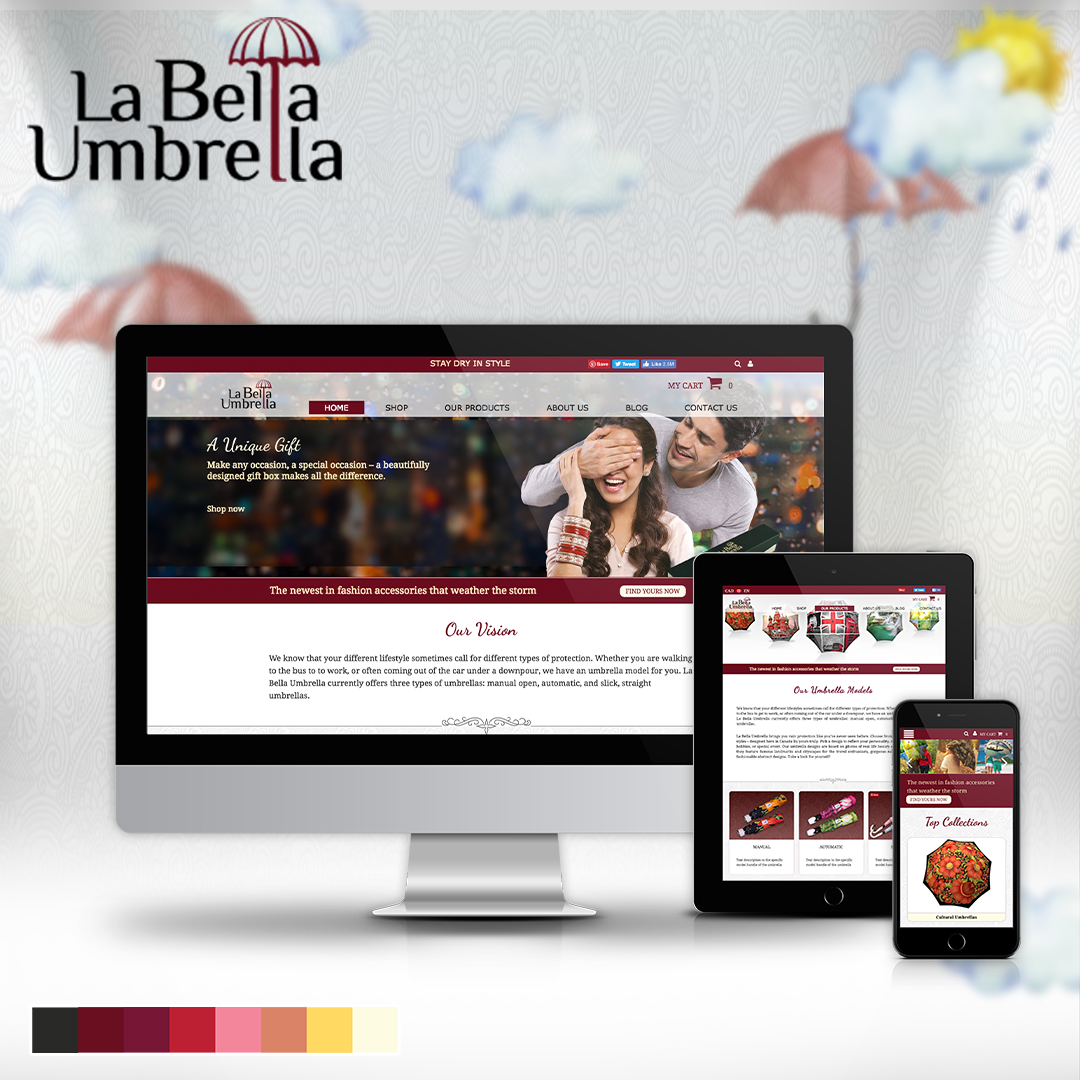
Labella Umbrella
A responsive online store direction combining brand storytelling, layouts, and product imagery.
Branding
Labella Umbrella
A responsive online store direction combining brand storytelling, layouts, and product imagery.
 UX Research
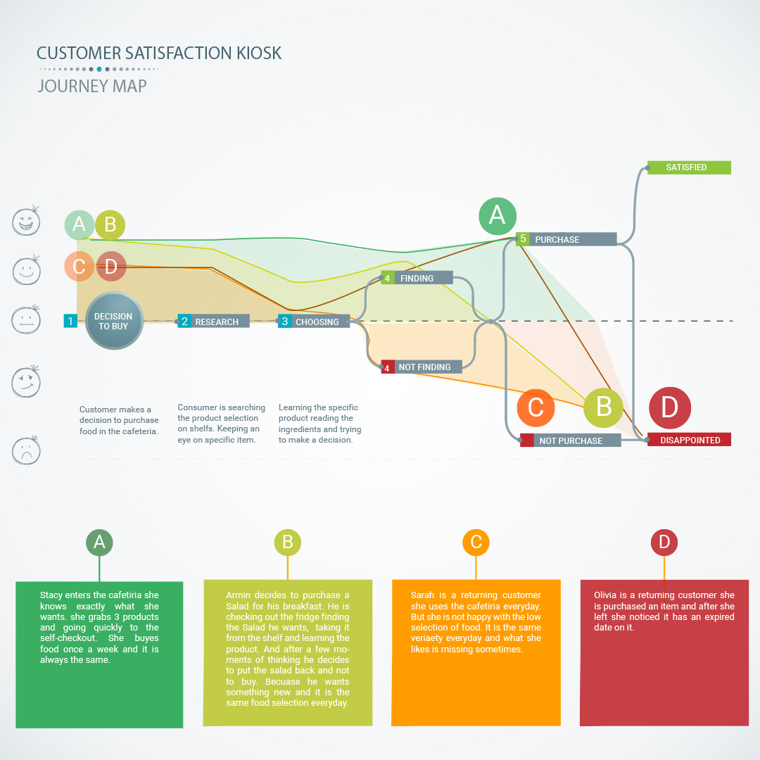
Customer Kiosk
A service kiosk and app concept for measuring customer satisfaction and operational feedback.
UX Research
Customer Kiosk
A service kiosk and app concept for measuring customer satisfaction and operational feedback.
 Interaction Design
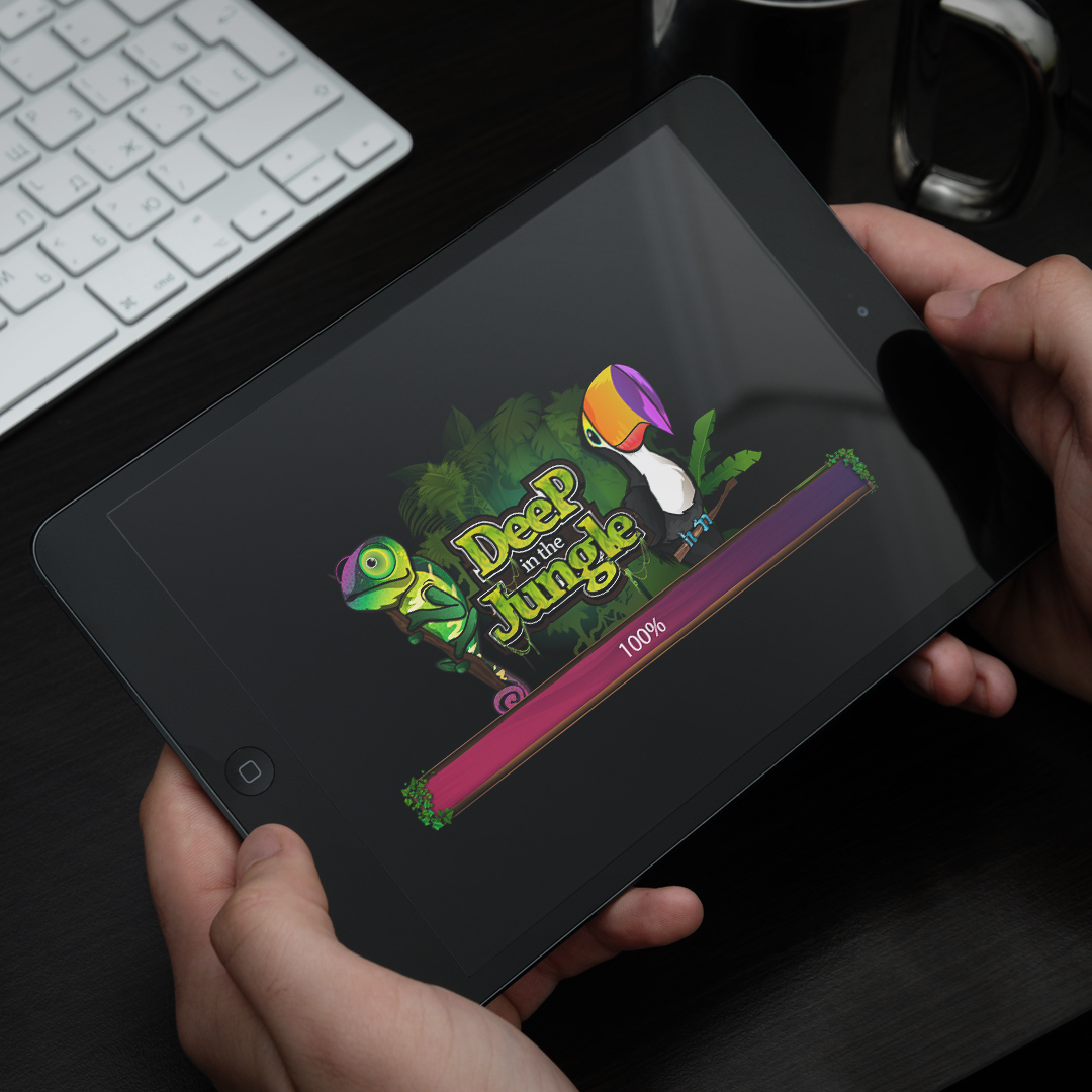
Wizits Game
A mobile game interface with character art, themed screens, animation, and playful UX systems.
Interaction Design
Wizits Game
A mobile game interface with character art, themed screens, animation, and playful UX systems.
 Interaction Design
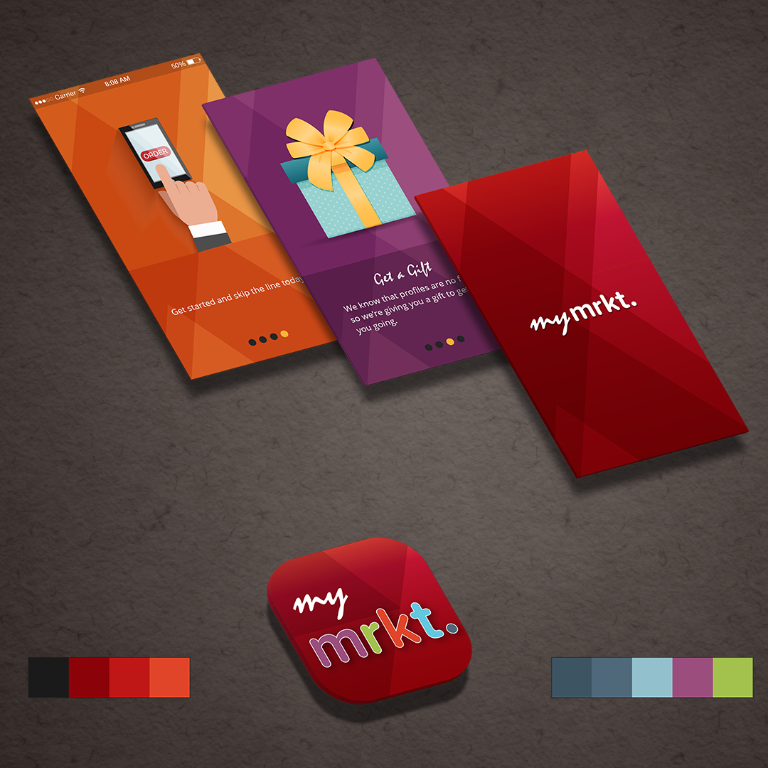
TJX Market
A multi-brand retail app concept exploring navigation, product discovery, and mobile shopping.
Interaction Design
TJX Market
A multi-brand retail app concept exploring navigation, product discovery, and mobile shopping.
 Branding
SharpLight
Beauty spa campaign materials spanning print design, promotional layouts, and branded visuals.
Branding
SharpLight
Beauty spa campaign materials spanning print design, promotional layouts, and branded visuals.
 Branding
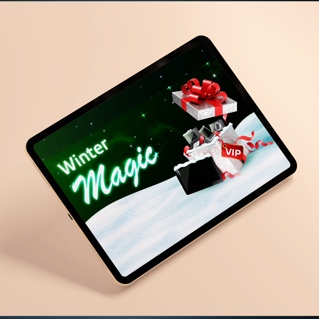
Bwin Promo
A festive gaming promotion with campaign concepts, interface graphics, and seasonal art direction.
Branding
Bwin Promo
A festive gaming promotion with campaign concepts, interface graphics, and seasonal art direction.
 Data Visualization
Power Center
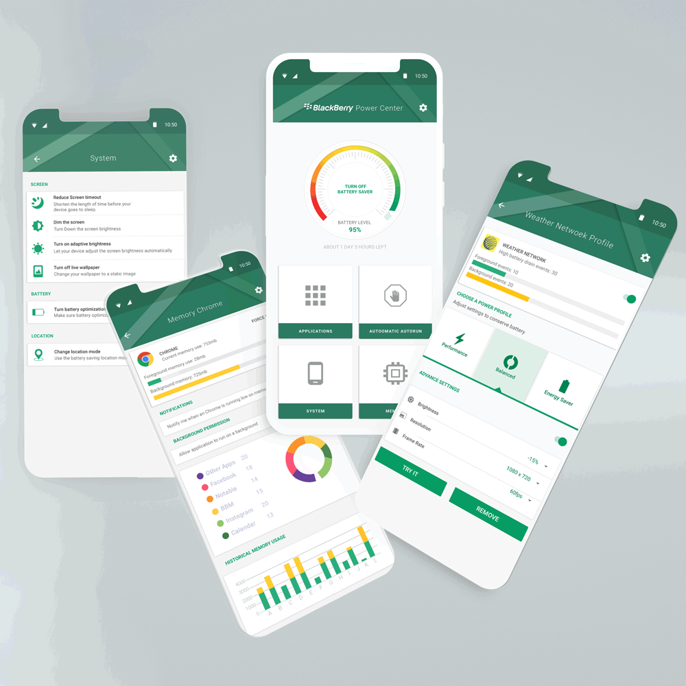
Battery app interaction design with information architecture, visual states, and usage insights.
Data Visualization
Power Center
Battery app interaction design with information architecture, visual states, and usage insights.
 Illustration
Interior Art
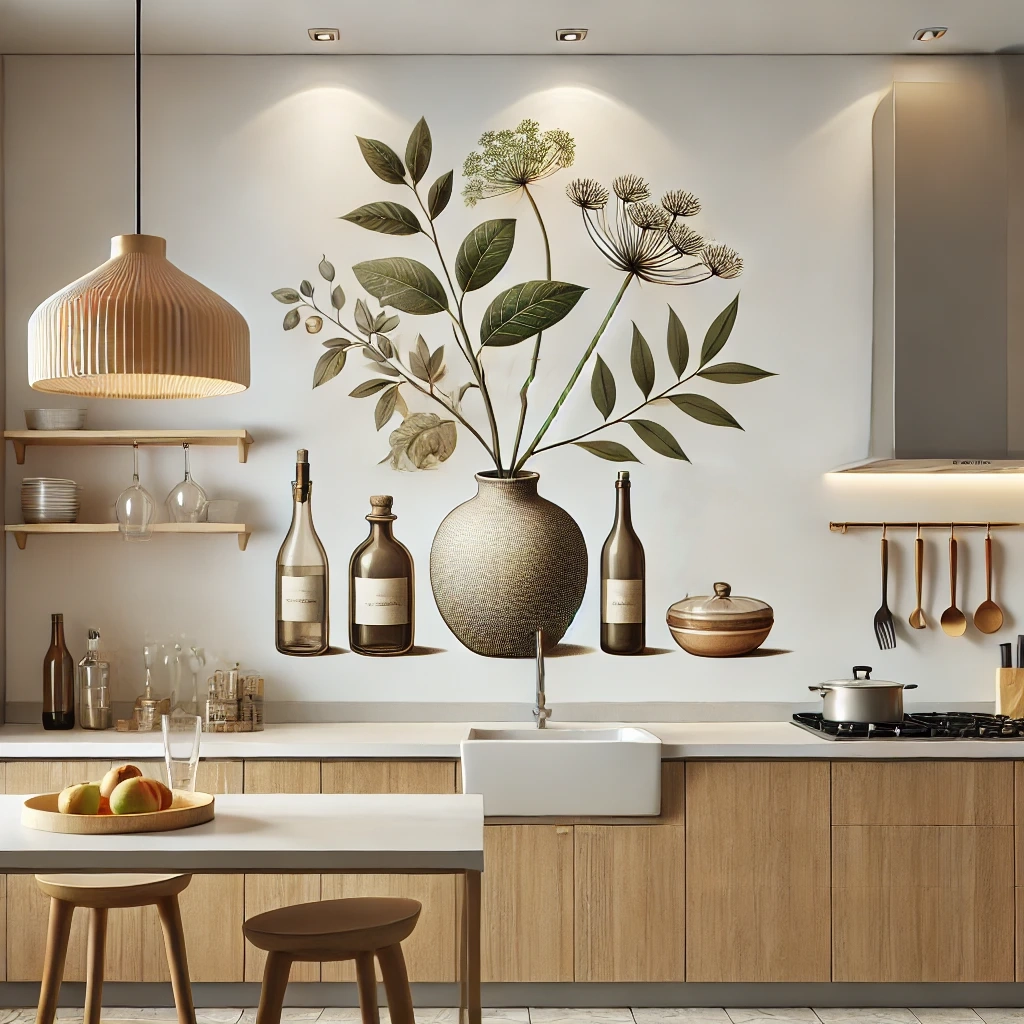
Interior and architectural illustrations using 3D composition, rooms, textures, and visual mood.
Illustration
Interior Art
Interior and architectural illustrations using 3D composition, rooms, textures, and visual mood.