Now that the market has completely changed, many businesses are moving online. Making it easier to discover and purchase products from anywhere in the world. However, that means a website or an app is the first interaction between a seller and a potential customer. It’s not just about having an e-commerce website or an online shop, but about a virtual relationship between a seller and a potential customer. It is about creating an experience that simplifies the processes, increasing efficiency and keeping customers engaged.
With the explosion of content, sellers need to communicate their information quickly enough, as people are increasingly selective with their choices and look for good products and prices to make sure their money is spent well.
Excellent user experience design is about the proper functionality and accessibility that is easy to use and navigate. Mobile or/and desktop experience that attracts the right people to a Brand and delivers values in a meaningful way.
An appealing, user-friendly design; that attracts and invites users to shop. Making the purchasing process as intuitive as possible.
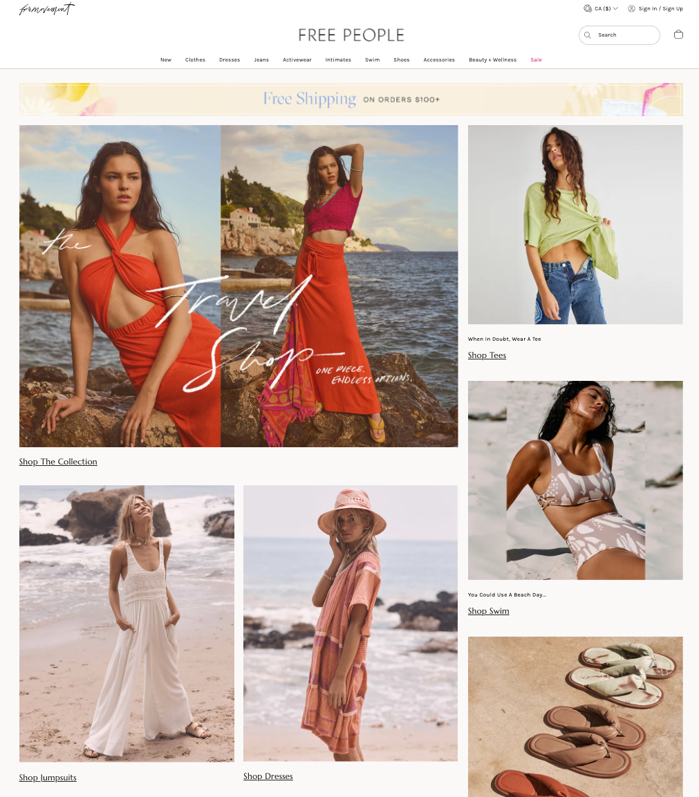
Free people- an online store that offers a simple grid layout, yet stunning large gorgeous photos of clothes and accessories. Without overwhelming with information on sales and prices.
Users can select their favorite style from the menu and at the same time offered inspirational seasonal items accessible directly on the home page.
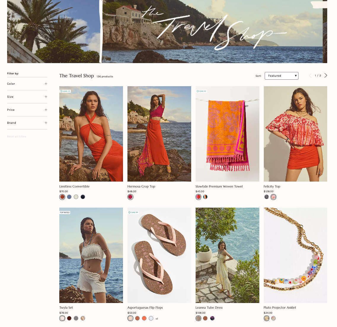
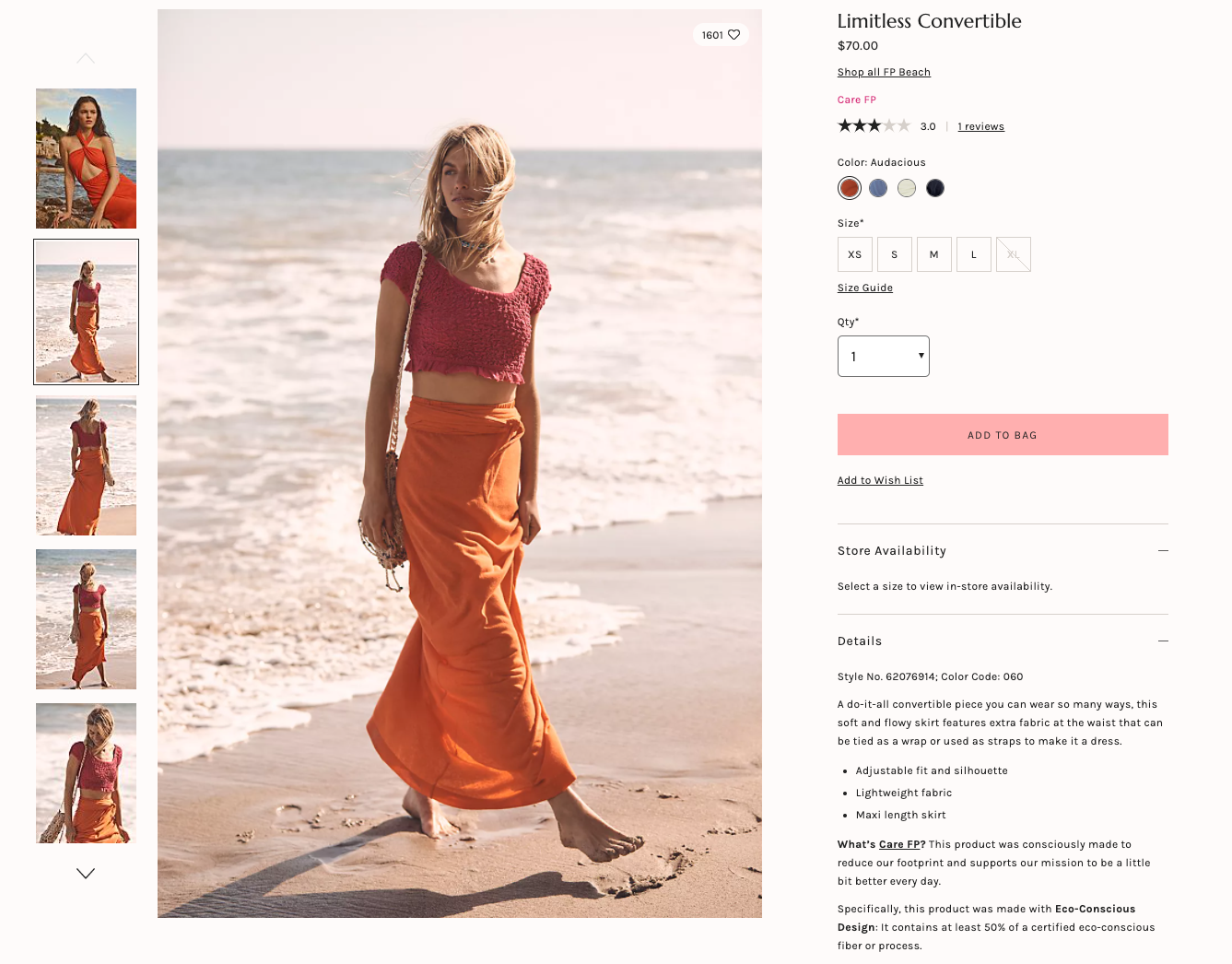
When selecting a specific product, users can choose their preferred size, color and see complete information about the product. Full use of left-hand website navigation with large visuals and magnifying glass to detail the exact materials.
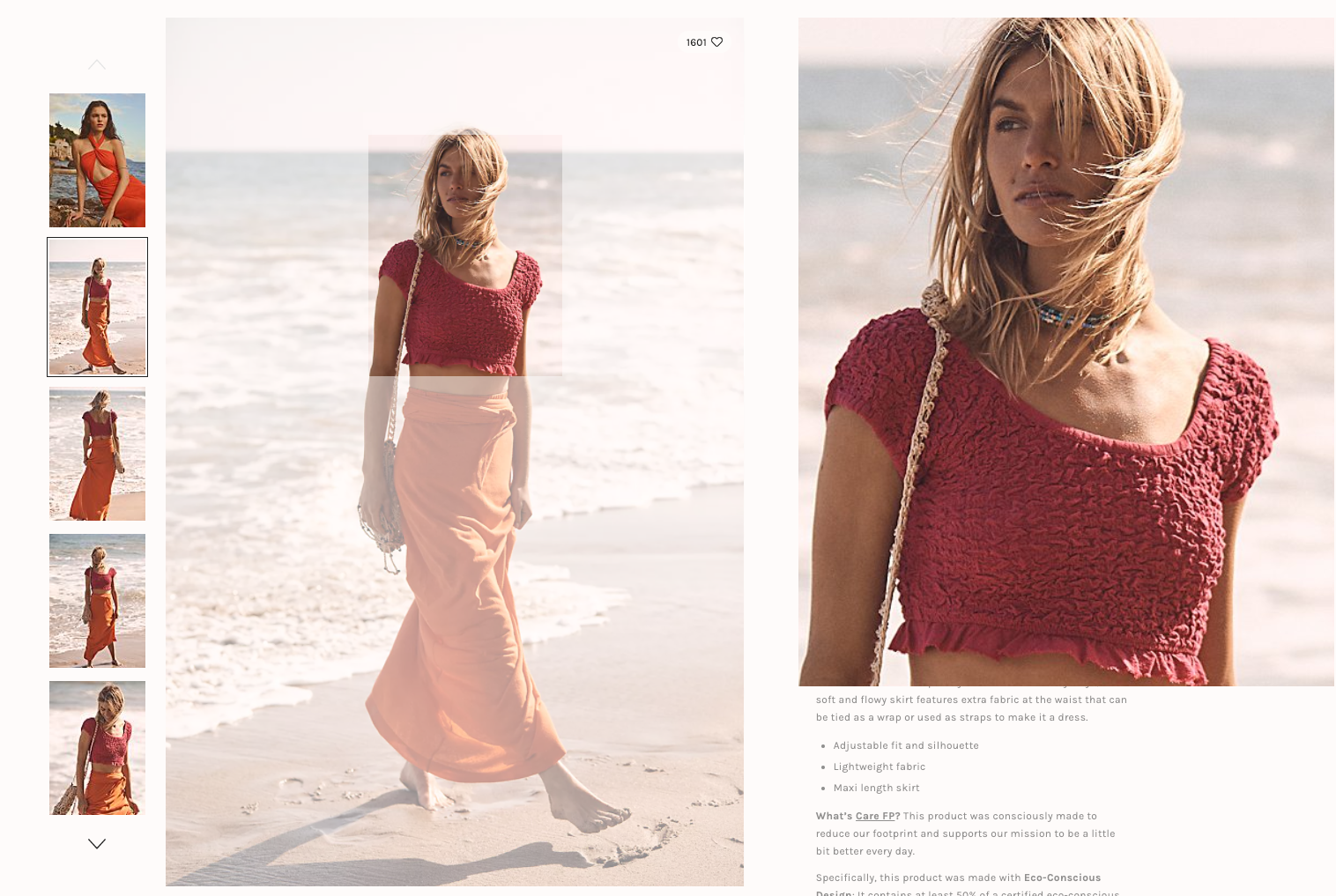
There are so many things to consider when building the perfect website experience. And a set of rules to help create a unified identity when connecting multiple elements of your Brand by defining your colors, your logo and, of course, your typography. Fonts may seem like a small thing, but it has a lot of power you should not underestimate when considering typography. Picking the right font can have a significant impact on the final look and feel of your website. But remember to be consistent throughout all your platforms and printed materials regarding color, style, font sizes, and the hierarchy. Free people used an excellent combination between custom handwritten typography and a modern sans/serif font. Which gives a balanced look that’s both timeless and modern and works perfectly with the freestyle concept.
I love Desigual! It is a simple design layout with a beautiful, large, full-width banner that immediately tells a story as you land on their homepage. The welcome message “Hello Summer” focuses on the new beachwear collection. And the scene of a jumping model on the summer beach background triggers emotions of fun, energetic and positive mood.
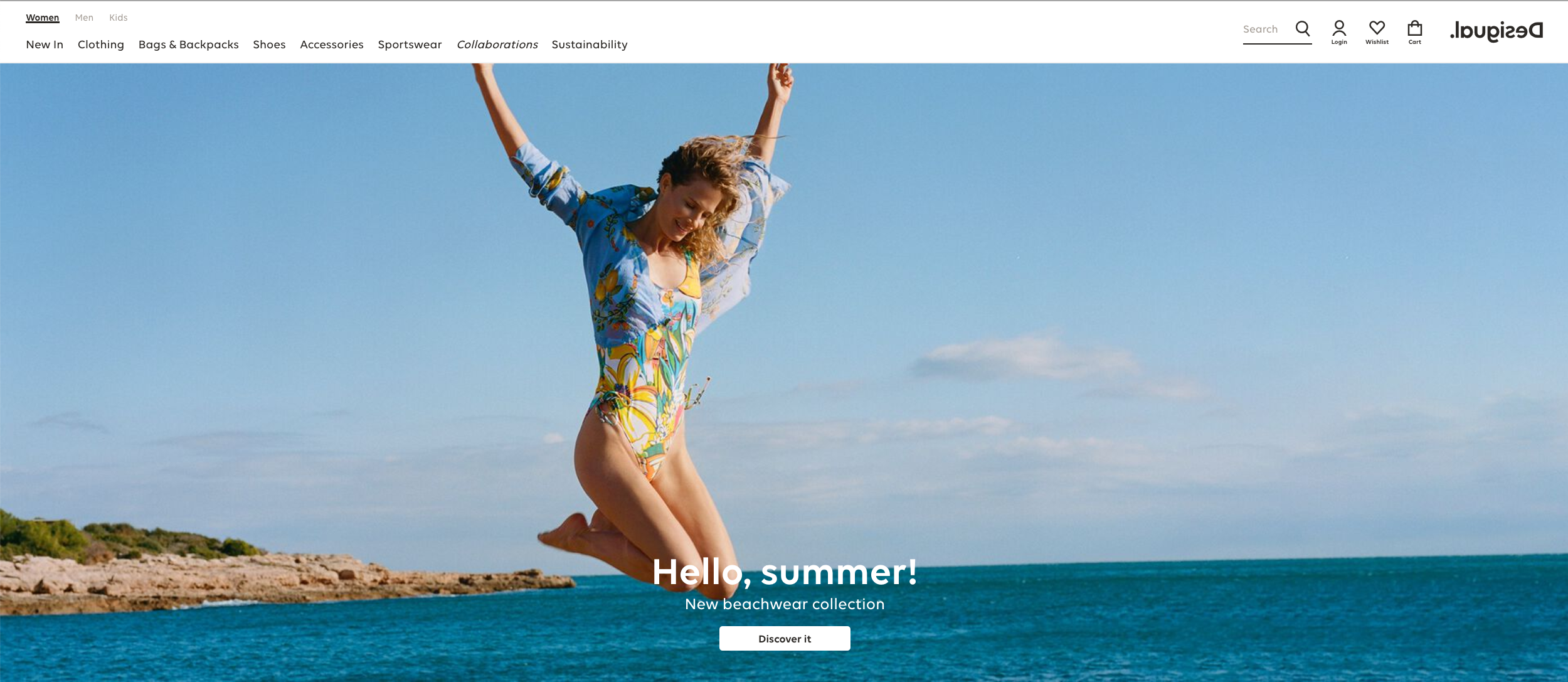
Desigual is a casual clothing brand based in Barcelona (Spain), using appealing and colorful photography with so much energy and style. Their style claims to have a philosophy based on positivity, tolerance, commitment and fun. The fonts are unique yet don’t distract from the products. Clicking on any category leads to a well-organized display page that includes the ability to filter by collection, occasion, or style.
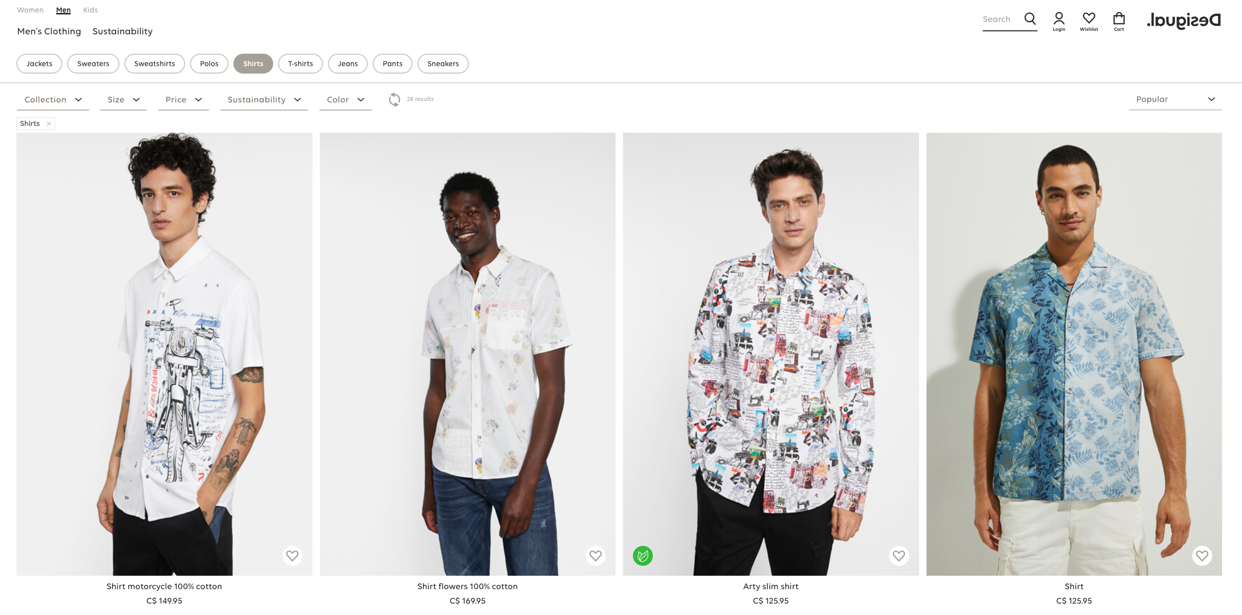
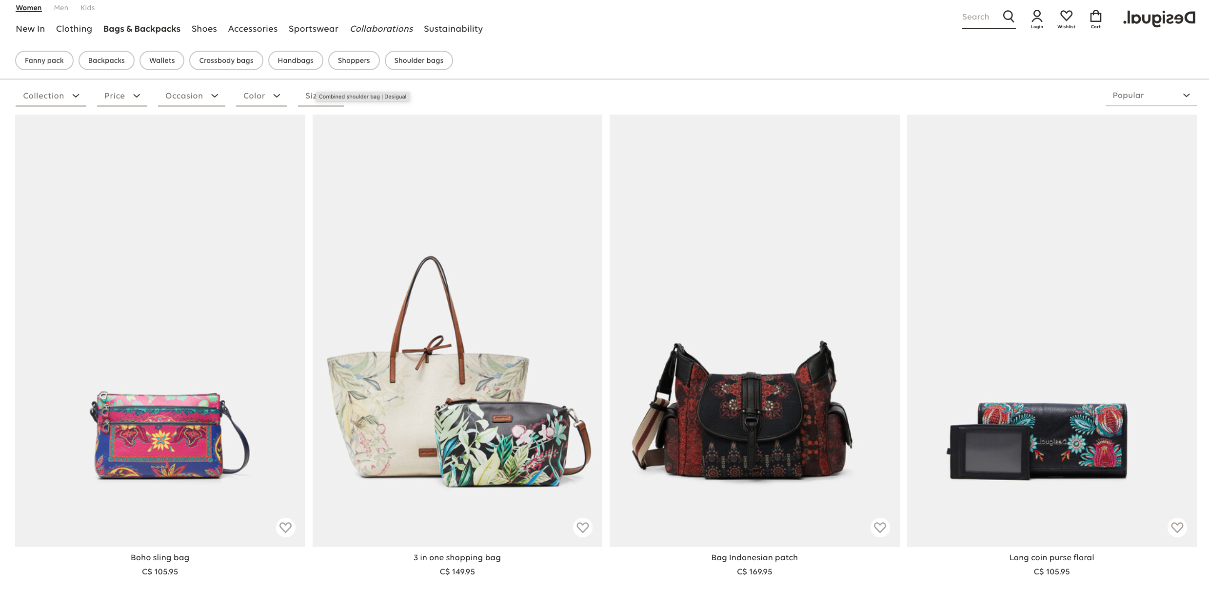
The beautiful, large, full-width slider on the homepage includes high quality photos of the products in use on models, and the rest of the design is quite simple, which puts the focus on this slider display. Desigual is a casual clothing brand based in Barcelona (Spain), appealing and colourful photography with style their Fashion. It claims to have a philosophy based on positivity, tolerance, commitment and fun. The fonts are very unique yet don’t distract from the products. Clicking on any category leads to a well-organized display page that includes the ability to filter by the colour. Every product tells a different story, but the pages and navigation are consistent and straightforward, suit their unique Brand style and naturally promoting their Fashion.
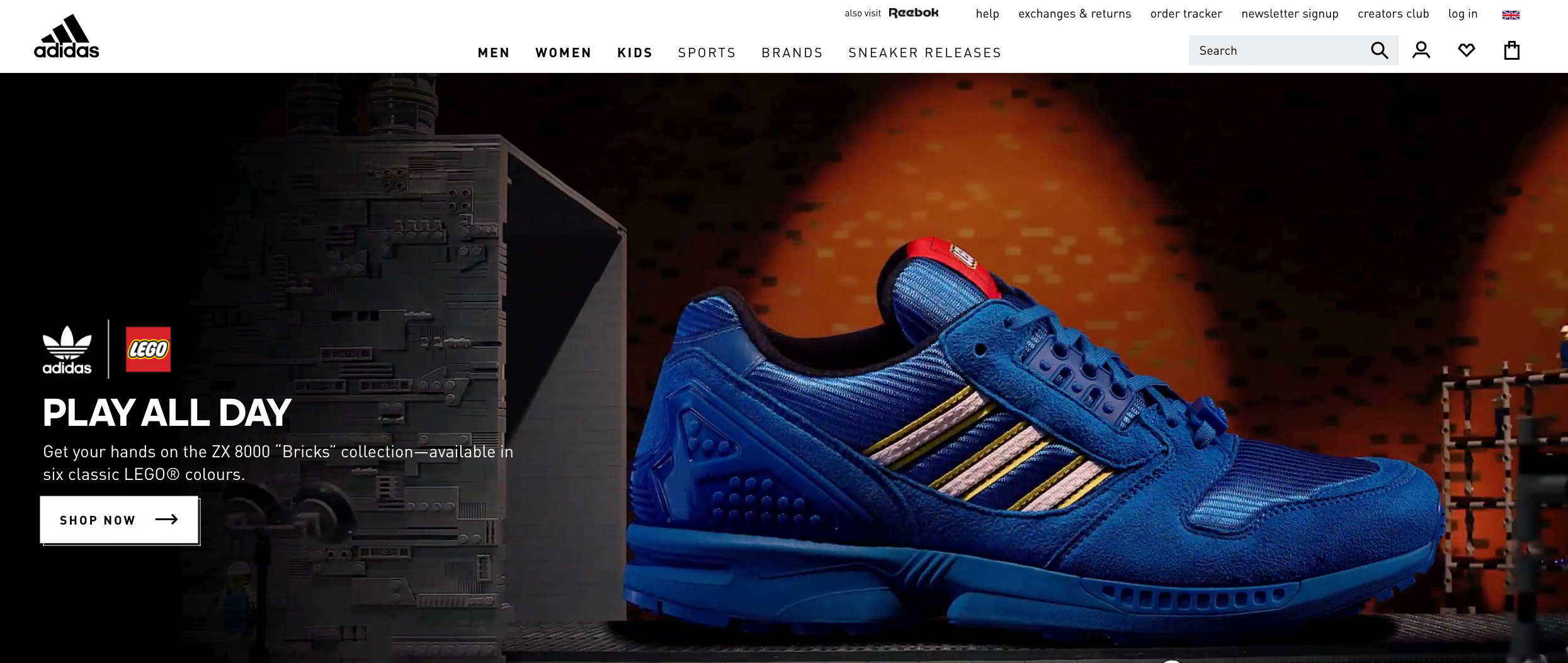
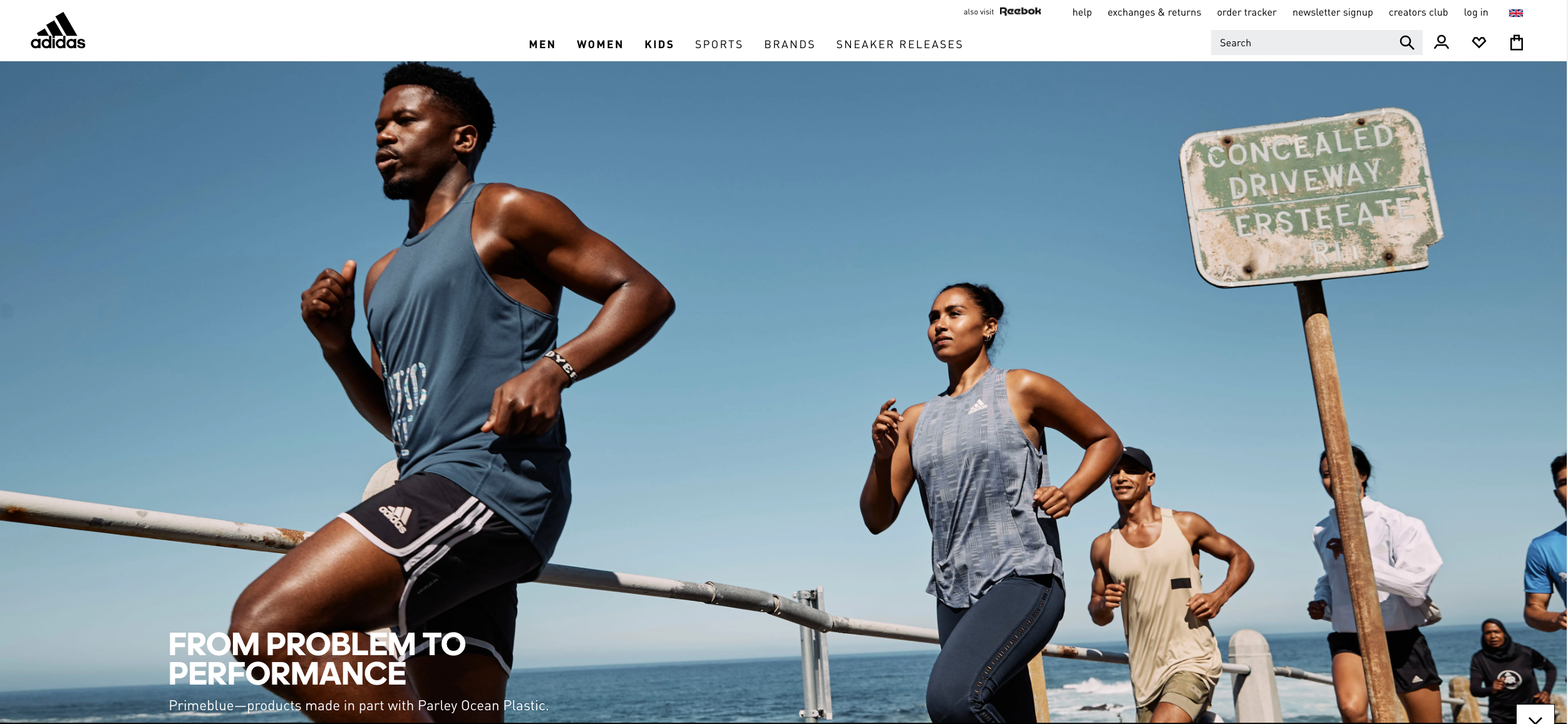
Adidas demonstrates a flair for style and interactivity. It encourages the visitors to stay and explore the site by adding fun, enjoyment and technology. The homepage uses an intelligent combination of fluid, elastic layout inside of fixed and familiar navigation. The layout comes to life under the mouse and encourages the visitor to browse and look at all the page elements. The huge product collection of Adidas is organized into categories that help to keep the product collection well organized and straightforward.
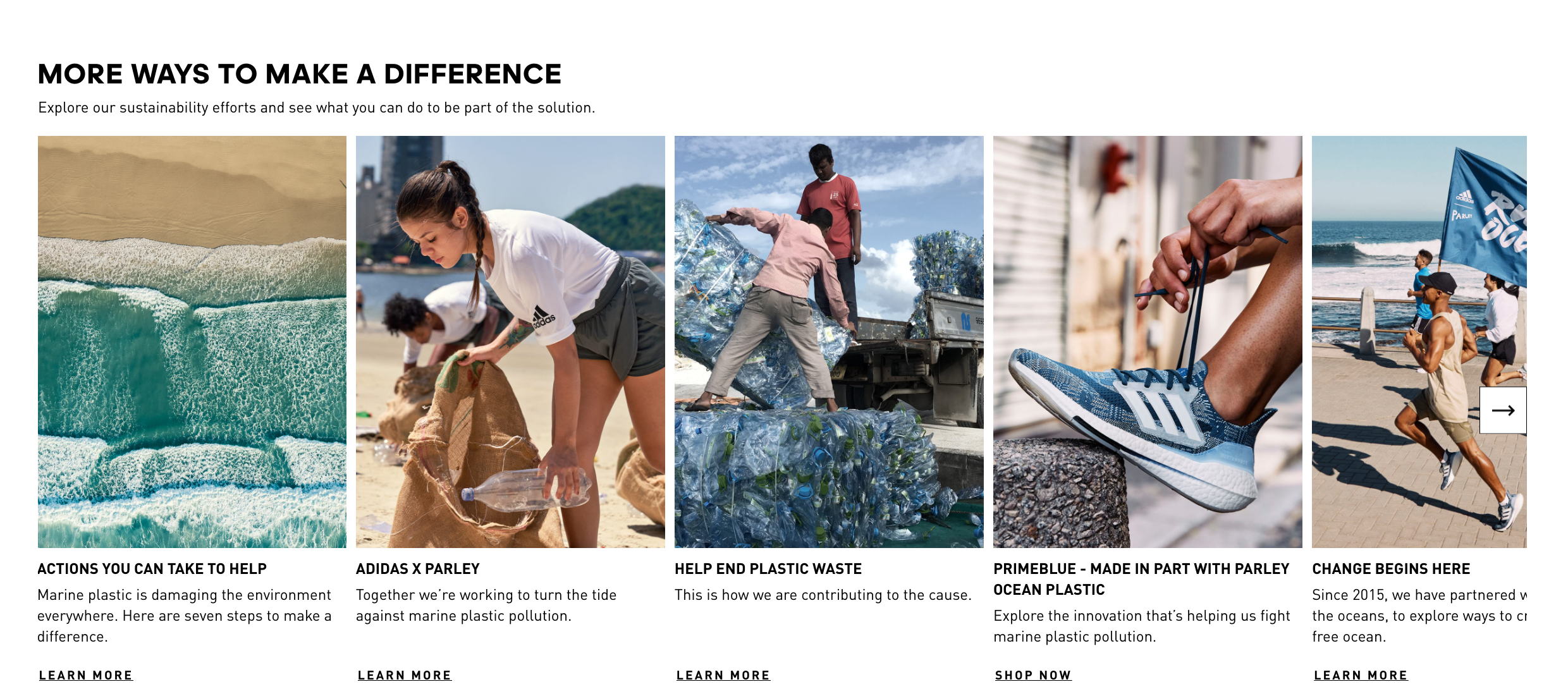
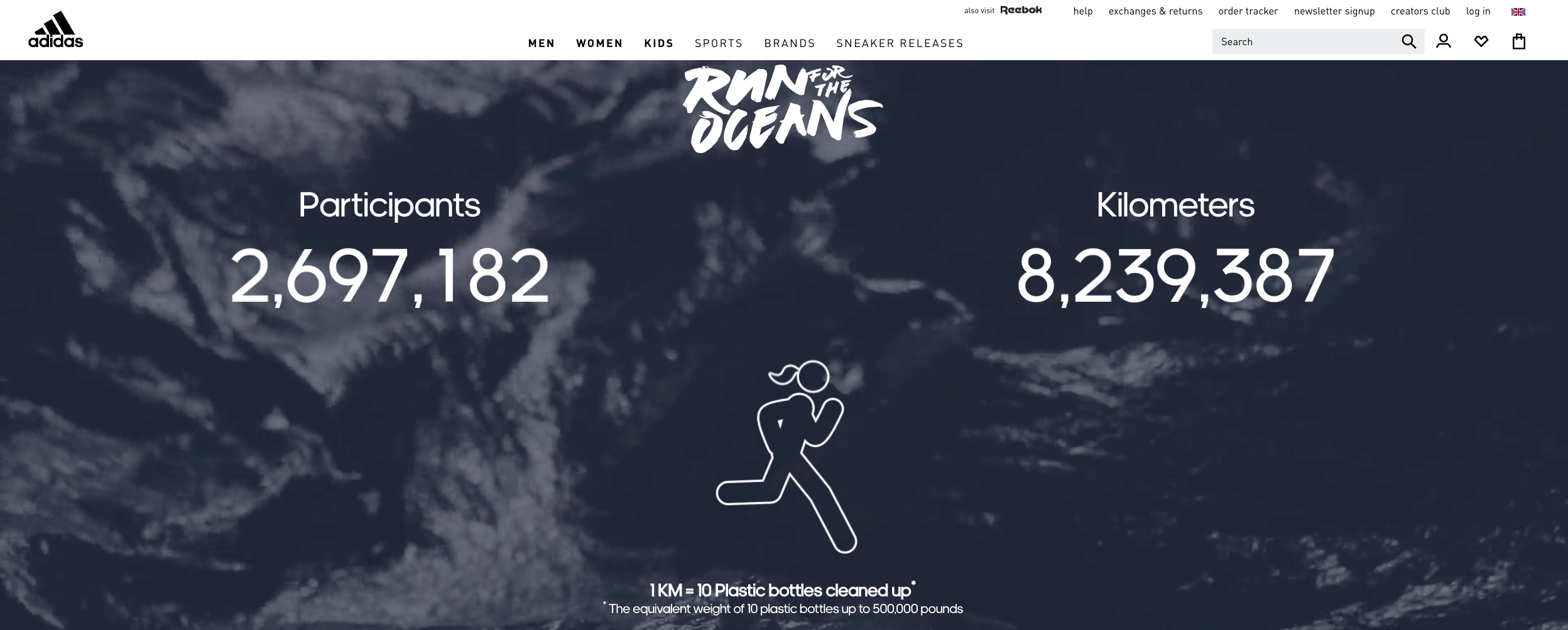
Adidas’s website and their App, promoting physical sport acitivty, organizing a Running challenge showcasing quotes and photography that has a focus on making a difference in the world. They brand themself as caring about the environment and creating eco-friendly products without the use of plastic. It is not surprising that adidas has so many awards. Ranking as the best in the industry for Brand Management and Efficiency. And they have an award for the best retail website, outstanding achievement in web development.
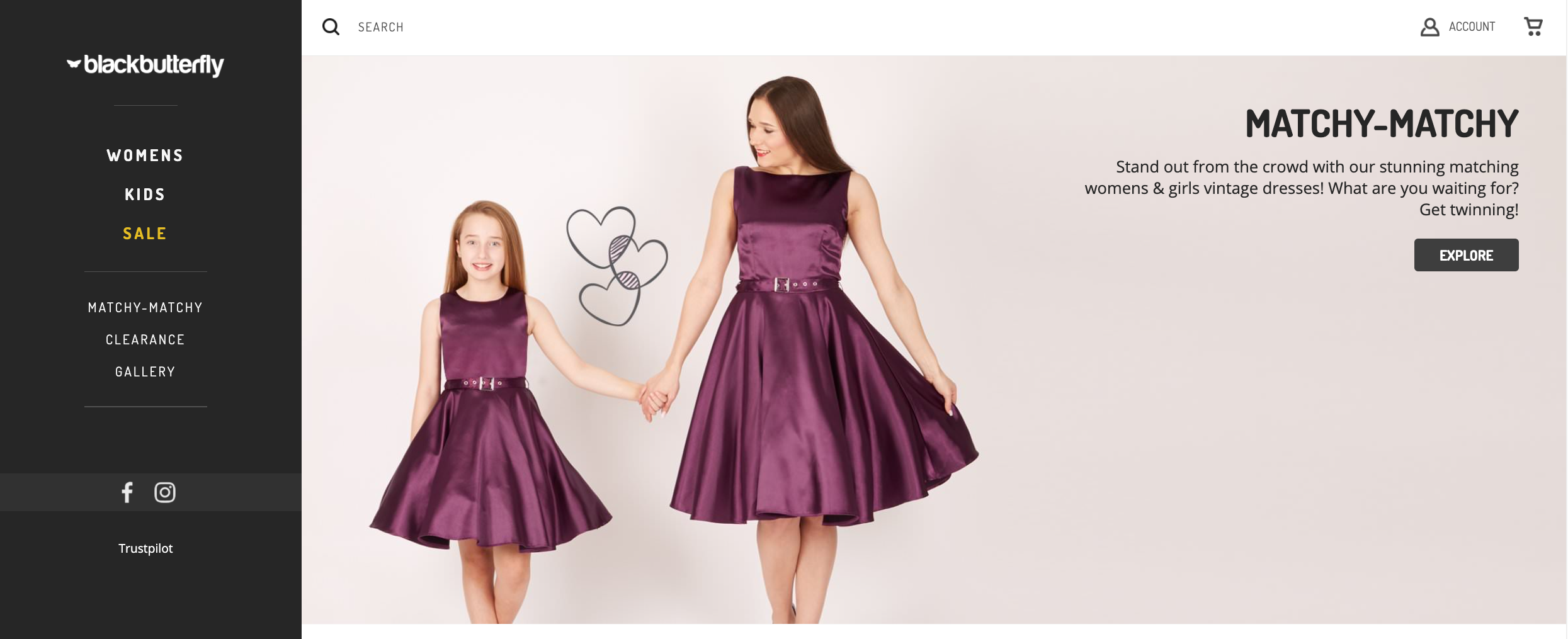
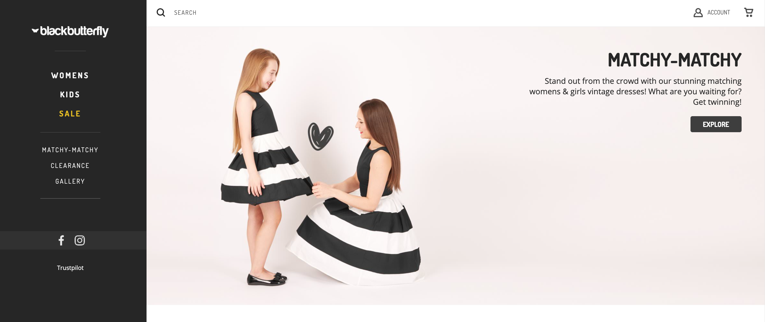
Black Butterfly’s website immediately gives the feeling of charming, adorable, clean style. It has minimal color use in the UI, showcasing the product as the center of the focus.
It represents a simplistic, modern feel with a menu on the left and a straightforward structure. The fun photography brings a smile with its cute graphics. And users can quickly scroll through to the category that they’re interested in exploring.
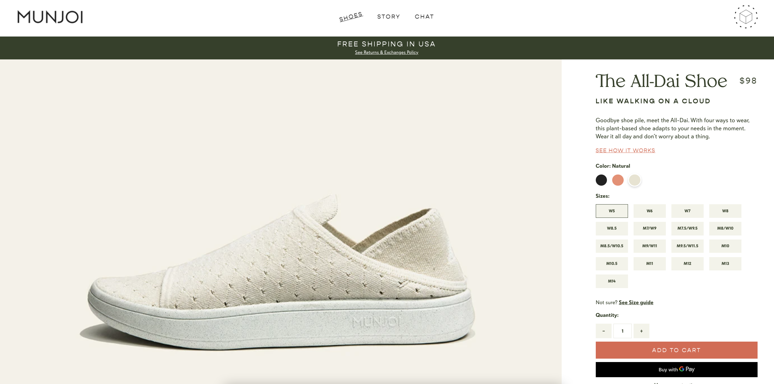
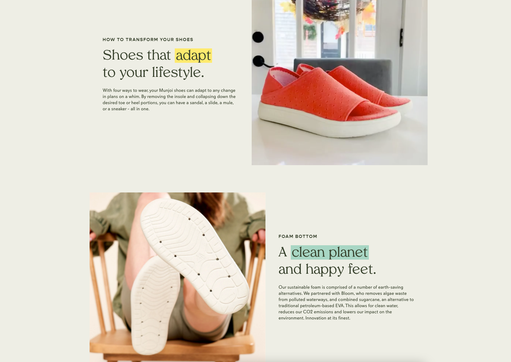
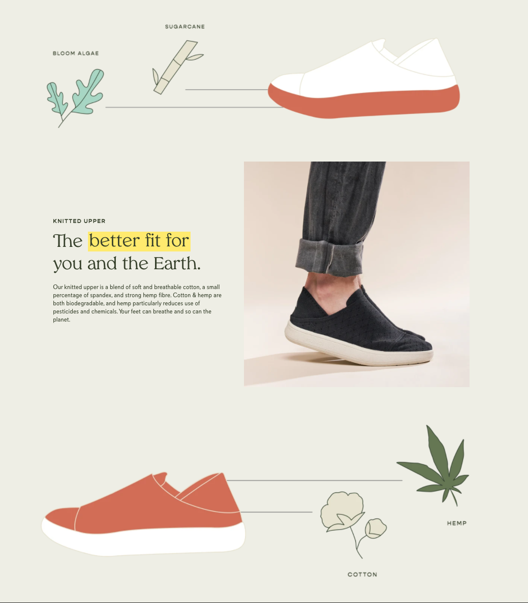
Munjoi
A minimal and clean design keeps the focus on the shoe with innovative and natural materials. That gives a rich and premium look of a personal and easy fit.
By Awwards jury, Munjoi is rated as honorable with the best web design. The company brand itself as a plant-based, sustainable shoe with one of the lowest carbon footprints. Using energetic + bright photography to showcase their values through design. Showcasing the environment-friendly materials with soft and breathable cotton.
When designing a website, I constantly research the industry standards and competitors. I find it many times companies make the mistake of putting too much stuff and information on their home page. Some think that it provides them an advantage by letting the visitor see a lot at a glance. Overloading the visitor with information only makes it harder to find the necessary stuff at a given time. In any case, it is known that people scan quickly, looking for fixed points that can guide them to necessary points. The less unnecessary stuff displayed, the more efficient the process is.
Good marketing may bring in some traffic, but good design and an enjoyable user experience improve user satisfaction. The goal is to create a website that will be easy to use, accessible and effective. Ensuring safety, leaving a trustful and positive experience from the user’s perspective. All of those could influence the success of a company’s website and the Brand’s impression. You may not have a second chance to make a good first impression!